Modern Grotesque Body

Dustone + One More
Creates crisp high-hierarchy contrast beneath Dustone headlines across menus, websites and labels.
Inspect One More specimenDisclosure: MakerFileHub may earn a commission from qualifying purchases via paid links on this page. How our links work.
Weathered Victorian Tuscan saloon & gravestone serif
Dustone is a bold vintage Tuscan display serif combining split fishtail serifs, diamond median spurs, and subtle stone-worn texture.
Paid link
Get this fontProject & layout blueprintsAt-a-glance maker compatibility
Sturdy stroke walls and open counters weed cleanly on adhesive vinyl, HTV apparel film, and cut cardstock.
Visual anatomy & craft review
Dustone is a Victorian Tuscan display serif in which the serifs split into fishtail points, diamond median spurs sit at mid-stem, and a light stone-worn texture mottles the surfaces. The construction is heavy and all-caps, with tight spacing that lets a word become a carved block, and the wear is subtle enough that it survives being printed at 30 mm without reading as a grunge overlay. Because the fishtails are structural rather than decorative, the face needs size to show them; below about 18 mm they merge. It is ideal for plaques, labels and period headings.
Antique · Weathered · Tuscan-spurred
Two-font hierarchy recipes
Tested contrast partners — pairing Dustone with grounded secondary typography.
Dustone + One More
Creates crisp high-hierarchy contrast beneath Dustone headlines across menus, websites and labels.
Inspect One More specimen
Dustone + Honey
Adds a warm human signature touch for 1-to-3-word callouts without competing against structured serif capitals.
Inspect Honey specimenPractical applications
Concrete hierarchy, scale and production guidance tailored to Dustone’s stroke geometry.
Split fishtails and diamond spurs read as carved lettering on a wooden sign, which is the register a barrel-aged drink or a traditional barber wants. Heavy construction holds up under a small label's varnish and gold ink.
Hierarchy & layout recipe
Label 90 x 110 mm, name 20 mm, abv 5 pt, 6 mm top arc clearance. Bottle 60 x 130 mm, name 12 mm, volume 4 pt. Tag 60 x 100 mm, initials 16 mm, 4 mm border, 5 mm hole clearance.
Pre-production check
Carved-looking letterforms suggest embossing, and a shallow emboss at 20 mm fills the fishtail splits with foil. Ask the die-maker for the minimum emboss depth and check one foil-stamped sample for bridging in the splits.
Stone-worn Tuscan capitals are what a real Victorian plaque looks like, so a haunted house gains atmosphere without a cartoon ghost. The mottled surface reads as age at a distance while the word stays legible up close.
Hierarchy & layout recipe
Plaque 500 x 300 mm on 10 mm PVC with a 3 mm bevel, name 90 mm, 50 mm margins. Menu 148 x 210 mm, header 30 mm, items 8.5/12 pt serif. Headstone 400 x 600 mm, name 70 mm, dates 20 mm.
Pre-production check
PVC edges are bevelled after printing and a word set within 40 mm of the trim loses its fishtails to the bevel. Keep 50 mm clear all round, and check one beveled sample before the run.
Tuscan capitals are the correct historical vocabulary for a Victorian poster or an archival cover, so a reproduction reads as a source rather than a pastiche. The subtle wear does not fight a letterpress reference the way a modern grunge face would.
Hierarchy & layout recipe
Poster 500 x 700 mm, title 220 mm, imprint 18/24 pt, 40 mm margins. Cover 170 x 240 mm, title 54 pt, author 18 pt on a 12 mm baseline from the foot. Museum label 100 x 60 mm, object name 9 mm, data 6 pt.
Pre-production check
Archive reproductions are often printed on uncoated laid paper and the diamond spurs pick up fibre shadow. Print a test sheet on the final stock and confirm the spur is visible at the viewing distance stated on the label.
Technical & licence verification
Confirm included OTF/TTF/WOFF formats, full glyph tables and licence coverage on the live store page before batch production.
Closest visual alternatives
Matched across letterform anatomy, stroke behaviour and craft applications.
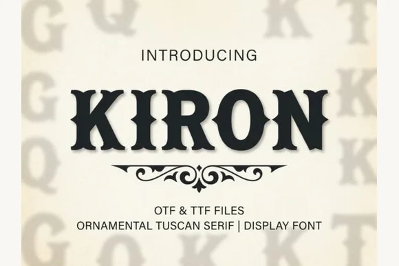
Classic median-spurred Western Tuscan slab-serif
Kiron is a clean, heavy Western Tuscan display serif with crisp diamond median spurs, flared bracketed serifs, and solid single-layer geometry.
Ideas for this font
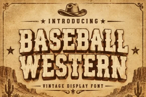
Spurred Wild-West saloon & vintage rodeo woodblock serif
Baseball Western blends classic American ballpark slabs with Wild-West Tuscan median spurs and rustic parchment distressing.
Ideas for this font
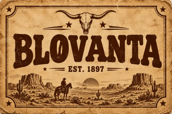
Weathered woodblock Western saloon display serif
Blovanta is a heavy, weathered Western display serif featuring chunky flared stems, a notched 'O' crossbar accent, and vintage ranch grit.
Ideas for this font
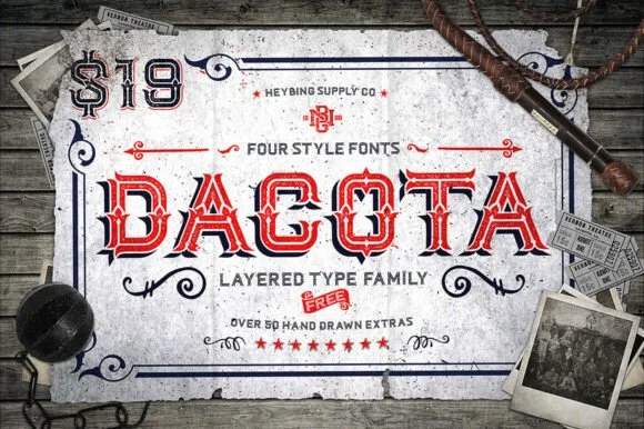
4-style layered Western saloon Tuscan family + 50+ extras
Dacota is a 4-style layered American West Tuscan serif family bundled with 50+ hand-drawn Western banners, ropes, and flourishes.
Ideas for this font
Allow optional Google Analytics to measure visits and catalogue actions. Your search words and notes are not included. Privacy & storage