Neutral Sans Workhorse

Mama Bundle + Homies
Lets Mama Bundle own the focal silhouette while handling secondary copy, sizing and subheads cleanly.
Inspect Homies specimenDisclosure: MakerFileHub may earn a commission from qualifying purchases via paid links on this page. How our links work.
Fat condensed display with notched counters
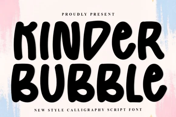
Mama Bundle is a fat condensed display in black on a pale sky: extremely heavy strokes, counters reduced to narrow slots, letters set almost touching, and small notches cut into the tops of the M and the A that keep the mass from reading as a solid block.
Paid link
Get this fontProject & layout blueprintsAt-a-glance maker compatibility
Sturdy stroke walls and open counters weed cleanly on adhesive vinyl, HTV apparel film, and cut cardstock.
Visual anatomy & craft review
The two words are stacked and fill the width of the frame, and the drawing is a display sans pushed to a limit: the stems are as thick as the counters are narrow, the A has a flat apex, and the B and the D carry rectangular bowls that read as slots rather than curves. The notches cut into the top of the M and the A are the detail that makes the face memorable, and they also stop the letters from merging when the tracking is negative. Because the counters are so small, the face only works above about 30 pt, which the sample acknowledges by setting it at hero scale with nothing else on the page but a photograph and two caption lines. The pale sky and the figure at the bottom give the black mass a clean field, so the letterforms read as a graphic rather than as text.
Fat, condensed, modern, quirky
Two-font hierarchy recipes
Tested contrast partners — pairing Mama Bundle with grounded secondary typography.
Mama Bundle + Homies
Lets Mama Bundle own the focal silhouette while handling secondary copy, sizing and subheads cleanly.
Inspect Homies specimen
Mama Bundle + Vanielst Elegant Serif Display Stylistic
Grounds bold display lettering with classic typographic authority on posters, badges and apparel.
Inspect Vanielst Elegant Serif Display Stylistic specimenPractical applications
Concrete hierarchy, scale and production guidance tailored to Mama Bundle’s stroke geometry.
A fat condensed mark reads at a glance and holds its silhouette on a garment label, which is what a small fashion label needs from a single-colour logo.
Hierarchy & layout recipe
Set the name at 44 pt with tracking at minus 25 units, then build a small version by opening the tracking to zero so the slots in the B and the D stay visible at 18 px. Keep the mark one colour and always on a light ground.
Pre-production check
Check the 18 px version, where the slots close first; if they do, use the standard tracking rather than scaling. Confirm the negative tracking does not fuse the M into the A at 44 pt on a laser print and that the mark holds on a woven label.
A fat condensed display gives a magazine cover a mass that reads from a shelf, and the notches give it a detail that survives a small online thumbnail.
Hierarchy & layout recipe
Set the cover word at 200 pt across the full width with 8 mm bleeds on both sides, the cover lines in a 9 pt sans, and the issue number at 14 pt. Keep the display on the palest part of the image and the cover lines in a separate band at the foot.
Pre-production check
Check the bleeds at trim: a condensed face loses its outer edge quickly, so keep at least 80 percent of the first and last letter. Confirm the notches survive the 175 lpi screen and that the cover lines read at newsstand distance.
A heavy condensed face turns a single word into a graphic that fills a poster or a tote without a second element, which is how a drop announcement reads as a brand statement.
Hierarchy & layout recipe
A2 print for the wall: the word at 260 mm cap height, the drop date in a 20 mm sans beneath, and the stockist in 10 mm. Keep 25 mm of clear space around the display so the negative tracking does not push the outer letters into the border.
Pre-production check
Check the print at A2 on a home printer, where solid black areas that large can band; use a rich black or reduce the size. Confirm the 20 mm date reads at two metres and that the 10 mm stockist line stays legible at arm's length.
Technical & licence verification
Confirm included OTF/TTF/WOFF formats, full glyph tables and licence coverage on the live store page before batch production.
Closest visual alternatives
Matched across letterform anatomy, stroke behaviour and craft applications.
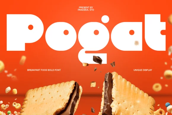
Ultra-fat heavy-packaging & cereal-box geometric display
Pogat is an ultra-heavy, slab-thick retro packaging font with massive ink mass and tiny circular pinhole counters built for snack and food branding!
Ideas for this font
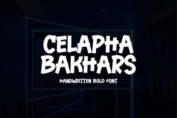
Energetic flat-chisel street-marker all-caps display
Celapha Bakhars is a punchy street-marker display font slashing thick, slightly overlapping chisel-tip capitals with urban poster energy.
Ideas for this font
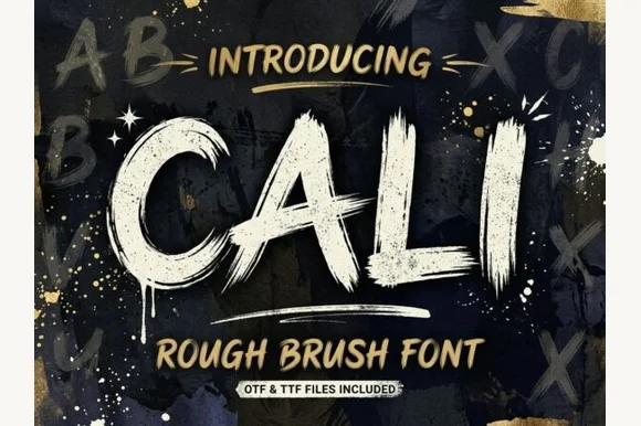
Heavy streaky hog-bristle wall-paint brush font (OTF & TTF)
Cali is a bold, wide-bristle rough brush display font streaked with authentic paint-roller and dry-brush fibers (OTF & TTF).
Ideas for this font
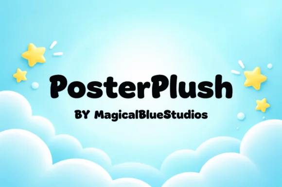
Heavy plush hand-drawn rounded poster display
Posterplush is a bold, velvety-thick rounded display font combining heavy black poster mass with warm hand-drawn softness.
Ideas for this font
Same independent foundry
Allow optional Google Analytics to measure visits and catalogue actions. Your search words and notes are not included. Privacy & storage