Modern Grotesque Body

Fishing + One More
Creates crisp high-hierarchy contrast beneath Fishing headlines across menus, websites and labels.
Inspect One More specimenDisclosure: MakerFileHub may earn a commission from qualifying purchases via paid links on this page. How our links work.
Dark contrast capitals with pointed serifs and sparse rough openings
Fishing is a contrasting display serif in which the stems run heavy, the serifs finish in points, the S turns compactly and the N takes a steep diagonal, with small rough openings near the edges, so one word reads as a bold label.
Paid link
Get this fontProject & layout blueprintsAt-a-glance maker compatibility
Sturdy stroke walls and open counters weed cleanly on adhesive vinyl, HTV apparel film, and cut cardstock.
Visual anatomy & craft review
The S closes two tight turns, the G ends in a substantial inward arm, the N falls on a steep diagonal and the pointed serifs meet the stems without brackets, while small worn openings appear near the outlines rather than across the faces. The light wear is the character: it barely shows at a glance and can vanish when the word is reduced, which is why the sample sets a single word on a plain field. Because the marks are small, the face wants 34 pt before they read as intent, and the heavy stems hold at almost any print size. Despite the name there are no illustrations in the specimen; the blue capital word is the face.
Contrasting · Pointed serifs · Slightly worn
Two-font hierarchy recipes
Tested contrast partners — pairing Fishing with grounded secondary typography.
Fishing + One More
Creates crisp high-hierarchy contrast beneath Fishing headlines across menus, websites and labels.
Inspect One More specimen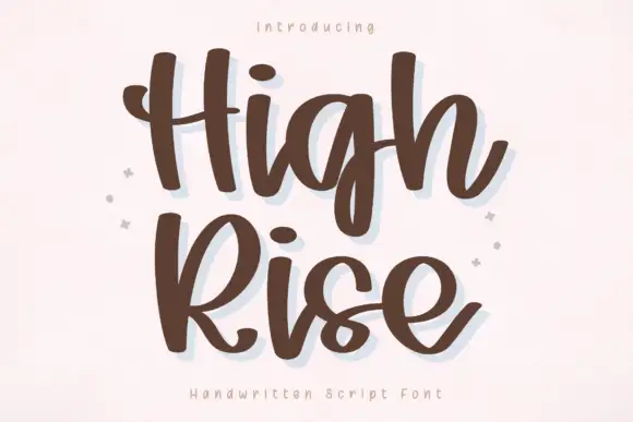
Fishing + High Rise
Adds a warm human signature touch for 1-to-3-word callouts without competing against structured serif capitals.
Inspect High Rise specimenPractical applications
Concrete hierarchy, scale and production guidance tailored to Fishing’s stroke geometry.
The bold capitals read from a car park, and the pointed serifs stay crisp at 70 mm on a painted board in one flat colour.
Hierarchy & layout recipe
Paint a 600 by 250 mm board: set the word at 70 mm, keep 25 mm of border all round, and set the opening hours in a 14 mm caps beneath with 18 mm of clear ground.
Pre-production check
Pointed serifs painted to a frame edge look cut; check the mounted sign and keep 20 mm of margin.
The bold serif carries a product label, and the heavy stems stay solid at 20 pt on a 60 mm printed panel in one flat ink.
Hierarchy & layout recipe
Print a 60 by 40 mm panel: set the brand at 20 pt, set the size code in an 8 pt caps beneath it, and keep 5 mm of border so the pointed feet stay whole.
Pre-production check
Worn openings printed at 14 pt read as dirt; check the proof and keep the brand at 18 pt or above.
The contrasting serif suits a long-form feature, and the compact S keeps a two-word title tight at 54 pt across a printed page.
Hierarchy & layout recipe
Print a 210 mm page: set the title at 54 pt on one row, set the standfirst at 11 pt in a serif beneath with 14 mm of clear ground, and keep the block on the upper third.
Pre-production check
A heavy headline set over a photograph loses its pointed serifs; check the spread and keep the title on a plain band.
Technical & licence verification
Confirm included OTF/TTF/WOFF formats, full glyph tables and licence coverage on the live store page before batch production.
Closest visual alternatives
Matched across letterform anatomy, stroke behaviour and craft applications.
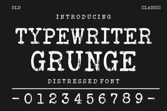
Distressed typewriter face with stamped edges
Typewriter Grunge is a distressed serif in white on near black: wide capitals with slab serifs and worn, ink-stamped edges, shown with a full row of digits and two small tracked labels at the corners.
Ideas for this font
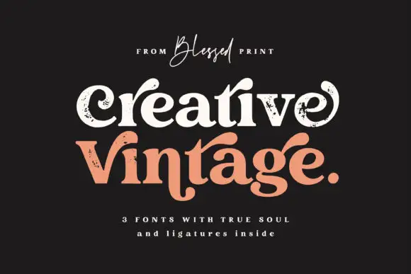
Distressed curled vintage serif
Creative Vintage is a high-contrast serif in which the terminals curl into swash shapes, the C turns inward, the t finishes in a broad low hook and scattered distressed marks break the fill, so a title reads as a worn printed label.
Ideas for this font
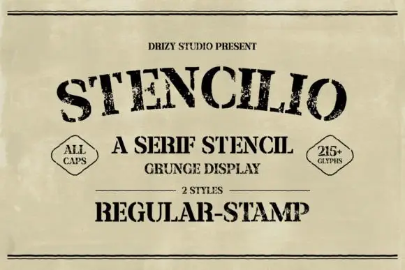
Distressed serif stencil
Stencilio is a distressed serif stencil in black on aged paper: heavy caps with interrupted bowls and rough feet, the letters set on a shallow arc, with a tracked line above, a small caps line and a two-diamond label beneath and a full second line in the stamp style.
Ideas for this font
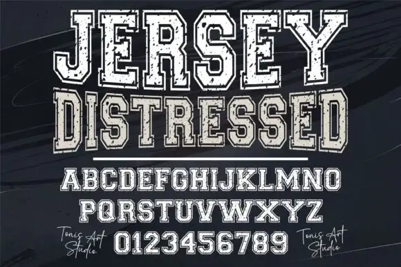
Distressed varsity slab capitals with an outline and a heavy fill
Jersey Distressed is a varsity slab capital alphabet with a heavy fill, a separate outline and a speckled wear texture, so one word reads as a shirt print that has been washed a hundred times.
Ideas for this font
Same independent foundry
Allow optional Google Analytics to measure visits and catalogue actions. Your search words and notes are not included. Privacy & storage