Neutral Sans Workhorse

Lucky Grunge + Taught
Lets Lucky Grunge own the focal silhouette while handling secondary copy, sizing and subheads cleanly.
Inspect Taught specimenDisclosure: MakerFileHub may earn a commission from qualifying purchases via paid links on this page. How our links work.
Grunge heavy sans display
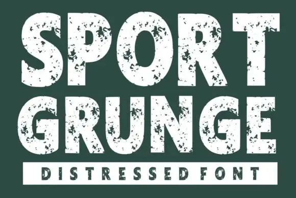
Lucky Grunge is a heavy grunge display in black on cream: wide condensed caps with chipped edges, speckled interiors and a slightly rough baseline, set over a dry orange brush swipe with a banner caption, so the pair reads as a stencilled crate label.
Paid link
Get this fontProject & layout blueprintsAt-a-glance maker compatibility
Fine grain and micro-texture excel in 300 DPI print, sublimation, and screen print rather than small vinyl weeding.
Visual anatomy & craft review
The two words are stacked and the drawing is a heavy sans with the wear built in: the stems are wide, the counters narrow, and the surfaces are eaten by chips at a consistent scale, which is what makes the two lines read as one plate rather than two textures. The damage stays away from the counters' middle, so the word still resolves at a distance, and the spacing is tight enough that the pair forms a block. The composition places the block over a brush stroke in a second colour, which lifts it off the background without an outline, and a small banner beneath carries the category. The palette is two inks on cream, and the only other element is a thin tracked line above, so the texture carries the page.
Grunge, heavy, bold, textured
Two-font hierarchy recipes
Tested contrast partners — pairing Lucky Grunge with grounded secondary typography.
Lucky Grunge + Taught
Lets Lucky Grunge own the focal silhouette while handling secondary copy, sizing and subheads cleanly.
Inspect Taught specimen
Lucky Grunge + Lumera Editorial
Grounds bold display lettering with classic typographic authority on posters, badges and apparel.
Inspect Lumera Editorial specimenPractical applications
Concrete hierarchy, scale and production guidance tailored to Lucky Grunge’s stroke geometry.
A grunge display reads as a stamped crate label, and the texture hides the small registration variations of a short run printed on uncoated stock.
Hierarchy & layout recipe
Print a 70 by 100 mm label: the beer at 18 pt, the style in a 7 pt sans, and the volume at 6 pt. Keep 5 mm inside the die, print one ink on a kraft stock, and let the chips read as part of the paper.
Pre-production check
Check the 18 pt name on kraft, where the chips can turn into noise; use the cleaner cut at that size. Confirm the 6 pt volume reads on the shelf and that the label survives a chilled cabinet.
A grunge display prints as one screen and looks worn on fabric, which suits a skate party better than a clean geometric mark.
Hierarchy & layout recipe
Print a 260 mm chest graphic: the phrase at 60 mm cap height, the date at 16 mm, and one ink on a light shirt. Keep the thinnest chip at 2.5 mm so the screen holds and place the graphic 80 mm below the collar.
Pre-production check
Check the screen at actual mesh, where a chip under 2 mm fills; open the texture for fabric. Wash-test one shirt and confirm the date stays legible after five cycles.
A grunge face signals a loud, informal workshop and reads from across a corridor, and the single ink keeps a school's printing cheap.
Hierarchy & layout recipe
A3 print: the headline at 90 mm cap height, the details in a 12 mm sans, and a brush rule beneath. Keep 25 mm margins and print one colour plus a dry brush swatch on a coloured sheet.
Pre-production check
Check the A3 at two metres, where the chips can reduce legibility; keep the letters clean at that size. Confirm the 12 mm details read at arm's length and that the brush swatch does not cross the text block.
Technical & licence verification
Confirm included OTF/TTF/WOFF formats, full glyph tables and licence coverage on the live store page before batch production.
Closest visual alternatives
Matched across letterform anatomy, stroke behaviour and craft applications.
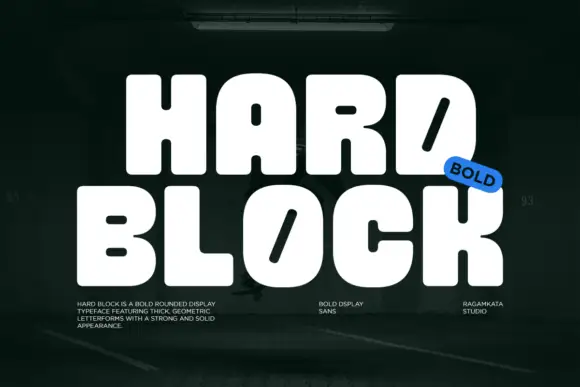
Very heavy rounded blocks with tiny counters and diagonal slots in D and O
Hard Block is a very heavy rounded display in which the capitals sit almost solid, the counters shrink to small pills and the D and O carry a long diagonal slot instead of an open bowl, so two stacked words read as one compact block.
Ideas for this font
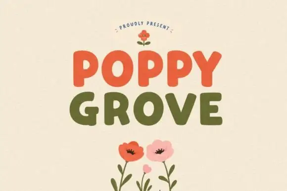
Simple rounded block capitals
Poppy Grove is a rounded block capital display in two warm inks: Poppy in vermilion and Grove in olive on a cream ground, with flat-sided letters, soft corners and a small drawn poppy above and below.
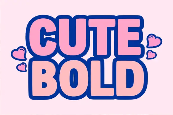
Heavy rounded bold sans with a thick dark outline
Cute Bold is a heavy rounded sans in which the letters swell, the counters close to slots and a thick dark outline wraps each word, so a two-word title reads as a cut sticker made for a scrapbook.
Ideas for this font
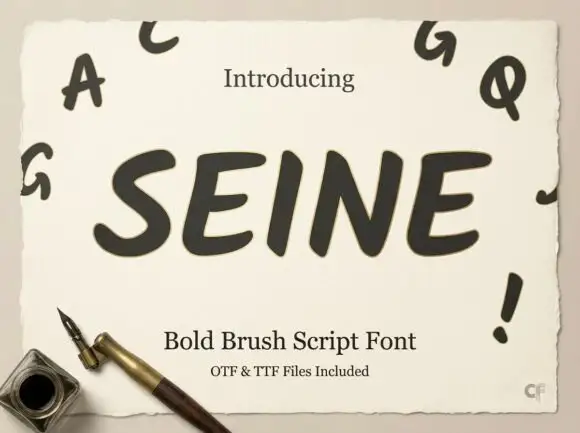
Slanted rounded brush capitals
Seine is a slanted rounded brush capital set in dark grey on a deckled cream sheet: very heavy strokes with rounded ends, a strong forward lean, and small capital letters scattered around the sheet as a specimen.
Ideas for this font
Same independent foundry
Allow optional Google Analytics to measure visits and catalogue actions. Your search words and notes are not included. Privacy & storage