Neutral Sans Workhorse

Cooper Black + Memoir Slang
Lets Cooper Black own the focal silhouette while handling secondary copy, sizing and subheads cleanly.
Inspect Memoir Slang specimenDisclosure: MakerFileHub may earn a commission from qualifying purchases via paid links on this page. How our links work.
Heavy rounded capitals shown in a plain block specimen
This Cooper Black listing shows heavy rounded capitals in which the strokes stay largely even, the C and O open broad, the A closes a small triangular counter and the R finishes in a blunt diagonal leg, so a title reads as a soft solid block.
Paid link
Get this fontProject & layout blueprintsAt-a-glance maker compatibility
Sturdy stroke walls and open counters weed cleanly on adhesive vinyl, HTV apparel film, and cut cardstock.
Visual anatomy & craft review
The C and O swell into wide rounds, the A keeps a small triangular counter, the R ends bluntly on its leg and the letter forms carry a shadow in the sample cover that lifts the white title off black and gold. The even weight is the character: the word reads as one soft mass rather than a high-contrast display, which is why the sample sets it in a plain block. Because the counters are small and round, the face wants 28 pt before they hold, and the shadow in the sample is artwork. The gold cover ground is presentation; the white lettering is the face.
Heavy · Rounded · Even
Two-font hierarchy recipes
Tested contrast partners — pairing Cooper Black with grounded secondary typography.
Cooper Black + Memoir Slang
Lets Cooper Black own the focal silhouette while handling secondary copy, sizing and subheads cleanly.
Inspect Memoir Slang specimen
Cooper Black + The Avenue Editorial
Grounds bold display lettering with classic typographic authority on posters, badges and apparel.
Inspect The Avenue Editorial specimenPractical applications
Concrete hierarchy, scale and production guidance tailored to Cooper Black’s stroke geometry.
The heavy rounds read from a pavement, and the soft blocks hold a two-word sign at 70 mm on a painted board in one colour. One colour keeps the rounds from looking heavy twice.
Hierarchy & layout recipe
Paint a 700 by 300 mm board: set the words at 70 mm on two rows, keep 20 mm between the rows so the bowls stay separate, and keep 30 mm of border all round the board. Hang the board square to the pavement.
Pre-production check
Two rounded rows painted flush merge into one mass; check the mounted board and open the gap to 24 mm. Paint the gap between the rows first.
The soft mass sets an appetising title, and the wide bowls hold a two-word headline at 58 pt across a printed spread. The even weight keeps a food page friendly.
Hierarchy & layout recipe
Print a 210 mm spread: set the title at 58 pt on one row, keep 18 mm of clear ground beneath before the standfirst at 11 pt, and keep the block on the upper third of the page.
Pre-production check
A heavy title printed over body text crowds the column; check the spread and keep 12 mm of air below the last bowl.
The friendly weight suits a birthday card, and the rounded blocks keep a greeting readable at 34 pt on an A6 sheet. The small triangular A counter stays open at that size.
Hierarchy & layout recipe
Print an A6 card: set the greeting at 34 pt, set the name at 15 pt in a rounded sans beneath with 12 mm of clear ground, and keep 16 mm of margin all round the card. Keep the card flat under the type.
Pre-production check
A heavy face at 20 pt on a small card leaves no margin; check the proof and keep the greeting at 30 pt or above.
Technical & licence verification
Confirm included OTF/TTF/WOFF formats, full glyph tables and licence coverage on the live store page before batch production.
Closest visual alternatives
Matched across letterform anatomy, stroke behaviour and craft applications.
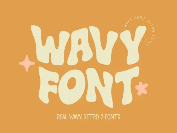
Wavy heavy capitals with bulging sides
Wavy Retro shows thick letters with curved outer edges and uneven tops, where the W spreads broadly, the O tilts and the T carries an exaggerated rightward arm, and the cream title sits on orange with almost no additional decoration.
Ideas for this font
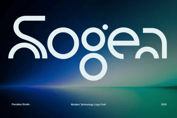
Elegant serif with ink traps
Sogea is an elegant serif in cream on a warm brown field: high contrast, fine hairlines, sharp serifs and small ink traps at the junctions, a tall waist and a wide x-height, set in two lines with a tracked caption beneath and a small ornament above.
Ideas for this font
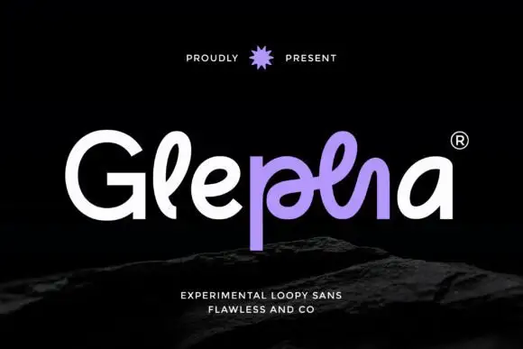
Looped rounded mixed case with interwoven central strokes and a deep p stem
Glepha shows white and purple lettering on black, where a broad open G introduces rounded lowercase forms, the l rises into a narrow loop and the central letters intertwine through a crossing horizontal stroke, while the p drops far below the main bodies and the final a keeps a simple broad bowl.
Ideas for this font
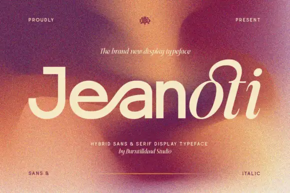
Broad plain mixed case shifting into a fine looped slanted ending
Jeanoti shows pale lettering over a warm blurred portrait, where the opening word uses broad near-even sans strokes with a squared J top and a wide e, before the ending rises into a large upper loop and closes with a detached oval dot and a curved foot.
Ideas for this font
Same independent foundry
Allow optional Google Analytics to measure visits and catalogue actions. Your search words and notes are not included. Privacy & storage