Neutral Sans Workhorse

Hard Block + Cultivo
Lets Hard Block own the focal silhouette while handling secondary copy, sizing and subheads cleanly.
Inspect Cultivo specimenDisclosure: MakerFileHub may earn a commission from qualifying purchases via paid links on this page. How our links work.
Very heavy rounded blocks with tiny counters and diagonal slots in D and O
Hard Block is a very heavy rounded display in which the capitals sit almost solid, the counters shrink to small pills and the D and O carry a long diagonal slot instead of an open bowl, so two stacked words read as one compact block.
Paid link
Get this fontProject & layout blueprintsAt-a-glance maker compatibility
Sturdy stroke walls and open counters weed cleanly on adhesive vinyl, HTV apparel film, and cut cardstock.
Visual anatomy & craft review
The O cuts a diagonal slot through a rounded mass, the D repeats that slot, the R and B keep small pill-shaped openings and every corner rounds off so the letter faces press against their neighbours. The slot is the character: it lets a heavy letter stay readable without an open counter, which is why the sample stacks two rows tight on a dark ground. Because the spacing is tight, a title needs deliberate tracking from 34 pt and clear air between rows so the block does not merge into one shape. The blue badge in the corner is artwork; the white rounded letters are the face.
Heavy block · Slotted · Compact
Two-font hierarchy recipes
Tested contrast partners — pairing Hard Block with grounded secondary typography.
Hard Block + Cultivo
Lets Hard Block own the focal silhouette while handling secondary copy, sizing and subheads cleanly.
Inspect Cultivo specimen
Hard Block + Svara
Grounds bold display lettering with classic typographic authority on posters, badges and apparel.
Inspect Svara specimenPractical applications
Concrete hierarchy, scale and production guidance tailored to Hard Block’s stroke geometry.
The solid blocks read across a lobby, and the slotted letters stay legible at 80 mm on a printed panel painted in one flat ink.
Hierarchy & layout recipe
Print a 700 by 300 mm panel: set the word at 80 mm, keep 8 mm of tracking so the slots stay separate, and keep 30 mm of border so the rounded corners are not trimmed.
Pre-production check
Solid letters printed without extra tracking merge into a single shape; check the panel at final size and add tracking rather than reducing weight.
The compact mass suits a zine cover, and the diagonal slots keep a two-word title readable at 60 pt against a dark ground.
Hierarchy & layout recipe
Print an A5 cover: set the title at 60 pt on two tight rows, keep 14 mm between the rows so the block reads as two lines, and set the issue number in a 7 pt mono in the corner.
Pre-production check
Two tight rows set flush read as one solid bar; check the cover proof and open the gap between them by 4 mm before the final plate.
The heavy blocks cut without small parts, and the slotted forms stay whole at 30 mm on a shaped die laid over a pale ground.
Hierarchy & layout recipe
Print an A4 sticker sheet: set the word at 30 mm, keep the slots at 3 mm so they stay open under laminate, and leave 6 mm between motifs for the die cuts.
Pre-production check
Slots under 2 mm close in a laminated sticker; check the print and keep the slot at 3 mm or wider.
Technical & licence verification
Confirm included OTF/TTF/WOFF formats, full glyph tables and licence coverage on the live store page before batch production.
Closest visual alternatives
Matched across letterform anatomy, stroke behaviour and craft applications.
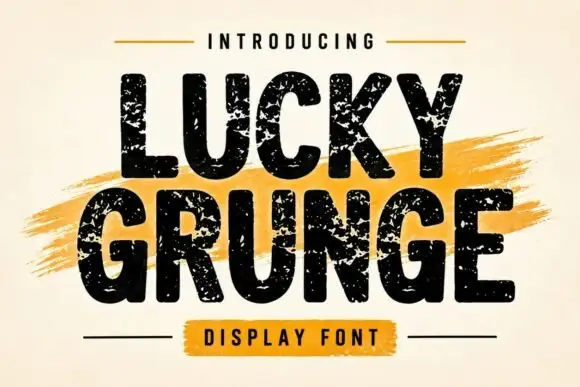
Grunge heavy sans display
Lucky Grunge is a heavy grunge display in black on cream: wide condensed caps with chipped edges, speckled interiors and a slightly rough baseline, set over a dry orange brush swipe with a banner caption, so the pair reads as a stencilled crate label.
Ideas for this font
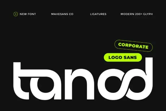
Heavy rounded logo display
Tanod is a heavy rounded lowercase display in white on near-black: wide strokes with squared outer corners, circular bowls, an extended t arm and a final pair of letters drawn as an interwoven knot, with two pill labels at the upper right naming the style and the glyph count.
Ideas for this font
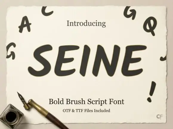
Slanted rounded brush capitals
Seine is a slanted rounded brush capital set in dark grey on a deckled cream sheet: very heavy strokes with rounded ends, a strong forward lean, and small capital letters scattered around the sheet as a specimen.
Ideas for this font
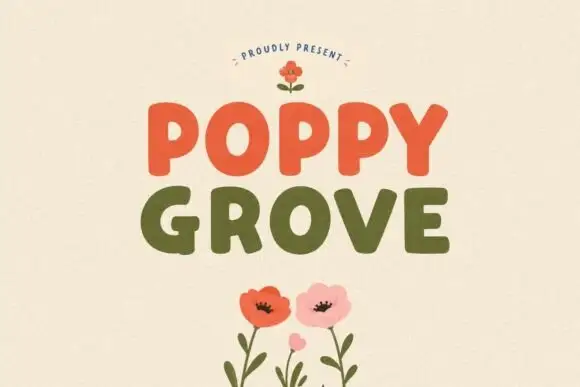
Simple rounded block capitals
Poppy Grove is a rounded block capital display in two warm inks: Poppy in vermilion and Grove in olive on a cream ground, with flat-sided letters, soft corners and a small drawn poppy above and below.
Same independent foundry
Allow optional Google Analytics to measure visits and catalogue actions. Your search words and notes are not included. Privacy & storage