Neutral Sans Workhorse

Retro Vintage + Nyxar
Lets Retro Vintage own the focal silhouette while handling secondary copy, sizing and subheads cleanly.
Inspect Nyxar specimenDisclosure: MakerFileHub may earn a commission from qualifying purchases via paid links on this page. How our links work.
Groovy layered display with heavy offset
Retro Vintage is a groovy display in sage green and dusty pink with a deep plum offset: fat rounded letters that lean and swell, a solid shadow layer that steps down and to the right, and ligatures that fuse adjoining letters into a single shape.
Paid link
Get this fontProject & layout blueprintsAt-a-glance maker compatibility
Sturdy stroke walls and open counters weed cleanly on adhesive vinyl, HTV apparel film, and cut cardstock.
Visual anatomy & craft review
The two words are stacked and each is set in a different colour of the same drawing, so the pair demonstrates the two treatments the face ships with rather than two typefaces. The letterforms are 1970s rounded: the bowls are wide, the stems swell in the middle, the R carries a curled leg, and several pairs are joined by ligatures, so the word reads as a ribbon of shapes rather than as separate letters. The depth is a single solid offset in a darker tone, consistent across the whole word, and it is thick enough to read as a layer of paper beneath rather than as a shadow. The ground is a pale panel with horizontal rainbow stripes and sparkles, and the two caption lines are set in a light connected script, which keeps the display face as the only heavy element.
Groovy, layered, seventies, bold
Two-font hierarchy recipes
Tested contrast partners — pairing Retro Vintage with grounded secondary typography.
Retro Vintage + Nyxar
Lets Retro Vintage own the focal silhouette while handling secondary copy, sizing and subheads cleanly.
Inspect Nyxar specimen
Retro Vintage + The Simple Editorial
Grounds bold display lettering with classic typographic authority on posters, badges and apparel.
Inspect The Simple Editorial specimenPractical applications
Concrete hierarchy, scale and production guidance tailored to Retro Vintage’s stroke geometry.
A groovy layered display sets a decade instantly, and the solid offset makes a two-colour print look three-dimensional without a photograph.
Hierarchy & layout recipe
A2 portrait: the two words at 120 mm cap height, the date in a 16 mm grotesque, and the offset at 5 mm. Keep the palette to two fills plus one offset tone and leave the lower third for the practical details.
Pre-production check
Check the offset at 5 mm on the printed poster, where it must stay even around the swelling strokes; inspect the bowls of the o and the a. Confirm the 16 mm date reads at four metres and that the ligatures do not obscure the word.
A groovy label gives a bakery a nostalgic identity that stands apart from minimal competitors, and the two fills plus offset print cheaply on a short run.
Hierarchy & layout recipe
Print a 70 by 90 mm label: the brand at 20 pt with a 1 mm offset, the product in a 7 pt grotesque, and the weight in 6 pt. Keep the ligatures only where they close cleanly at that size and leave 5 mm clear inside the die.
Pre-production check
Check the 20 pt brand on the label, where a ligature can turn two letters into a smudge; disable the ligature for small sizes. Confirm the 6 pt weight reads on the box and that the offset stays inside the die line.
A groovy face makes a decade-themed invitation look designed rather than dressed up, and the offset depth survives being printed at home.
Hierarchy & layout recipe
A6 card: the phrase at 32 pt with a 1.2 mm offset, the details in a 9 pt grotesque, and two sparkles at the corners. Keep the card to two colours plus the offset tone so a home printer does not muddle the layers.
Pre-production check
Check the offset at 32 pt on a home printer, where a 1 mm step can look like a misregistration; keep it consistent on every letter. Confirm the 9 pt details keep a 4.5:1 contrast and that the leaning letters clear the margin.
Technical & licence verification
Confirm included OTF/TTF/WOFF formats, full glyph tables and licence coverage on the live store page before batch production.
Closest visual alternatives
Matched across letterform anatomy, stroke behaviour and craft applications.
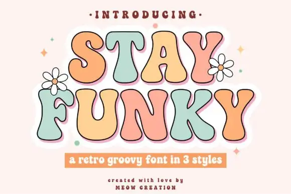
Blobby retro display in three styles
Stay Funky is a retro display in pastel pink, mint and cream on a pale ground: fat blobby letters of uneven height, each one a different colour with a dark outline and a white sticker edge, with drawn daisies between the words.
Ideas for this font
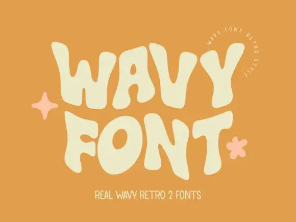
Wavy heavy capitals with bulging sides
Wavy Retro shows thick letters with curved outer edges and uneven tops, where the W spreads broadly, the O tilts and the T carries an exaggerated rightward arm, and the cream title sits on orange with almost no additional decoration.
Ideas for this font
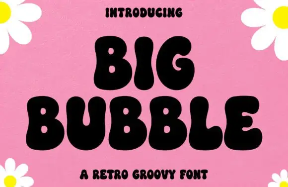
Very heavy groovy capitals with pinched contours and full round bowls
Big Bubble is a very heavy groovy capital alphabet in which each stroke swells and pinches, so the letters read as inflated shapes rather than drawn outlines.
Ideas for this font
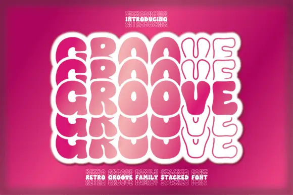
Textured tall slab
Oldstone is a textured slab in off-white on a dark green ground: tall condensed slabs with heavy bracketed serifs, a worn surface that chips the edges and fills the counters at random, offered in regular and stamp, with small flanking notes and a bordered strip beneath, so the plate reads as an aged print.
Same independent foundry
Allow optional Google Analytics to measure visits and catalogue actions. Your search words and notes are not included. Privacy & storage