Neutral Sans Workhorse

Daisy + Furion
Lets Daisy own the focal silhouette while handling secondary copy, sizing and subheads cleanly.
Inspect Furion specimenDisclosure: MakerFileHub may earn a commission from qualifying purchases via paid links on this page. How our links work.
Tall patch-like capitals filled with colourful outlined flowers
Daisy is a bitmap colour face in which every letter is a bold outlined shape filled edge to edge with painted flowers — pansies, daisies, petals and dots — in purple, pink, orange and lime.
Paid link
Get this fontProject & layout blueprintsAt-a-glance maker compatibility
Sturdy stroke walls and open counters weed cleanly on adhesive vinyl, HTV apparel film, and cut cardstock.
Visual anatomy & craft review
DAISY fills the card in five fat letters, each drawn as a heavy black contour with a slight hand wobble and then filled with a dense field of painted flowers: a violet pansy, a pink daisy, an orange bloom, a scatter of small petals and dots. The flowers are painted rather than vector-drawn, so the colour has brush edges and varies inside each shape, and the pattern follows the letter rather than tiling behind it. A caption above introduces the set in a thin grey sans and one below states the formats. The construction is a bitmap font supplied with PNG files, which is the practical detail: the letters are images, so they scale to the size of the artwork before they soften, and they are best used for covers, prints and cards rather than for body text.
Tall patch-like capitals filled with colourful outlined flowers
Two-font hierarchy recipes
Tested contrast partners — pairing Daisy with grounded secondary typography.
Daisy + Furion
Lets Daisy own the focal silhouette while handling secondary copy, sizing and subheads cleanly.
Inspect Furion specimen
Daisy + Svara
Grounds bold display lettering with classic typographic authority on posters, badges and apparel.
Inspect Svara specimenPractical applications
Concrete hierarchy, scale and production guidance tailored to Daisy’s stroke geometry.
The painted flowers make the cover without a photograph, and the heavy contour keeps the word readable over the busy pattern inside the letters.
Hierarchy & layout recipe
Print an A5 journal cover: set the title at 54 pt across one row, keep 16 mm of clear ground beneath before the subtitle at 9 pt, and hold 14 mm of margin so the pattern is not clipped at the edge.
Pre-production check
Bitmap letters soften when enlarged; export one cover at the final print size and check a petal before sending it to press.
The face treats flowers as print rather than as decoration, which is what a fashion page wants, and one word carries the whole opening without an image budget.
Hierarchy & layout recipe
Print a 230 by 300 mm opener: set the feature title at 120 pt across one row, keep 32 mm of clear ground beneath before the standfirst at 11 pt, and hold 18 mm from the last letter to the right trim.
Pre-production check
Dense painted patterns moire in offset; print one opener on the intended press and check a purple petal first.
The letters are the decoration, so a card can be printed in a short run with no photograph and still look considered rather than cheap.
Hierarchy & layout recipe
Print a 105 by 148 mm card: set the greeting at 40 pt across one row, keep 15 mm of clear ground beneath before the message at 9 pt, and hold 12 mm from the outline to the card edge.
Pre-production check
Small cards turn the pattern to confetti; print one card at the finished size and read the word before ordering the batch.
Technical & licence verification
Confirm included OTF/TTF/WOFF formats, full glyph tables and licence coverage on the live store page before batch production.
Closest visual alternatives
Matched across letterform anatomy, stroke behaviour and craft applications.
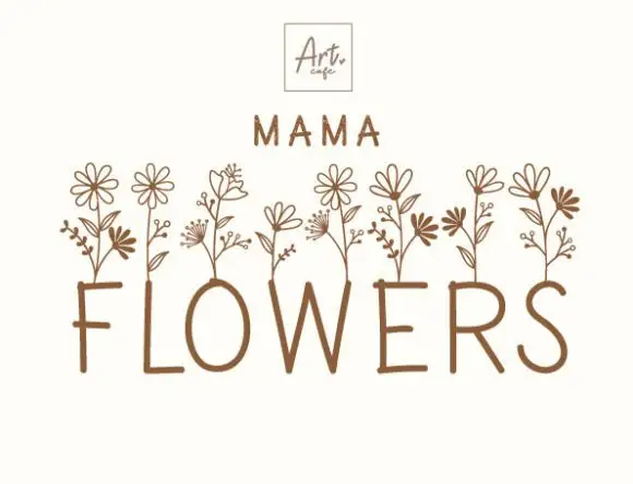
Flower-stem display
Mama Flowers Font is a decorative display in warm brown on white: fine narrow capitals whose upper edges grow tall outlined flower stems, with a small framed logo above and a tracked line beneath that names the style.
Ideas for this font
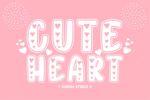
Soft tall outlined capitals with vertical rows of small heart-shaped openings
Cute Heart sets fat rounded capitals in white on pink and fills each stroke with a column of small hearts, so the word reads as a paper cut of tiny hearts rather than as letters.
Ideas for this font
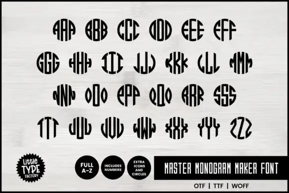
Narrow monogram letters fitted into circles
Master Monogram is a monogram set in black on white: narrow capitals drawn to be repeated and mirrored inside a circular silhouette, so each pair of letters fills a disc with stripes, plus digits and circle icons in the same weight.
Ideas for this font
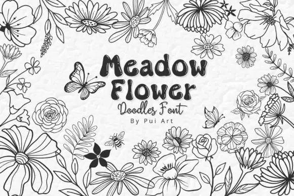
Meadow flower doodle set
Meadow Flower Doodles is a dingbat set drawn in black outline on a pale ground: loose meadow flowers with varied petals, leaves, buds and scattered butterflies, arranged as a border around a central panel that carries the name in a rounded hand, a script line and a small credit.
Ideas for this font
Same independent foundry
Allow optional Google Analytics to measure visits and catalogue actions. Your search words and notes are not included. Privacy & storage