Editorial Serif Anchor

Happy Rainbow Family + Kernova
Anchors Happy Rainbow Family's fluid strokes with crisp Roman proportions on wedding suites, headers and packaging.
Inspect Kernova specimenDisclosure: MakerFileHub may earn a commission from qualifying purchases via paid links on this page. How our links work.
Playful family with contrasting display lettering
Happy Rainbow Family builds a compact three-row stack, where chunky rounded HAPPY and FAMILY carry soft shadows and the tall narrow RAINBOW sits between them in multicolour letters, surrounded by leaves, butterflies, pencils and flowers.
Paid link
Get this fontProject & layout blueprintsAt-a-glance maker compatibility
Weld or Unite overlapping script joins into one continuous vector path before sending to the blade.
Visual anatomy & craft review
The outer rows stay heavy and rounded, the middle row stays slim and tall, the shadows lift the heavy words and the middle line changes colour per letter. That three-row shape is the character, because the stack narrows in the centre and widens at the top and bottom, which is what makes it read as a badge. The botanical art, the butterflies and the pencils are cover decoration, so check which rows belong to your files before promising a three-part lockup. Keep 40 pt for the slim middle row and set the colours yourself.
Chunky · Narrow · Colourful artwork
Two-font hierarchy recipes
Tested contrast partners — pairing Happy Rainbow Family with grounded secondary typography.
Happy Rainbow Family + Kernova
Anchors Happy Rainbow Family's fluid strokes with crisp Roman proportions on wedding suites, headers and packaging.
Inspect Kernova specimen
Happy Rainbow Family + Clyne Sans
Keeps small-scale dates, URLs, nutrition facts and care instructions crisp and legible below script titles.
Inspect Clyne Sans specimenPractical applications
Concrete hierarchy, scale and production guidance tailored to Happy Rainbow Family’s stroke geometry.
The badge shape suits a family gathering sign, where three words have to sit in one compact block over a doorway or a table.
Hierarchy & layout recipe
Print a 500 by 400 mm board: set the outer words at 60 mm each, set the middle word at 46 mm, keep 18 mm between rows, and keep 30 mm of border so the shadows stay inside the panel.
Pre-production check
The heavy rows carry more weight than the middle; check the block balance on a scaled proof first.
The cheerful stack reads at a distance and the slim centre row keeps a long fair name inside a single column of the poster.
Hierarchy & layout recipe
Print an A3 poster: set the two outer words at 70 pt each, set the middle row at 54 pt, keep 16 mm between rows, and keep 20 mm of clear ground beneath before the date at 14 pt.
Pre-production check
Multicolour letters need separate passes; check the file and the artwork time before quoting a two-ink print.
The compact badge works as a small shop mark and the middle row can hold a product word at a readable size on a round label.
Hierarchy & layout recipe
Print a 70 by 70 mm round label: set the outer words at 22 pt each, set the middle row at 17 pt, keep 6 mm between rows, and keep 5 mm of clear ring so the shadows are not clipped by the die.
Pre-production check
Shadows on a round die look cut off at the edge; check the artwork and remove them for this format.
Technical & licence verification
Confirm included OTF/TTF/WOFF formats, full glyph tables and licence coverage on the live store page before batch production.
Closest visual alternatives
Matched across letterform anatomy, stroke behaviour and craft applications.
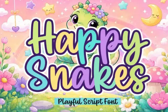
Playful rounded script with chunky loops and heart tittles
Happy Snakes is a chunky playful script with rounded loops, a heavy even weight and small heart tittles, drawn so two stacked words read as a solid friendly block.
Ideas for this font
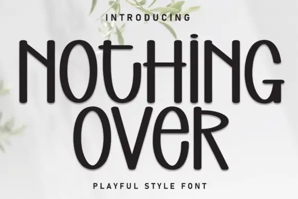
Playful monoline sans with uneven widths
Nothing Over is a playful display sans in black on white: a single even weight with narrow and wide letters side by side, tall ascenders and a baseline that lifts, with a small tracked capital line beneath.
Ideas for this font
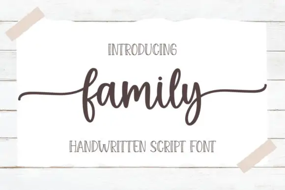
Low connected script with wide flat tails and a compact body
Family is a low connected script in which the body sits close to the baseline, the stroke stays even and both ends run out as wide flat tails, so a short word reads as a caption signed across a card.
Ideas for this font
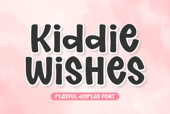
Chubby rounded sans with a warm wobble and open counters
Kiddie Wishes is a chubby rounded sans in which the strokes swell at the joints, the terminals round off and every letter leans a little, so a word reads as something drawn on a card with a fat marker.
Ideas for this font
Same independent foundry
Allow optional Google Analytics to measure visits and catalogue actions. Your search words and notes are not included. Privacy & storage