Neutral Sans Workhorse

Cute Heart + Taught
Lets Cute Heart own the focal silhouette while handling secondary copy, sizing and subheads cleanly.
Inspect Taught specimenDisclosure: MakerFileHub may earn a commission from qualifying purchases via paid links on this page. How our links work.
Soft tall outlined capitals with vertical rows of small heart-shaped openings
Cute Heart sets fat rounded capitals in white on pink and fills each stroke with a column of small hearts, so the word reads as a paper cut of tiny hearts rather than as letters.
Paid link
Get this fontProject & layout blueprintsAt-a-glance maker compatibility
Sturdy stroke walls and open counters weed cleanly on adhesive vinyl, HTV apparel film, and cut cardstock.
Visual anatomy & craft review
CUTE over HEART fills the frame, the letters soft-cornered with a thin inner keyline, and the hearts inside vary slightly in size so the fill never looks mechanical. Loose hearts float in the margins and dotted arcs sit in the top corners, which keeps the composition moving. The palette is one pink and one white and nothing else, so the pattern carries the whole design. Because the hearts are cut out of the fill, the face needs enough size for each heart to stay separate, and reversed out of pink on white it reads as a printed textile instead of a cut card.
Soft tall outlined capitals with vertical rows of small heart-shaped openings
Two-font hierarchy recipes
Tested contrast partners — pairing Cute Heart with grounded secondary typography.
Cute Heart + Taught
Lets Cute Heart own the focal silhouette while handling secondary copy, sizing and subheads cleanly.
Inspect Taught specimen
Cute Heart + Resquel
Grounds bold display lettering with classic typographic authority on posters, badges and apparel.
Inspect Resquel specimenPractical applications
Concrete hierarchy, scale and production guidance tailored to Cute Heart’s stroke geometry.
The heart fill carries the occasion without a single illustration, and the fat shapes stay legible on a small card a child hands over.
Hierarchy & layout recipe
Print a 105 by 148 mm card: set the message at 30 pt across one row, keep 14 mm of clear ground beneath before the name at 9 pt, and keep 12 mm of margin so the loose hearts stay inside the card.
Pre-production check
Small hearts close below 18 pt; check the printed card before running a class set. Confirm it on a printed sample, not on screen.
The pattern sets the theme in one element, and the heavy letters read from across a garden where bunting would be needed otherwise.
Hierarchy & layout recipe
Print a 1000 by 300 mm banner: set the name at 120 pt on one row, keep 28 mm of clear ground beneath before the age at 20 pt, and keep 30 mm of border so no letter is cropped at the ends.
Pre-production check
White lettering needs a strong ground; check the contrast on your own banner stock. Have the printer send a physical sample first.
The hearts suit a school kindness week, and the rounded letters stay friendly on a small printed badge that is pinned to a shirt all day.
Hierarchy & layout recipe
Print a 60 mm round badge: set the wording at 14 pt on one row, keep 5 mm of clear ground beneath before the class name at 6 pt, and keep 4 mm from the art to the badge edge.
Pre-production check
Fine hearts blur in a cheap print; check a badge sample before ordering the whole set. Request a proof on the actual stock before signing off.
Technical & licence verification
Confirm included OTF/TTF/WOFF formats, full glyph tables and licence coverage on the live store page before batch production.
Closest visual alternatives
Matched across letterform anatomy, stroke behaviour and craft applications.
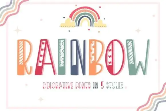
Striped narrow novelty capitals
Rainbow is a tall narrow novelty display on a white sheet inside a pale frame: capitals carrying different side details — diagonal stripes, hearts, loops, dots — in a palette of coral, teal and green, with a drawn rainbow above and a small line beneath naming five styles.
Ideas for this font
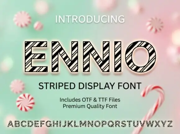
Geometric outlined capitals filled with tightly grouped diagonal black stripes
Ennio draws squat slab capitals with a heavy outline and a diagonal stripe running through each letter, so a word looks cut from a barber's pole or a fairground awning.
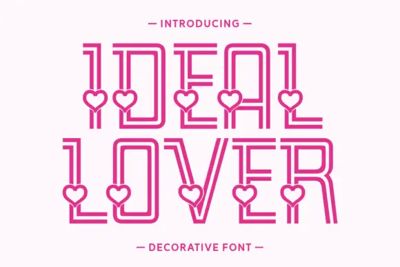
Tall double-line capitals interrupted by small open hearts near the lower stems
Ideal Lover is a decorative line face in which each tall capital is drawn as an inline outline and a small heart sits inside the base of the stroke, so a word marches along a row of little hearts.
Ideas for this font
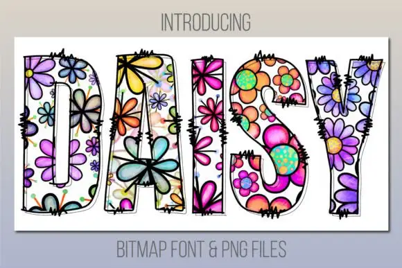
Tall patch-like capitals filled with colourful outlined flowers
Daisy is a bitmap colour face in which every letter is a bold outlined shape filled edge to edge with painted flowers — pansies, daisies, petals and dots — in purple, pink, orange and lime.
Ideas for this font
Same independent foundry
Allow optional Google Analytics to measure visits and catalogue actions. Your search words and notes are not included. Privacy & storage