Editorial Serif Anchor

Stencil + The Avenue Editorial
Anchors Stencil's fluid strokes with crisp Roman proportions on wedding suites, headers and packaging.
Inspect The Avenue Editorial specimenDisclosure: MakerFileHub may earn a commission from qualifying purchases via paid links on this page. How our links work.
Tall thin modern stencil
Stencil is a tall thin display in white on black: elongated letters with hairline strokes, wide open counters, a high waist and a generally stencil-like separation at the joins, so the word reads as contemporary signage rather than as a military stencil.
Paid link
Get this fontProject & layout blueprintsAt-a-glance maker compatibility
Open counter bridges hold interior islands intact on laser-cut wood, acrylic, and mylar stencils.
Visual anatomy & craft review
The word is set once across the plate and the drawing is extremely tall and narrow: the stems are hairlines, the counters are long slots, and the crossbars sit high, which gives the face the look of a sign cut from sheet metal. The joins break slightly, which is where the stencil reference comes from, but the drawing stays elegant rather than utilitarian, and the letters keep an even width so the word reads as a rhythm rather than a texture. Because the strokes are fine, the face needs a large size and high contrast, and the specimen places white on black with a tracked caption beneath in a small roman. Nothing else appears on the plate, which is honest for a display face whose whole character is the drawing.
Thin, tall, stencil, contemporary
Two-font hierarchy recipes
Tested contrast partners — pairing Stencil with grounded secondary typography.
Stencil + The Avenue Editorial
Anchors Stencil's fluid strokes with crisp Roman proportions on wedding suites, headers and packaging.
Inspect The Avenue Editorial specimen
Stencil + Mansory
Keeps small-scale dates, URLs, nutrition facts and care instructions crisp and legible below script titles.
Inspect Mansory specimenPractical applications
Concrete hierarchy, scale and production guidance tailored to Stencil’s stroke geometry.
A tall thin display reads as contemporary signage, and the hairline strokes in metal or vinyl give a gallery a fascia that looks fabricated rather than printed.
Hierarchy & layout recipe
Cut a 1,500 by 300 mm fascia: the name at 200 mm cap height, a 6 mm minimum stroke, and 40 mm clear between letters. Keep the strokes at least 5 mm for the cutting file and specify a matte finish to control reflections.
Pre-production check
Check the cutting file at 200 mm, where a 5 mm stroke can flex on installation; thicken it or add a backing. Confirm the fascia reads at thirty metres and that the joins do not weaken the letters during fixing.
A tall thin display gives a journal a masthead that looks engineered, and the narrow letters let a long title run the full height of a cover without wrapping.
Hierarchy & layout recipe
Set the title at 100 mm cap height across 200 mm, the issue in a 9 pt roman, and the contents in 7 pt. Keep the title vertical along the spine edge and leave the photograph unimpeded.
Pre-production check
Check the title at 100 mm on the press, where a hairline can break; keep the stroke above 0.3 mm at final size. Confirm the 7 pt contents read at arm's length and that the title survives the matte lamination.
A thin tall display suits a modern wedding that wants signage without a script, and the fine strokes read as elegant rather than rustic on a large board.
Hierarchy & layout recipe
A1 board: the names at 90 mm cap height, the date in a 24 mm roman, and a 4 mm rule. Keep 40 mm margins, paint white on a dark board, and keep the letter spacing loose so the hairlines do not merge at distance.
Pre-production check
Check the board at four metres, where a hairline can disappear under hall lighting; thicken the stroke for the panel. Confirm the 24 mm date reads at three metres and that the rule does not crowd the descenders.
Technical & licence verification
Confirm included OTF/TTF/WOFF formats, full glyph tables and licence coverage on the live store page before batch production.
Closest visual alternatives
Matched across letterform anatomy, stroke behaviour and craft applications.
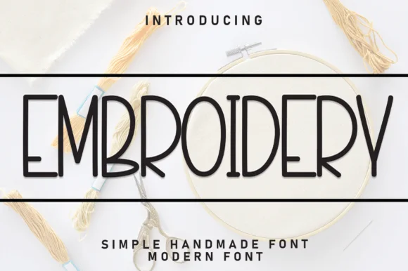
Tall condensed clean monoline craft-hoop sans print
Embroidery (by Robbots stores) is a tall, narrow monoline uppercase sans print engineered for clean minimalist labels and easy cutting.
Ideas for this font
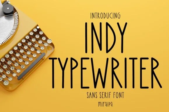
Tall condensed handwritten monoline sans serif (NOT a serif typewriter!)
Indy Typewriter is actually a tall, friendly monoline handwritten sans serif—zero serifs or mechanical slabs despite the 'Typewriter' name!
Ideas for this font
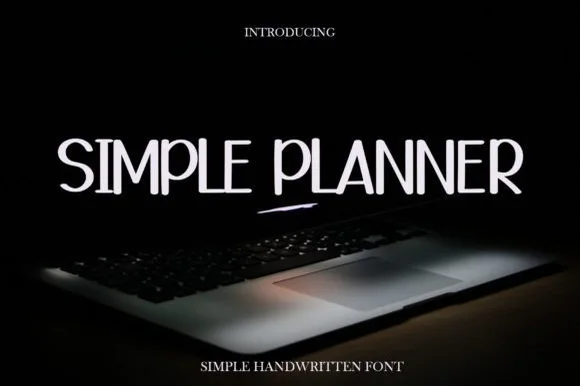
Tall thin handwritten capitals
Simple Planner is a tall thin handwritten face in white on a dark photograph: narrow capitals with gentle wobble, uneven heights, a high waist on the E and a rounded S, so the phrase reads as pen lettering written on a planner page rather than as a drawn display.
Ideas for this font
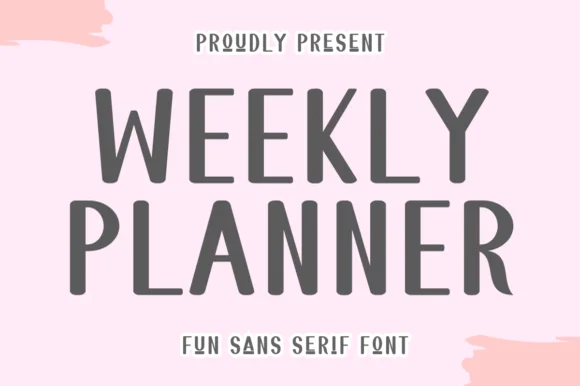
Tall quirky rounded sans
Weekly Planner is a tall rounded sans in grey on pink: narrow upright letters with rounded terminals, an open R leg, a bowed W and a curled L, presented in two stacked lines with a tracked caption beneath, so the pair reads as a planner cover rather than a neutral sans.
Ideas for this font
Same independent foundry
Allow optional Google Analytics to measure visits and catalogue actions. Your search words and notes are not included. Privacy & storage