Editorial Serif Anchor

Astutely + Cervelique
Anchors Astutely's fluid strokes with crisp Roman proportions on wedding suites, headers and packaging.
Inspect Cervelique specimenDisclosure: MakerFileHub may earn a commission from qualifying purchases via paid links on this page. How our links work.
Single-line monoline script with connected ribbon strokes
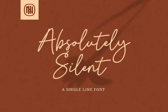
Astutely is a single-line script: one unvarying stroke loops through every letter without swelling, thinning or overlapping, so the word reads as a piece of bent wire rather than written ink.
Paid link
Get this fontProject & layout blueprintsAt-a-glance maker compatibility
Set Cricut or Silhouette operation to Pen, Foil Quill, or Laser Score — not Basic Blade Cut.
Visual anatomy & craft review
The capital A starts with a horizontal loop that curls back on itself above the cap line, then cuts down through a sharp angle before it meets the first join, and that angle is the only corner in the word. Because the stroke never changes weight, the letters are defined entirely by their paths: the s is a tight double curve, the t crosses its own stem with a straight bar, and the l and y both run long straight ascenders and descenders with no taper at all. Joins overlap where the stroke passes back over itself, and the crossings sit at the same height on the y and the l, which keeps the rhythm even. The baseline is level and the spacing is generous, so the word reads as a single line floating in space. The soft floral background and the small caps line beneath are presentation; the script is the word.
Monoline · Connected · Light
Two-font hierarchy recipes
Tested contrast partners — pairing Astutely with grounded secondary typography.
Astutely + Cervelique
Anchors Astutely's fluid strokes with crisp Roman proportions on wedding suites, headers and packaging.
Inspect Cervelique specimen
Astutely + Monure
Keeps small-scale dates, URLs, nutrition facts and care instructions crisp and legible below script titles.
Inspect Monure specimenPractical applications
Concrete hierarchy, scale and production guidance tailored to Astutely’s stroke geometry.
A monoline that already looks like bent wire says what the studio does before a single word of copy is read, and the unvarying stroke stays clean when it is cut from vinyl or routed, because there is no thin joint to break.
Hierarchy & layout recipe
Set the studio name at 20 pt on the door plate, keep the address in a condensed uppercase sans at 5 pt centred beneath, and keep 8 mm of clear space above so the capital's top loop does not touch the plate edge.
Pre-production check
Etching a monoline into brushed steel needs about 0.3 mm of stroke to hold an edge; confirm the plate maker's minimum and enlarge the mark rather than thickening just one letter.
A light connected script counterpoints a dense body column without adding visual weight, and because the stroke is even, the quote stays legible at 24 pt where a contrasted script would lose its hairlines.
Hierarchy & layout recipe
Set the quote at 24 pt on a 90 mm measure, align it flush left under the body column's left edge, and keep the attribution in the same face at 12 pt with 6 mm of space above it.
Pre-production check
A light monoline on newsprint can break up at 24 pt; print one copy on the actual stock and hold the quote to 20 pt only if the curves stay open.
Looped single-line lettering in one weight reads well against foliage, where a high-contrast script would be swallowed by the background, and the long joins let a short event name span a wide board.
Hierarchy & layout recipe
Set the event name at 9 cm on a 600 by 400 mm board, put the time in the same face at 3 cm beneath, and keep the arrow in a plain bold arrow glyph at the bottom right where the eye finishes.
Pre-production check
Outdoor boards are read at an angle and a light monoline thins visually; check the board from twenty paces in daylight and go up one size if the joins disappear.
Technical & licence verification
Confirm included OTF/TTF/WOFF formats, full glyph tables and licence coverage on the live store page before batch production.
Closest visual alternatives
Matched across letterform anatomy, stroke behaviour and craft applications.
Narrow fine formal calligraphy
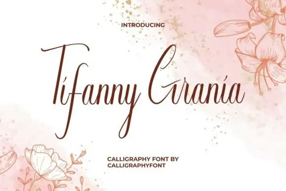
Tifanny Grania is a narrow fine formal calligraphy in sepia on a pink watercolour: hairline joins, tall narrow letters with a strong slant, and a capital T whose entry stroke rises above the word before descending.
Ideas for this font
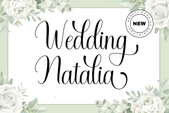
Fine italic calligraphy with tall loops
Wedding Natalia is a fine italic calligraphy in black on white: hairline ascenders, a soft forward slant, a capital W drawn as a tall double loop and a capital N whose first stroke rises above the line.
Ideas for this font
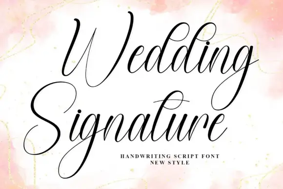
Fine slanted signature calligraphy
Wedding Signature is a fine slanted calligraphy: hairline joins, high thin loops, a capital W that runs above the word and a descender that sweeps back under both lines in one stroke.
Ideas for this font
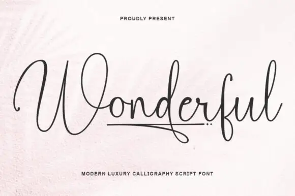
Fine expansive calligraphy with an underline
Wonderful is a fine expansive calligraphy in black on off-white: hairline joins, tall narrow letters, wide open capitals on the W and a short rule drawn beneath the middle of the word with three small dots beside it.
Ideas for this font
Same independent foundry
Allow optional Google Analytics to measure visits and catalogue actions. Your search words and notes are not included. Privacy & storage