Neutral Sans Workhorse

Neon Night Market + Bargain Condensed
Lets Neon Night Market own the focal silhouette while handling secondary copy, sizing and subheads cleanly.
Inspect Bargain Condensed specimenDisclosure: MakerFileHub may earn a commission from qualifying purchases via paid links on this page. How our links work.
Rounded outlined display with a matching lowercase
Neon Night Market is a rounded display face drawn as an outline rather than a solid: uniform stroke thickness, bullet-rounded terminals, a chunky uppercase and a shorter lowercase that lets the same width run as a two-line lockup.
Paid link
Get this fontProject & layout blueprintsAt-a-glance maker compatibility
Sturdy stroke walls and open counters weed cleanly on adhesive vinyl, HTV apparel film, and cut cardstock.
Visual anatomy & craft review
Every letter in the sample is built from a single-weight outline, so the inside of each stroke is open and the counter is the same colour as the page: the N, E and O of the first word are wide and rounded with soft outer corners, while the lowercase underneath is narrower and sits tight to the baseline. A third line in small spaced capitals repeats the same outline construction at caption size, which shows the face keeps its shape when scaled down, though the openings begin to close below about 12 pt. Colour is used as a design device rather than a property of the font: each letter takes a different hue on the pale ground, and the mockup hangs a string of lightbulbs across the top with two bulb characters carrying sketched faces at the lower corners. The result is a display face for cheerful signage, and it also hints at the technique that makes it useful, which is stacking it over a darker plate so the open counters fill with a second colour.
Playful, outlined, rounded, cute
Two-font hierarchy recipes
Tested contrast partners — pairing Neon Night Market with grounded secondary typography.
Neon Night Market + Bargain Condensed
Lets Neon Night Market own the focal silhouette while handling secondary copy, sizing and subheads cleanly.
Inspect Bargain Condensed specimen
Neon Night Market + Marquis - Elegant Modern Serif
Grounds bold display lettering with classic typographic authority on posters, badges and apparel.
Inspect Marquis - Elegant Modern Serif specimenPractical applications
Concrete hierarchy, scale and production guidance tailored to Neon Night Market’s stroke geometry.
An outline face reads as hand-painted signage, which suits a party that imitates a night market, and the open strokes keep a busy invitation from feeling heavy.
Hierarchy & layout recipe
Print A6 portrait: set the first word in outline caps at 30 pt in one colour and the second in the matching lowercase at 26 pt beneath, then place the date in small spaced caps 8 mm lower. Fill the counters by printing a soft circle of pale colour behind the type rather than recolouring the glyphs.
Pre-production check
At A6 check that the outline does not drop below 0.6 pt, which is where most digital presses start to break a hairline. Read the invitation at arm's length to confirm the two colours of the lockup do not clash against the pastel ground.
A stall sign has to be legible in mixed evening light and still look like fun, and an outlined display face does both when it is placed over a solid plate.
Hierarchy & layout recipe
Cut a 600 by 400 mm plate in dark card, set the two words in outline caps at 120 mm cap height and back the plate with a warm light so the open counters read as glow. Keep the vendor credit in the small spaced caps cut at 20 mm along the bottom edge.
Pre-production check
Check the cut file at full size: the outline stroke must stay at least 3 mm wide after the cutter's kerf, and the counters have to be wide enough that the backing light does not bloom them shut. Look at the sign from ten metres in dusk light.
Children read rounded outlined letters as friendly before they read the words, so the face sets a tone on a certificate that a rigid serif would not.
Hierarchy & layout recipe
A4 landscape: the word at 72 pt in outline caps at the top third, the recipient name in the matching lowercase at 40 pt below, and the club line in the small spaced caps at 10 pt. Leave 25 mm margins and put the seal at the lower right so it never overlaps the outline word.
Pre-production check
Check the outline at print size on the school's laser printer, where very fine lines tend to drop out; if the counters fill in, thicken the stroke or print on a heavier sheet. Confirm the printed name clears the outline by 6 mm at the closest point.
Technical & licence verification
Confirm included OTF/TTF/WOFF formats, full glyph tables and licence coverage on the live store page before batch production.
Closest visual alternatives
Matched across letterform anatomy, stroke behaviour and craft applications.
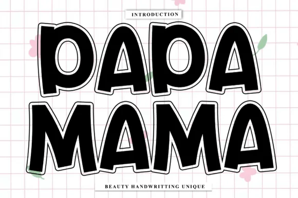
Fat rounded outlined sticker caps
Papa Mama is a fat rounded display in black with a white outline on a pink grid: very heavy caps with soft corners, generous counters, a slight lean on some letters, and a thick cut-out outline that reads as a sticker or a die-cut shape.
Ideas for this font
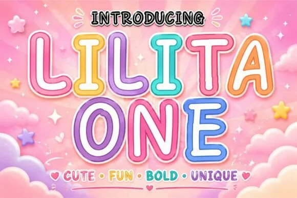
Rounded retro-candy outline & inline kids' display
Lilita One (by creativelabstd) is a plump, rounded display typeface shown with playful double candy-cane border styling and soft tubular terminals.
Ideas for this font
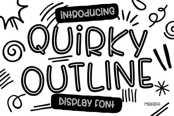
Tall funky hand-drawn tubular outline display
Quirky Outline Font is a tall, lively hand-drawn outline display font with double-walled tubular strokes and playful dancing rhythm.
Ideas for this font
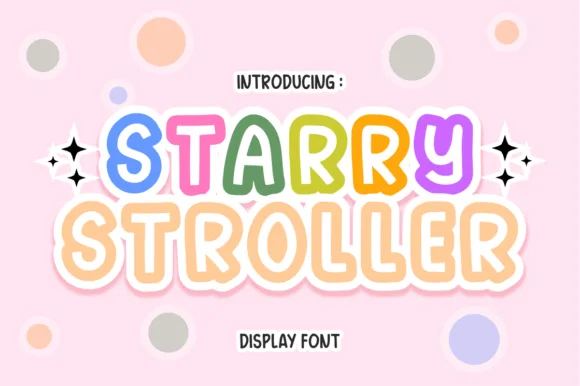
Hollow-inline bubbly pastel nursery & baby display
Starry Stroller is a cute, bubbly nursery display font tracing plump rounded capitals with a cheerful parallel inner/outer outline.
Ideas for this font
Allow optional Google Analytics to measure visits and catalogue actions. Your search words and notes are not included. Privacy & storage