Editorial Serif Anchor

Scholarly Ambition + Alerigue
Anchors Scholarly Ambition's fluid strokes with crisp Roman proportions on wedding suites, headers and packaging.
Inspect Alerigue specimenDisclosure: MakerFileHub may earn a commission from qualifying purchases via paid links on this page. How our links work.
Compact heavy rounded separate letters
Scholarly Ambition is a compact heavy hand-drawn print in dusty rose on a cream card taped to a pink wall: fat rounded letters with blunt ends, a light bounce, and a brush-stroke caption beneath.
Paid link
Get this fontProject & layout blueprintsAt-a-glance maker compatibility
Weld or Unite overlapping script joins into one continuous vector path before sending to the blade.
Visual anatomy & craft review
Scholarly sits above Ambition, and the letters are drawn as separate fat shapes: the S is a broad double curve, the c and the h are compact, the l rises into a plain stem, the y drops into a straight tail and the whole pair bounces gently between two heights. The stroke is a heavy monoline with blunt rounded ends, and the counters are small, which keeps the word reading as a block rather than a line of letters. The card is a cream sheet taped to a pink wall with two strips of dotted tape, a drawn heart on the right and a brush-stroke banner at the foot carrying the caption in the same hand. The face is a friendly display for school and craft material: the heavy strokes hold at small sizes, and it reads as written by hand rather than set.
A compact rounded hand on a taped card
Two-font hierarchy recipes
Tested contrast partners — pairing Scholarly Ambition with grounded secondary typography.
Scholarly Ambition + Alerigue
Anchors Scholarly Ambition's fluid strokes with crisp Roman proportions on wedding suites, headers and packaging.
Inspect Alerigue specimen
Scholarly Ambition + Cenura
Keeps small-scale dates, URLs, nutrition facts and care instructions crisp and legible below script titles.
Inspect Cenura specimenPractical applications
Concrete hierarchy, scale and production guidance tailored to Scholarly Ambition’s stroke geometry.
A hand-drawn display makes a project folder look like a pupil's own work rather than a printed cover, which is what a school display is actually judging.
Hierarchy & layout recipe
Print an A4 cover: set the title at 60 pt across two rows, keep 20 mm of clear ground beneath before the name line at 14 pt, and hold 18 mm of margin on all four sides.
Pre-production check
Heavy letters in a pale rose can fade on a classroom printer; print one cover on the actual machine and check the contrast before the set.
A compact hand signals a feature written from inside a classroom rather than about policy, and the heavy weight holds at heading size on newsprint.
Hierarchy & layout recipe
Print a 230 by 300 mm opener: set the heading at 48 pt across two rows, keep 18 mm of clear ground beneath before the standfirst at 10.5 pt, and hold 18 mm of margin on both sides.
Pre-production check
Two bouncing rows at heading size can look like a poster; print one opener and check the heading reads as text before the issue.
The heavy compact letters are legible to a child at a glance, and the blunt shapes cut cleanly on a small label die without a weld step.
Hierarchy & layout recipe
Print a 60 by 25 mm label: set the subject at 11 pt on one row, keep 3 mm of clear ground around the word, and hold 3 mm from the tallest letter to the label edge.
Pre-production check
Small counters fill in at eleven points; print one sheet at the real size and check the e and the a before the run.
Technical & licence verification
Confirm included OTF/TTF/WOFF formats, full glyph tables and licence coverage on the live store page before batch production.
Closest visual alternatives
Matched across letterform anatomy, stroke behaviour and craft applications.
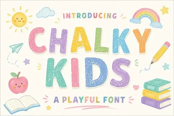
Textured chalk capitals with rounded frames and a broken inner fill
Chalky Kids is a rounded capital alphabet with a chalk texture inside the strokes, drawn so a word looks written on a blackboard rather than printed on paper.
Ideas for this font
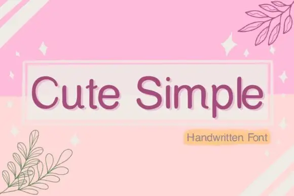
Simple rounded separate letters
Cute Simple sets rounded, separated letters with a mixed outline treatment and a soft pill badge, reading as a friendly printed label rather than a script.
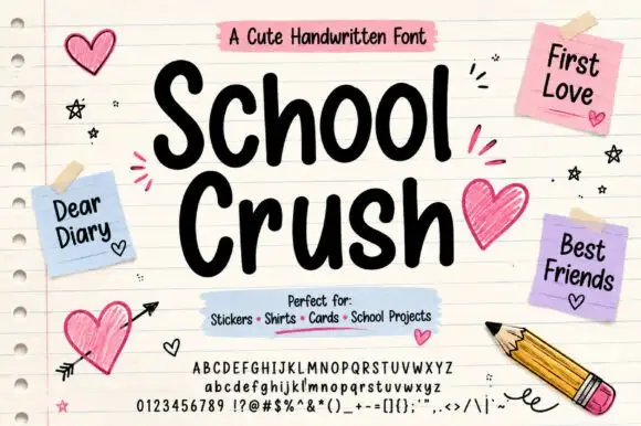
Heavy rounded marker print on a notebook page
School Crush is a heavy rounded marker print in black on a lined notebook page, with drawn hearts, sticky notes and a pencil turning the specimen into a school desk.
Ideas for this font
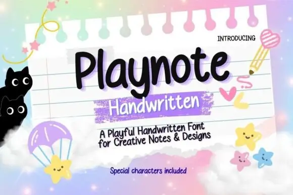
Rounded upright handwriting with a bouncy baseline
Playnote is a rounded upright handwriting face in black on a pink lined notepad: fat rounded letters with a bouncy baseline, shown over a spiral-bound sheet with a purple highlighter block, star stickers and drawn cats.
Ideas for this font
Same independent foundry
Allow optional Google Analytics to measure visits and catalogue actions. Your search words and notes are not included. Privacy & storage