Neutral Sans Workhorse

Papa Mama + Memoir Slang
Lets Papa Mama own the focal silhouette while handling secondary copy, sizing and subheads cleanly.
Inspect Memoir Slang specimenDisclosure: MakerFileHub may earn a commission from qualifying purchases via paid links on this page. How our links work.
Fat rounded outlined sticker caps
Papa Mama is a fat rounded display in black with a white outline on a pink grid: very heavy caps with soft corners, generous counters, a slight lean on some letters, and a thick cut-out outline that reads as a sticker or a die-cut shape.
Paid link
Get this fontProject & layout blueprintsAt-a-glance maker compatibility
Sturdy stroke walls and open counters weed cleanly on adhesive vinyl, HTV apparel film, and cut cardstock.
Visual anatomy & craft review
Two words are stacked and the drawing is a rounded display at maximum weight: the stems are wide and soft-cornered, the counters are large and round, and the diagonal of the A is drawn thick enough to match the stems, so the word reads as a solid block with holes. The white outline is the same weight on every letter, which makes the pair read as one die-cut sticker rather than as separate outlined letters, and a soft shadow beneath the second line lifts the block off the grid. Some letters lean a degree or two, which gives the pair a hand-made bounce without breaking the grid the words sit on. The ground is a pale pink sheet with a fine grid and a few pastel blossoms, and the two captions are set in tracked caps, so the page reads as a decor product rather than a type specimen.
Chunky, rounded, outlined, friendly
Two-font hierarchy recipes
Tested contrast partners — pairing Papa Mama with grounded secondary typography.
Papa Mama + Memoir Slang
Lets Papa Mama own the focal silhouette while handling secondary copy, sizing and subheads cleanly.
Inspect Memoir Slang specimen
Papa Mama + The Lumina Awesome
Grounds bold display lettering with classic typographic authority on posters, badges and apparel.
Inspect The Lumina Awesome specimenPractical applications
Concrete hierarchy, scale and production guidance tailored to Papa Mama’s stroke geometry.
A fat rounded display with a thick outline reads clearly from across a room, and the friendly shapes suit a party where the banner is the main decoration.
Hierarchy & layout recipe
Print 700 by 400 mm: the child's name at 120 mm cap height with a 5 mm outline, the age in a 30 mm rounded sans, and a 4 mm border. Keep the outline the same weight on every letter and print on a pale ground.
Pre-production check
Check the banner at four metres, where the outline can merge with the fill if the contrast is low; keep white on dark or the reverse. Confirm the 30 mm age reads at two metres and that the letter lean does not make the name look crooked.
A soft, heavy display is readable for young children and looks decorated without an illustration, which suits a classroom where the sign must survive lamination.
Hierarchy & layout recipe
A3 print, laminated: the class name at 60 mm cap height, the teacher's name at 20 mm, and a 3 mm outline. Keep 15 mm margins so the outline never touches the trim, and print one colour on a pale ground.
Pre-production check
Check the A3 behind lamination, where a thick outline can look muddy; keep the fill dark and the outline light. Confirm the 20 mm teacher name reads from three metres and that the sign survives a term of handling.
A sticker-style outline is a graphic in itself, so a small brand gets a finished-looking label without paying for die-cut artwork on top of the type.
Hierarchy & layout recipe
Die-cut a 55 mm sticker: the brand at 14 pt with a 1.5 mm outline, the web address in a 6 pt sans, and 2 mm clear to the die. Keep the outline uniform so the cutter follows the letters cleanly.
Pre-production check
Check the 55 mm sticker, where a 1.5 mm outline can break at the letter joins; thicken it for the die. Confirm the 6 pt web address reads on the backing card and that the outline clears the die line on every letter.
Technical & licence verification
Confirm included OTF/TTF/WOFF formats, full glyph tables and licence coverage on the live store page before batch production.
Closest visual alternatives
Matched across letterform anatomy, stroke behaviour and craft applications.
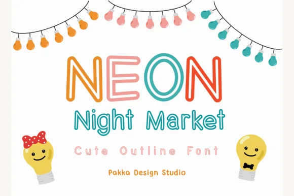
Rounded outlined display with a matching lowercase
Neon Night Market is a rounded display face drawn as an outline rather than a solid: uniform stroke thickness, bullet-rounded terminals, a chunky uppercase and a shorter lowercase that lets the same width run as a two-line lockup.
Ideas for this font
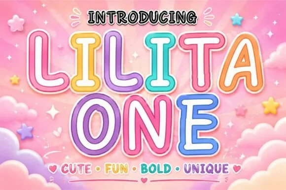
Rounded retro-candy outline & inline kids' display
Lilita One (by creativelabstd) is a plump, rounded display typeface shown with playful double candy-cane border styling and soft tubular terminals.
Ideas for this font
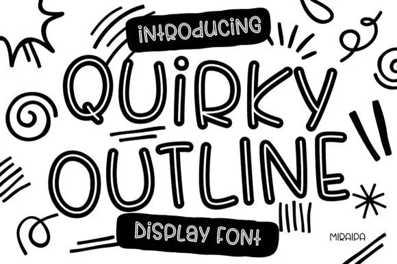
Tall funky hand-drawn tubular outline display
Quirky Outline Font is a tall, lively hand-drawn outline display font with double-walled tubular strokes and playful dancing rhythm.
Ideas for this font
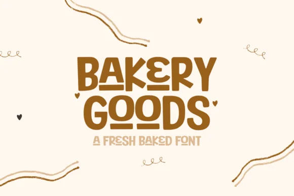
Vintage interlocking geometric sans + striped inline bakery display
Bakery Goods is a punchy mid-century packaging display font (NOT a cursive script!) interlocking bold geometric capitals with tiny heart accents!
Ideas for this font
Same independent foundry
Allow optional Google Analytics to measure visits and catalogue actions. Your search words and notes are not included. Privacy & storage