Modern Grotesque Body

Bryn + Cultivo
Creates crisp high-hierarchy contrast beneath Bryn headlines across menus, websites and labels.
Inspect Cultivo specimenDisclosure: MakerFileHub may earn a commission from qualifying purchases via paid links on this page. How our links work.
Double-outlined varsity letterman-patch slab serif (OTF & TTF)
Bryn is a bold modern varsity slab serif featuring built-in inner-gap outlines across every uppercase letter for instant chenille-patch impact (OTF & TTF).
Paid link
Get this fontProject & layout blueprintsAt-a-glance maker compatibility
Sturdy stroke walls and open counters weed cleanly on adhesive vinyl, HTV apparel film, and cut cardstock.
Visual anatomy & craft review
Bryn is a bold varsity slab with a built-in double outline across every uppercase letter, so a word arrives already looking like a chenille patch without a designer adding a stroke. The block forms are massive, the inner gap is consistent, and the outline is cut as part of the glyph, which means the gap cannot drift when the artwork is scaled. It needs roughly 25 mm for the inner gap to stay open in print, and it reads as a school or team mark rather than a text face; the outline makes it a one-colour graphic, not a layerable typeface.
Letterman-patch · Built-in-border · Bold-modern
Two-font hierarchy recipes
Tested contrast partners — pairing Bryn with grounded secondary typography.
Bryn + Cultivo
Creates crisp high-hierarchy contrast beneath Bryn headlines across menus, websites and labels.
Inspect Cultivo specimen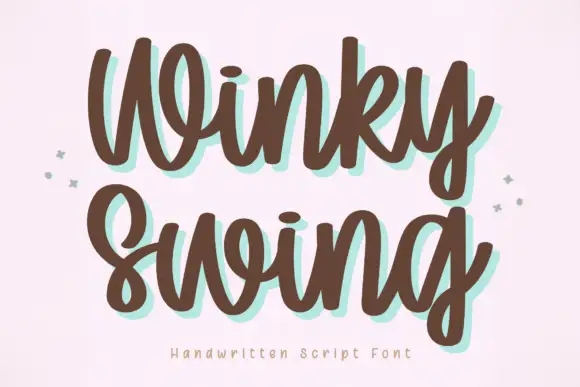
Bryn + Winky Swing
Adds a warm human signature touch for 1-to-3-word callouts without competing against structured serif capitals.
Inspect Winky Swing specimenPractical applications
Concrete hierarchy, scale and production guidance tailored to Bryn’s stroke geometry.
The built-in inner gap gives patch impact with one ink, which is what a school can actually afford on a banner. Massive blocks stay readable from a car at a yard-sign distance.
Hierarchy & layout recipe
Poster A2, word 300 mm, roster 20/26 pt, 40 mm margins. Banner 1200 x 400 mm, word 240 mm. Yard sign 600 x 450 mm, word 180 mm, 40 mm margins, 5 mm H-stakes.
Pre-production check
The inner gap is about 3 percent of the cap height, so at 20 mm on a roster line it closes to nothing. Restrict the outlined style to headings 60 mm and above, and use a plain block for small type.
Double outlines read as a patch sewn onto a garment, which is the visual reference a sneaker drop or gym brand uses. One colour covers the whole graphic, which keeps a mural affordable.
Hierarchy & layout recipe
Flyer A5, word 90 mm, details 9/12 pt, 12 mm margins. Mural 3000 x 1200 mm, word 700 mm, 300 mm margins. Banner 1920 x 480 px, word 300 px, safe area 8 percent.
Pre-production check
Murals are painted by hand or plotted in sections, and a consistent inner gap is hard to hold across a seam. Split the artwork at a natural gap rather than through a letter, and check the join from ten metres.
A patch-styled block gives a thank-you the weight of an award, which is what a team wants for a coach. One ink keeps a banner affordable at the end of a season.
Hierarchy & layout recipe
Banner 1500 x 500 mm, word 260 mm, 100 mm margins, eyelets every 500 mm. Plaque 300 x 200 mm, word 45 mm engraved, 25 mm margins. Print 300 x 400 mm, word 80 mm, 30 mm margins.
Pre-production check
Engraving cannot reproduce a double outline at 45 mm, so the plaque must switch to a single-level silhouette. Supply a second file for anything engraved, or the plaque will arrive as a solid block.
Technical & licence verification
Confirm included OTF/TTF/WOFF formats, full glyph tables and licence coverage on the live store page before batch production.
Closest visual alternatives
Matched across letterform anatomy, stroke behaviour and craft applications.
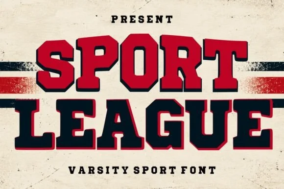
Heavy two-tone collegiate varsity block slab with shadow outline
Sport League is a powerhouse collegiate varsity slab serif featuring ultra-chunky octagonal letters framed in a crisp offset athletic border.
Ideas for this font
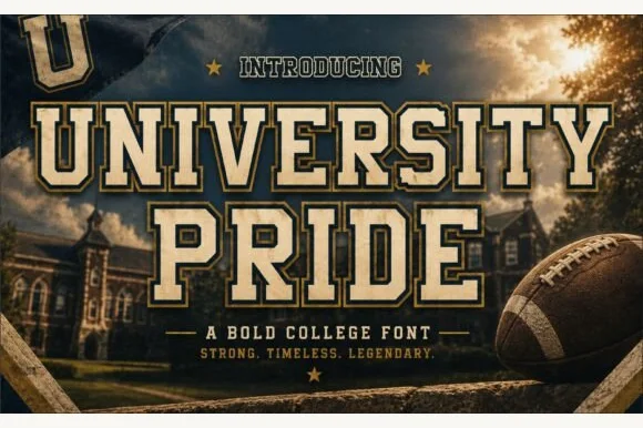
Double-outlined collegiate stadium varsity slab
University Pride is a commanding collegiate varsity slab serif featuring chamfered block stems framed by a crisp outer contour line.
Ideas for this font
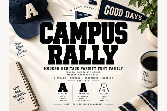
3-style collegiate varsity slab family (Regular, Condensed & Outline)
Campus Rally is a crisp, clean 3-style collegiate varsity slab family bundling matched Regular, Condensed, and Outline cuts.
Ideas for this font
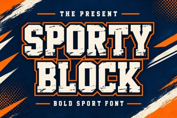
Heavy chamfered collegiate varsity block slab
Sporty Block is a classic heavy collegiate athletic slab serif built for 2- and 3-color layered jersey outlines, banners, and spirit wear.
Ideas for this font
Same independent foundry
Allow optional Google Analytics to measure visits and catalogue actions. Your search words and notes are not included. Privacy & storage