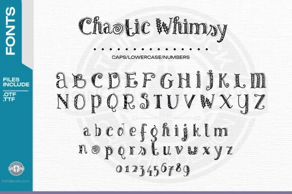
Modern Grotesque Body

Celtic Finery + Lemon Milk Pro FTR
Creates crisp high-hierarchy contrast beneath Celtic Finery headlines across menus, websites and labels.
Inspect Lemon Milk Pro FTR specimenDisclosure: MakerFileHub may earn a commission from qualifying purchases via paid links on this page. How our links work.
Uncial Celtic capitals with triangular serifs and knot borders
Celtic Finery is an uncial capital alphabet in which the stems turn on rounded shoulders, the serifs flare into triangles and the letters sit wide, so a title reads as an illuminated manuscript head rather than as a modern sans.
Paid link
Get this fontProject & layout blueprintsAt-a-glance maker compatibility
Sturdy stroke walls and open counters weed cleanly on adhesive vinyl, HTV apparel film, and cut cardstock.
Visual anatomy & craft review
The C curls a wide crescent, the E sets three short arms on a rounded stem, the M builds four rounded valleys, the R turns a hooked leg and the O stays a wide ring, all at a monoline weight with triangular serifs and uncial proportions. The uncial shape is the character: the letters are built from rounded strokes, which is why the sample sets a two-word title above an alphabet line and a pair of knot borders. Because the strokes are even and open, the face holds from 22 pt and prints in one ink; the triangular serifs need a smooth stock at caption sizes. The white ground, the knot roundels, the dotted rules and the sidebar labels are presentation; the black uncial letters are the face.
Celtic · Uncial · All caps
Two-font hierarchy recipes
Tested contrast partners — pairing Celtic Finery with grounded secondary typography.
Celtic Finery + Lemon Milk Pro FTR
Creates crisp high-hierarchy contrast beneath Celtic Finery headlines across menus, websites and labels.
Inspect Lemon Milk Pro FTR specimen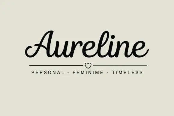
Celtic Finery + Aureline
Adds a warm human signature touch for 1-to-3-word callouts without competing against structured serif capitals.
Inspect Aureline specimenPractical applications
Concrete hierarchy, scale and production guidance tailored to Celtic Finery’s stroke geometry.
The uncial head gives a printed certificate a manuscript feel, and the even strokes hold a two-name line at 40 pt on laid paper.
Hierarchy & layout recipe
Print an A4 certificate: set the names at 40 pt across the head, set the body in a 12 pt serif beneath, and keep 25 mm of border so the knot border sits outside the text block.
Pre-production check
An even monoline printed on laid paper breaks along the chain lines; check the proof and specify a smooth stock if the strokes look ragged.
The uncial letters give a bookshop a period mark, and the wide fit keeps a long shop name readable at 40 mm on a fascia.
Hierarchy & layout recipe
Paint a 900 by 250 mm fascia: set the shop name at 40 mm with 3 percent tracking, keep 30 mm of border, and paint in one dark colour so the triangular serifs stay sharp.
Pre-production check
Triangular serifs painted by hand lose their points; check the fascia and use a cut vinyl mask rather than freehand lettering.
The uncial head sets the tone of a folklore journal, and the even monoline keeps the title clear at 44 pt on a printed page.
Hierarchy & layout recipe
Print an A5 cover: set the journal title at 44 pt, set the issue line in a 9 pt caps beneath, and keep 18 mm of margin so the rounded shoulders are inside the trim.
Pre-production check
A rounded shoulder at the trim looks clipped; check the cover and centre the title on the trim rather than the text block.
Technical & licence verification
Confirm included OTF/TTF/WOFF formats, full glyph tables and licence coverage on the live store page before batch production.
Closest visual alternatives
Matched across letterform anatomy, stroke behaviour and craft applications.
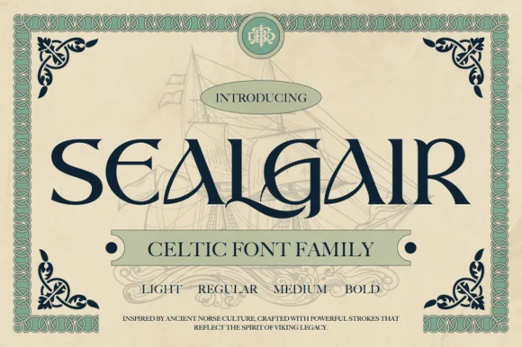
Ornamental Celtic & Norse display serif family
Sealgair is a four-weight Celtic display serif blending chiseled wedge terminals with sinuous interlocking crossbars and descender hooks.
Ideas for this font
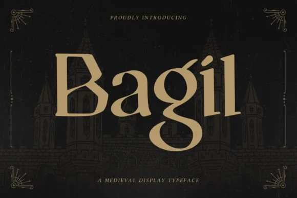
Regal uncial-accented medieval book & tavern serif
Bagil is a stately medieval display serif blending flared wedge terminals with an uncial-inspired double-story 'g' for fantasy books, games, and meaderies.
Ideas for this font
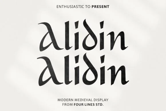
Modern calligraphic uncial-medieval display serif
Alidin is a sleek modern medieval serif blending broad-nib calligraphic curves and an arched 'A' swash with crisp contemporary polish.
Ideas for this font
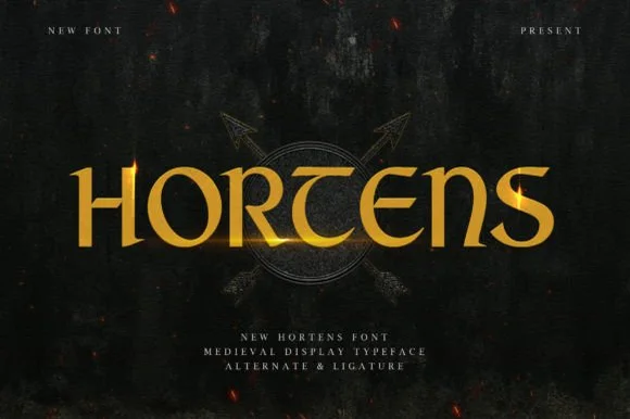
Celtic-uncial knightly medieval display serif (Alternates & Ligatures)
Hortens is a noble medieval display typeface blending curved uncial 'T' and 'E' forms with custom ligatures for historical & fantasy titles.
Ideas for this font
Same independent foundry
Allow optional Google Analytics to measure visits and catalogue actions. Your search words and notes are not included. Privacy & storage