Modern Grotesque Body

Hortens + Cenura
Creates crisp high-hierarchy contrast beneath Hortens headlines across menus, websites and labels.
Inspect Cenura specimenDisclosure: MakerFileHub may earn a commission from qualifying purchases via paid links on this page. How our links work.
Celtic-uncial knightly medieval display serif (Alternates & Ligatures)
Hortens is a noble medieval display typeface blending curved uncial 'T' and 'E' forms with custom ligatures for historical & fantasy titles.
Paid link
Get this fontProject & layout blueprintsAt-a-glance maker compatibility
Sturdy stroke walls and open counters weed cleanly on adhesive vinyl, HTV apparel film, and cut cardstock.
Visual anatomy & craft review
Hortens is a medieval display serif with uncial T and E forms, knightly proportions and custom ligatures that link RT into a single curved crossbar, so a word reads as an inscription from a chronicle rather than as a blackletter. The ligature is the signature, which means the face needs size for the join to read as deliberate, and the wide capitals fill a panel with one word. It needs roughly 28 mm for the uncial curves to read, and it is best in burnished gold on charcoal or in one dark ink on parchment cream.
Uncial-curved-T-E · Crossed-swords · Knightly-gold
Two-font hierarchy recipes
Tested contrast partners — pairing Hortens with grounded secondary typography.
Hortens + Cenura
Creates crisp high-hierarchy contrast beneath Hortens headlines across menus, websites and labels.
Inspect Cenura specimen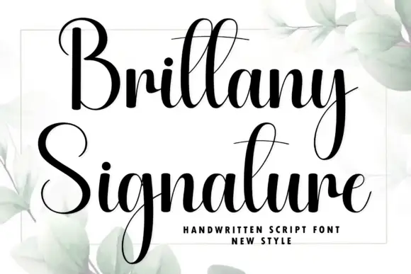
Hortens + Brittany Signature
Adds a warm human signature touch for 1-to-3-word callouts without competing against structured serif capitals.
Inspect Brittany Signature specimenPractical applications
Concrete hierarchy, scale and production guidance tailored to Hortens’s stroke geometry.
Knightly medieval lettering reads as a chronicle title, which is what a fantasy or history series prints on a spine. The RT ligature gives a long invented name a single carved join, and the wide capitals hold at 54 pt on coated stock.
Hierarchy & layout recipe
Cover 152 x 229 mm, title 56 pt, author 14 pt, 18 mm margins and 10 mm trim. Spread 420 x 297 mm, opener 90 mm, body 10/15 pt. Chapter 22 pt, 15 mm margins.
Pre-production check
A 56 pt ligature on a cover is fine, but a spine at 14 pt loses the join and the series titles stop matching on the shelf. Set the spine in the plain caps and check the row of spines printed together.
Uncial medieval forms read as a house with a long history, which is what a mead or bookbinding studio is selling. The ligature gives a short brand name a single continuous line, and the flared stems hold in one spot ink on textured stock at 14 mm.
Hierarchy & layout recipe
Label 70 x 95 mm, name 16 mm, weight 5 pt, 5 mm top arc and 4 mm die margin. Card 85 x 55 mm, name 10 mm, 5 mm margins. Sign 600 x 400 mm, word 110 mm, 40 mm margins.
Pre-production check
A 16 mm label name on a curved bottle rotates and the uncial T's curved crossbar tips under the arc and gets cut. Keep 5 mm of clear label above the arc, and check one applied label on a filled bottle.
Chronicle lettering reads as a grimoire, which is what an immersive Halloween tavern uses on a prop and a poster. The ligatures hold in gold on charcoal under warm light, and the wide capitals keep the event name readable across a dim room.
Hierarchy & layout recipe
Poster A2, word 260 mm, times 22/28 pt, 30 mm margins and 20 mm trim. Card 105 x 148 mm, word 26 mm, details 8/11 pt. Book cover 170 x 240 mm, title 50 mm, 15 mm margins.
Pre-production check
Gold on charcoal loses contrast under a warm lamp and a 26 mm card word reads as a brown smear. Add a pale keyline behind the word, and check one card under the venue's actual lighting.
Technical & licence verification
Confirm included OTF/TTF/WOFF formats, full glyph tables and licence coverage on the live store page before batch production.
Closest visual alternatives
Matched across letterform anatomy, stroke behaviour and craft applications.
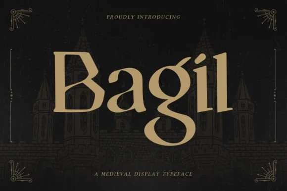
Regal uncial-accented medieval book & tavern serif
Bagil is a stately medieval display serif blending flared wedge terminals with an uncial-inspired double-story 'g' for fantasy books, games, and meaderies.
Ideas for this font
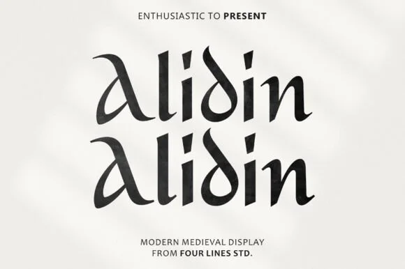
Modern calligraphic uncial-medieval display serif
Alidin is a sleek modern medieval serif blending broad-nib calligraphic curves and an arched 'A' swash with crisp contemporary polish.
Ideas for this font
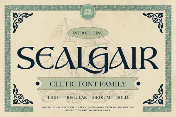
Ornamental Celtic & Norse display serif family
Sealgair is a four-weight Celtic display serif blending chiseled wedge terminals with sinuous interlocking crossbars and descender hooks.
Ideas for this font
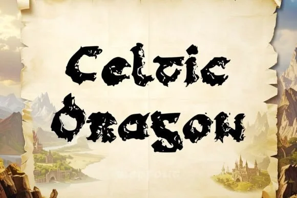
Jagged dragon-scale & weathered Gaelic uncial display
Celtic Dragon is a rugged medieval uncial display font combining rounded Gaelic manuscript skeletons with jagged dragon-wing / torn-parchment edges.
Ideas for this font
Same independent foundry
Allow optional Google Analytics to measure visits and catalogue actions. Your search words and notes are not included. Privacy & storage