Editorial Serif Anchor

Whisful Graduation + Lumera Editorial
Anchors Whisful Graduation's fluid strokes with crisp Roman proportions on wedding suites, headers and packaging.
Inspect Lumera Editorial specimenDisclosure: MakerFileHub may earn a commission from qualifying purchases via paid links on this page. How our links work.
Thick monoline handwriting script
Whisful is a thick monoline handwriting script in dark grey on cream: a slight forward slant, tall looped ascenders on the W and the h, a descender on the g that swings under the word, and joins that stay visible rather than fusing into a solid stroke.
Paid link
Get this fontProject & layout blueprintsAt-a-glance maker compatibility
Weld or Unite overlapping script joins into one continuous vector path before sending to the blade.
Visual anatomy & craft review
The two words are set on a gentle rise and the drawing is a pen-written script rather than a brush one: the stroke width stays constant through every letter, the entries and exits are rounded, and the loops on the W, the h and the f are open enough to read at a glance. Letters connect with a short low link, so the word reads as handwriting while remaining easy to parse, and the second word steps in from the left to follow the first, which is how the sample suggests stacking two lines without a strict grid. The angle is steady at around ten degrees, which gives the script movement without turning into an italic, and the spacing is loose enough that the loops never collide. The ground is a plain cream card with a dried sprig and a fountain pen at the edges, and the descriptor at the foot is set in small tracked capitals, so the sample presents the face as stationery rather than as signage.
Handwritten, monoline, friendly, flowing
Two-font hierarchy recipes
Tested contrast partners — pairing Whisful Graduation with grounded secondary typography.
Whisful Graduation + Lumera Editorial
Anchors Whisful Graduation's fluid strokes with crisp Roman proportions on wedding suites, headers and packaging.
Inspect Lumera Editorial specimen
Whisful Graduation + Homies
Keeps small-scale dates, URLs, nutrition facts and care instructions crisp and legible below script titles.
Inspect Homies specimenPractical applications
Concrete hierarchy, scale and production guidance tailored to Whisful Graduation’s stroke geometry.
A monoline handwriting script gives a certificate a personal voice without the fragility of a thin calligraphy, and the constant stroke weight prints cleanly on an office laser.
Hierarchy & layout recipe
A4 landscape: the two words at 54 pt stacked on the left half, the recipient name at 30 pt in the same script centred, and the details in an 11 pt sans beneath. Keep 30 mm margins and put the seal at the lower right, clear of the script's descenders.
Pre-production check
Check the descender of the g against the seal at actual size, where the printed circle can crowd the loop. Confirm the script at 54 pt holds its loops on the laser printer, which fills in strokes under 0.4 pt, and that the 11 pt details stay readable under stage lighting.
A handwriting script signs a card the way a person would, and because the strokes are thick the message still reads when the card is a small 100 mm square.
Hierarchy & layout recipe
Set the phrase at 24 pt at the lower right of a 100 mm square card, the message in a 9.5 pt sans at 12 pt leading above, and leave 12 mm below the script. Print in one dark ink on cream so the script carries the whole tone.
Pre-production check
Check the phrase at 24 pt, where the W and the h loops can close at the join; open the tracking between the two words rather than shrinking them. Confirm the 9.5 pt message keeps a 4.5:1 contrast and that the script clears the trim by 8 mm.
A handwriting script personalises a save-the-date that is otherwise photographic, and a monoline drawing stays readable over an image where a hairline calligraphy would break up.
Hierarchy & layout recipe
A6 card: the names at 26 pt in one line, the date in a 9 pt sans caps 10 mm below, and the photograph occupying the lower two thirds with a 30 percent dark scrim behind the script. Keep 15 mm between the script and the scrim edge.
Pre-production check
Check the script against the brightest part of the photograph, where a mid-grey stroke loses contrast first; darken the scrim rather than the type. Confirm the 9 pt caps stay outside the scrim and that the descender does not reach the image's bright edge.
Technical & licence verification
Confirm included OTF/TTF/WOFF formats, full glyph tables and licence coverage on the live store page before batch production.
Closest visual alternatives
Matched across letterform anatomy, stroke behaviour and craft applications.
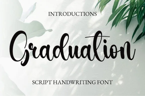
PUA-encoded bouncy modern brush calligraphy script (Ligatures)
Graduation (by 21Design) is a crisp, bouncy modern brush calligraphy script (NOT a slab serif!) with PUA access and smooth custom ligatures.
Ideas for this font
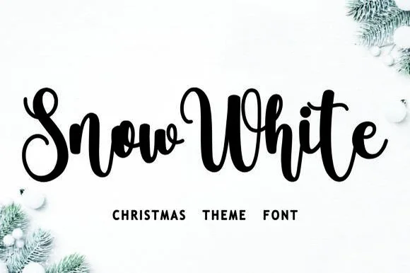
Bouncy Christmas script
Snow White is a Christmas script in black on a snowy white ground: a connected monoline hand with a pronounced bounce, tall loops on the S and the h, and a w in the first word that lifts above the cap line, framed by fir branches and baubles.
Ideas for this font
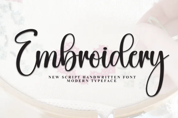
Classic bouncy modern brush calligraphy script
Embroidery (by andikastudio) is a classic, flowing modern calligraphy script with lively baseline bounce and a deep sweeping 'y' loop.
Ideas for this font
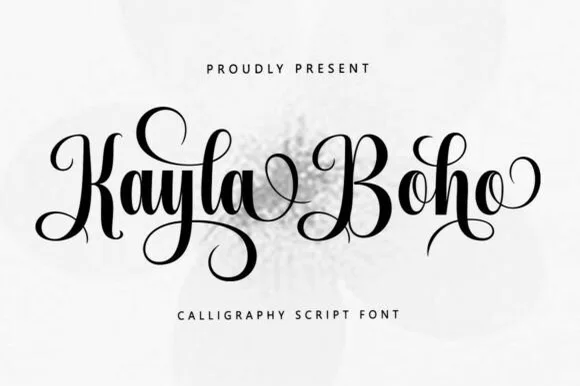
Upright romantic calligraphy script with coiled descenders
Kayla Boho is an upright modern calligraphy script featuring high-contrast brush strokes and graceful spiral-curled capitals and descenders.
Ideas for this font
Same independent foundry
Allow optional Google Analytics to measure visits and catalogue actions. Your search words and notes are not included. Privacy & storage