Modern Grotesque Body

Varsity Texture + Helina
Creates crisp high-hierarchy contrast beneath Varsity Texture headlines across menus, websites and labels.
Inspect Helina specimenDisclosure: MakerFileHub may earn a commission from qualifying purchases via paid links on this page. How our links work.
Display
Varsity Texture is a collegiate block face: heavy slab-serifed capitals with a flat top and foot, tight spacing and a grain texture that leaves the letters looking stamped on fabric.
Paid link
Get this fontProject & layout blueprintsAt-a-glance maker compatibility
Fine grain and micro-texture excel in 300 DPI print, sublimation, and screen print rather than small vinyl weeding.
Visual anatomy & craft review
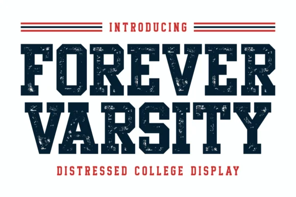
VARSITY over TEXTURE fills the card in off-white on navy, and each letter is a wide block with firm slab serifs, a small counter and a surface eaten by small grain specks. The spacing is tight enough that the two rows read as a single slab, which is how a jersey wordmark works, and the texture is even across all the letters rather than random per glyph. A caption above names the face in a lighter weight and a line below states the style and credits the designer. The face is built for apparel and signage: one colour, one pass, and enough weight to survive a screen print, with the grain giving it the worn-in look that an athletic brand usually has to fake.
Varsity block lettering with a grain texture and slab serifs
Two-font hierarchy recipes
Tested contrast partners — pairing Varsity Texture with grounded secondary typography.
Varsity Texture + Helina
Creates crisp high-hierarchy contrast beneath Varsity Texture headlines across menus, websites and labels.
Inspect Helina specimen
Varsity Texture + Ideas
Adds a warm human signature touch for 1-to-3-word callouts without competing against structured serif capitals.
Inspect Ideas specimenPractical applications
Concrete hierarchy, scale and production guidance tailored to Varsity Texture’s stroke geometry.
The block serifs and the grain read as a college jersey, and one colour on fabric is exactly the format the face was drawn for.
Hierarchy & layout recipe
Print a 300 by 200 mm chest print: set the team name at 90 pt on one row, keep 24 mm of clear ground beneath before the number at 60 pt, and hold 20 mm from the widest letter to the print edge.
Pre-production check
Grain drops out on a coarse mesh; print one pull on the actual shirt and check a serif before the run.
The lettering matches the architecture of a campus notice board, and a short name in these blocks reads from across a courtyard.
Hierarchy & layout recipe
Print a 600 by 400 mm board: set the event name at 100 pt across two rows, keep 26 mm of clear ground beneath before the times at 15 pt, and hold 24 mm of border on all sides.
Pre-production check
Grain reads as dirt from a distance; print one board and look at it from ten metres before the set.
A small label needs a face that stays a block at fifteen millimetres, and these slab serifs do not thin out or close up at that size.
Hierarchy & layout recipe
Print a 45 by 35 mm woven label: set the line name at 11 pt on one row, keep 4 mm of clear ground beneath before the size at 4 pt, and hold 3 mm from the serif to the label edge.
Pre-production check
Woven labels lose the grain entirely; print one label on the real weave and check the letters still read before the order.
Technical & licence verification
Confirm included OTF/TTF/WOFF formats, full glyph tables and licence coverage on the live store page before batch production.
Closest visual alternatives
Matched across letterform anatomy, stroke behaviour and craft applications.
Solid athletic blocks with clipped bowls
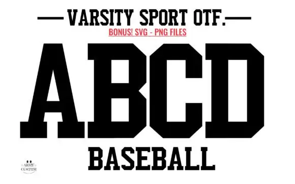
Varsity Sport Army is a solid athletic block in black on white: wide slab-serifed capitals with clipped corners, a flat top and foot, and squared counters, shown as an alphabet specimen above the word Baseball.
Ideas for this font
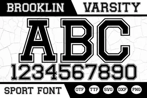
Angular bordered athletic capitals with matched numerals
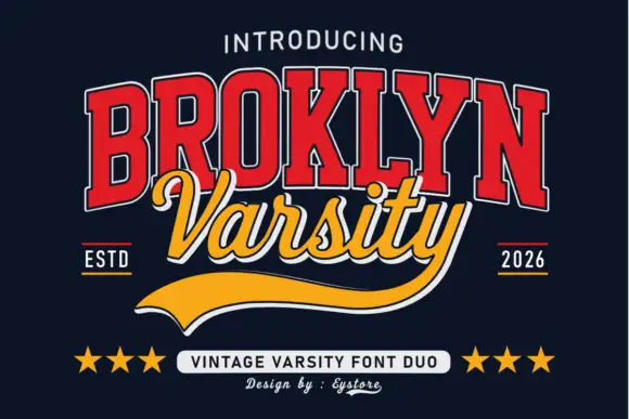
Brooklin Varsity is an athletic display face: heavy capitals with sharp inner corners, a white inline border running inside each stroke, and a full numeral set drawn to the same construction.
Ideas for this font

Layered varsity slab with depth
Vintage Glory is a layered varsity slab in red and navy on cream: heavy square serifs, notched corners, a solid extrusion behind every letter that steps down and right, and a round badge with a ball seam, so the two words read as a printed sports pennant rather than a flat headline.
Ideas for this font
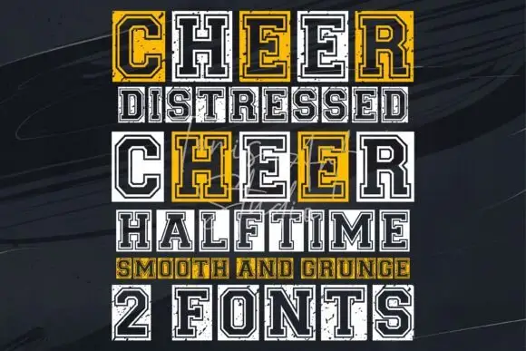
Outlined varsity capitals with a distressed twin and a squared skeleton
Cheer is a varsity capital alphabet shown as a clean outline and a distressed twin, built on a squared skeleton with an inner border and heavy slabs.
Ideas for this font
Same independent foundry
Allow optional Google Analytics to measure visits and catalogue actions. Your search words and notes are not included. Privacy & storage