Modern Grotesque Body

Mystic Halloween + Homies
Creates crisp high-hierarchy contrast beneath Mystic Halloween headlines across menus, websites and labels.
Inspect Homies specimenDisclosure: MakerFileHub may earn a commission from qualifying purchases via paid links on this page. How our links work.
Curled tall mystic display serif
Mystic Halloween is a curled display serif in cream on a dark apothecary shelf: tall condensed capitals with hooked serifs, hairline flourishes in the counters, and a small inline detail on the thick stems.
Paid link
Get this fontProject & layout blueprintsAt-a-glance maker compatibility
Sturdy stroke walls and open counters weed cleanly on adhesive vinyl, HTV apparel film, and cut cardstock.
Visual anatomy & craft review
The two words are stacked and centred, and the face is a display serif built on ornament: the M carries a hook at the apex, the Y throws a curl, the T has a wide top bar with a spur, the H is tall and narrow and the W of Halloween closes with a hooked terminal, while several letters carry a thin flourish that curls inside the counter. The stroke is heavy in the stems with hairline serifs, the proportions are condensed and the letters read as engraved rather than drawn, which is what gives a seasonal face a vintage rather than a cartoon feel. The ground is a dark shelf of bottles, books and a lit candle, and two orange capital lines name the style and the foundry. Mystic Halloween is a display face for seasonal posters, labels and event graphics, and it needs a short word at a large size.
An ornate serif for the darker half of the year
Two-font hierarchy recipes
Tested contrast partners — pairing Mystic Halloween with grounded secondary typography.
Mystic Halloween + Homies
Creates crisp high-hierarchy contrast beneath Mystic Halloween headlines across menus, websites and labels.
Inspect Homies specimen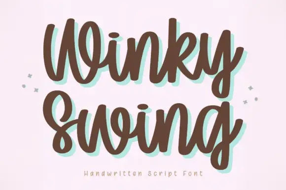
Mystic Halloween + Winky Swing
Adds a warm human signature touch for 1-to-3-word callouts without competing against structured serif capitals.
Inspect Winky Swing specimenPractical applications
Concrete hierarchy, scale and production guidance tailored to Mystic Halloween’s stroke geometry.
A curled display serif carries the season without a cartoon pumpkin, and the ornate capitals read from across a room in one ink on a dark ground.
Hierarchy & layout recipe
Print an A2 poster: set the title at 160 pt over two lines, keep 30 mm of clear ground beneath before the details at 26 pt, and hold 24 mm of margin on all four sides.
Pre-production check
Hairline flourishes disappear at poster size on a dark ground; print one proof at the final size and check the curls before the run.
The face reads as an old apothecary label, which is exactly the tone a seasonal drink wants, and the condensed width fits a long product name.
Hierarchy & layout recipe
Print a 55 by 90 mm label: set the product at 15 pt over two lines, keep 6 mm of clear ground beneath before the volume at 5 pt, and hold 4 mm of margin on all four sides.
Pre-production check
Hooked serifs fill in on a small label; print one on the real stock and check the terminals before the order.
A vintage display serif gives a seasonal cover a period voice, and the ornate capitals do the work of an illustration on a dark photograph.
Hierarchy & layout recipe
Print a 230 by 300 mm cover: set the cover word at 96 pt over two lines, keep 26 mm of clear ground beneath before the cover lines at 11 pt, and hold 22 mm of margin on all four sides.
Pre-production check
A dark face on a dark cover needs contrast; print one cover and check the letter edges against the image before the run.
Technical & licence verification
Confirm included OTF/TTF/WOFF formats, full glyph tables and licence coverage on the live store page before batch production.
Closest visual alternatives
Matched across letterform anatomy, stroke behaviour and craft applications.
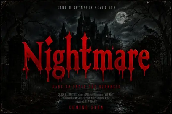
Pointed horror serifs with descending drips
Nightmare Bloodline is a horror display in red on a moonlit castle scene: tall pointed serifs, sharp shoulders and drops of blood falling from the lower terminals of the letters.
Ideas for this font
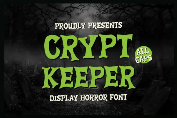
Uneven spooky serif capitals with pointed terminals and wobbly stems
Crypt Keeper is a capital alphabet with uneven stems, pointed terminals and slight lean on some letters, so a word reads as lettering scratched onto a board rather than as a printed serif.
Ideas for this font
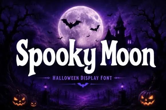
Bulbous seasonal display
Spooky Moon is a bulbous display in white on a purple graveyard scene: heavy letters with rounded shoulders, flared stems and a few small spurs, a tight rhythm and a slight bounce, with a tracked subtitle beneath and a small bat divider between the words.
Ideas for this font
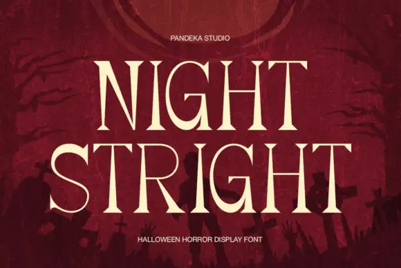
High-contrast horror serif display
Night Stright is a horror display serif in bone cream on blood red: very high contrast, tall pointed serifs that flare into thorns, a splayed M and sharp wedge terminals, set over a graveyard silhouette, so the pair reads as a film title rather than as an editorial serif.
Ideas for this font
Same independent foundry
Allow optional Google Analytics to measure visits and catalogue actions. Your search words and notes are not included. Privacy & storage