Modern Grotesque Body

Hired + Bareum
Creates crisp high-hierarchy contrast beneath Hired headlines across menus, websites and labels.
Inspect Bareum specimenDisclosure: MakerFileHub may earn a commission from qualifying purchases via paid links on this page. How our links work.
Heavy modern serif with sturdy slabs and a tight, dense fit
Hired is a heavy modern serif in which the stems stay broad, the serifs become sturdy slabs and the fit runs tight, so a single word reads as a bold headline set on a press rather than as a display flourish.
Paid link
Get this fontProject & layout blueprintsAt-a-glance maker compatibility
Sturdy stroke walls and open counters weed cleanly on adhesive vinyl, HTV apparel film, and cut cardstock.
Visual anatomy & craft review
The H sets two wide stems with a thick bar, the I holds a full slab on both feet, the R closes a square bowl on a thick leg, the E stacks three heavy arms and the D fills its counter, all at a bold weight with bracketed slabs and a dense, even colour. The slab weight is the character: the face holds a long word on one line at a small size, which is why the sample sets a single word large with a pill label above it. Because the counters stay open, the face reads down to 14 pt and holds a hoarding at 200 pt, and it prints happily in one ink. The cream ground, the two outlined pills and the small sans lines are presentation; the orange display word is the face.
Heavy · Modern serif · Dense
Two-font hierarchy recipes
Tested contrast partners — pairing Hired with grounded secondary typography.
Hired + Bareum
Creates crisp high-hierarchy contrast beneath Hired headlines across menus, websites and labels.
Inspect Bareum specimen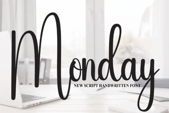
Hired + Monday
Adds a warm human signature touch for 1-to-3-word callouts without competing against structured serif capitals.
Inspect Monday specimenPractical applications
Concrete hierarchy, scale and production guidance tailored to Hired’s stroke geometry.
The slab weight gives a cover a decisive head, and the dense fit keeps a long word on one line at 96 pt without condensing.
Hierarchy & layout recipe
Print an A4 cover: set the headline at 96 pt across the upper third, keep 22 mm of margin at each side, and set the issue line in a 9 pt sans 24 mm beneath.
Pre-production check
A dense heavy serif at 96 pt on uncoated stock can fill its counters; check the proof and keep the sheet smooth if the word clots.
The heavy serif reads through an office window, and the slab weight keeps a one-word name solid at 90 mm cut from cast vinyl.
Hierarchy & layout recipe
Cut a 500 by 200 mm vinyl sign: set the word at 90 mm, keep every slab at 4 mm of vinyl, and leave 25 mm of clear glass beneath for the opening hours.
Pre-production check
Slab serifs thinner than 4 mm peel from glass; check the cut file and widen the slabs rather than the letters.
The bold slabs read across a crowded hall, and the dense colour holds a career fair headline at 120 mm on a printed banner.
Hierarchy & layout recipe
Print a two-metre banner: set the headline at 120 mm, set the date in a 30 mm caps line beneath, and keep 45 mm of border so the slabs are not trimmed by the hem.
Pre-production check
A heavy serif at banner size shows every registration wobble; check the print and keep the colour solid rather than a build.
Technical & licence verification
Confirm included OTF/TTF/WOFF formats, full glyph tables and licence coverage on the live store page before batch production.
Closest visual alternatives
Matched across letterform anatomy, stroke behaviour and craft applications.
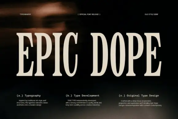
Condensed old-style serif with tall narrow letterspaced capitals
Epic Dope is a condensed old-style serif in which the capitals stretch tall, the serifs finish in small balls and the fit runs narrow, so a two-word title reads as a film credit card rather than as a headline.
Ideas for this font
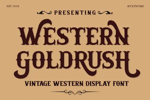
Ornamental western capitals with long curved spurs and heavy slab feet
Western Goldrush is an ornamental western serif in which the capitals carry long curved spurs, the feet flare into heavy slabs and the middle letters stay narrow, so a word reads as a saloon sign.
Ideas for this font
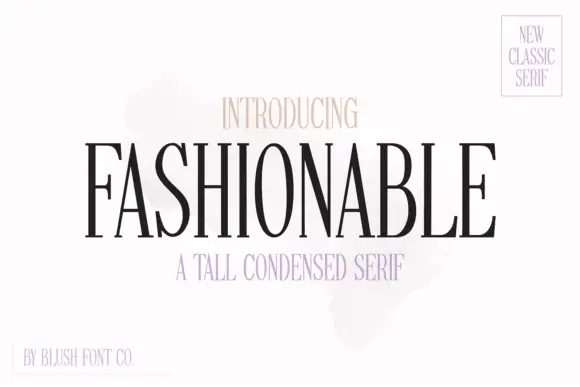
Tall condensed classic serif with narrow bowls and fine hairlines
Fashionable is a tall condensed serif in which the stems stretch upward, the bowls narrow and the hairlines stay fine, so a single word reads as a magazine masthead rather than as a title.
Ideas for this font
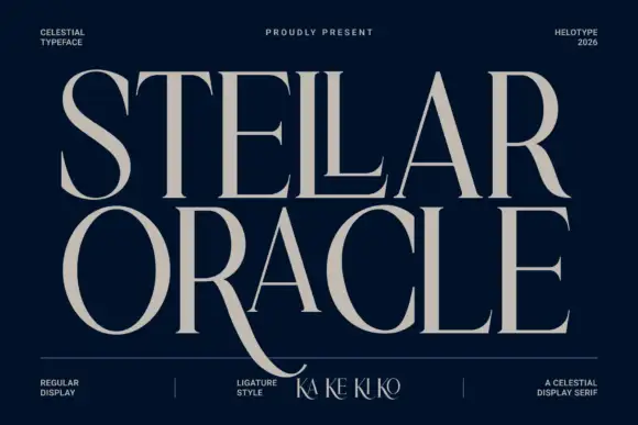
Fine classical display serif
Stellar Oracle is a fine classical display serif in cream on navy: tall capitals with hairline stems, a long curved R leg that descends below the baseline, sharp flat serifs and a swash crossing from the second line, with tracked notes in the four corners naming style, studio and cut.
Ideas for this font
Same independent foundry
Allow optional Google Analytics to measure visits and catalogue actions. Your search words and notes are not included. Privacy & storage