Modern Grotesque Body

Frinder + Cenura
Creates crisp high-hierarchy contrast beneath Frinder headlines across menus, websites and labels.
Inspect Cenura specimenDisclosure: MakerFileHub may earn a commission from qualifying purchases via paid links on this page. How our links work.
Modern sharp-spurred Western serif with interlocking ligatures
Frinder is a sharp, modern editorial Western serif combining triangular thorn spurs with custom interlocking ligatures ('DE') and hooked 'R' legs.
Paid link
Get this fontProject & layout blueprintsAt-a-glance maker compatibility
Sturdy stroke walls and open counters weed cleanly on adhesive vinyl, HTV apparel film, and cut cardstock.
Visual anatomy & craft review
Frinder is a Western-flavoured display serif with triangular thorn spurs on the serifs, custom interlocking ligatures where D and E fuse into a shared bar, and hooked R legs, so a word reads as a carved ranch mark rather than a clean editorial face. The spurs are thin against a heavy stem, which means they need size, and the interlocks only pay off in caps. It needs roughly 30 mm before the thorns register as deliberate detail, and it is at its best in one warm ink on wood, kraft or a bone ground.
Razor-spur · Ligature-rich · Editorial-west
Two-font hierarchy recipes
Tested contrast partners — pairing Frinder with grounded secondary typography.
Frinder + Cenura
Creates crisp high-hierarchy contrast beneath Frinder headlines across menus, websites and labels.
Inspect Cenura specimen
Frinder + Hello Honey
Adds a warm human signature touch for 1-to-3-word callouts without competing against structured serif capitals.
Inspect Hello Honey specimenPractical applications
Concrete hierarchy, scale and production guidance tailored to Frinder’s stroke geometry.
Thorn spurs and interlocking caps read as a hand-branded ranch mark, which is the reference a small distillery or leather shop borrows. The heavy stem survives a hot-foil and a rubber-stamp impression, and the fused D-E ligature gives a short brand name a single carved block instead of two letters.
Hierarchy & layout recipe
Carton 90 x 130 x 60 mm, name 24 mm on the front panel, 10 mm margins and 5 mm clear of the fold. Label 80 x 60 mm, name 14 mm, 4 mm top arc and 3 mm die margin. Stamp 40 mm round, word 9 mm with 2 mm shoulder clearance.
Pre-production check
A hot foil on a textured carton fills the thorn spurs and blunts them into nubs, so the mark loses the detail that made it Western. Print one foil proof on the final board, and drop to the plain serif if the spurs close.
Hooked R legs and interlocking caps give a Western feature a headline that looks typeset by a letterpress shop. The ligatures let a long place name break the column grid without a photograph, and the face holds at 60 pt in a single ink on newsprint.
Hierarchy & layout recipe
Spread 420 x 297 mm, opener 90 mm across two columns, body 9.5/14 pt, 15 mm margins. Programme A5, title 40 mm, schedule 7/10 pt on an 11 pt pitch. Cover 210 x 297 mm, title 72 pt, cover lines 9/12 pt, 18 mm margins.
Pre-production check
Newsprint absorbs ink and a 0.2 mm spur at 40 mm turns to a smudge on the programme cover. Set the programme title in the plain caps, keep the ligatures for coated stock, and check one pulled sheet before the run.
Carved Western letterforms read as a fairground bill, which is what an autumn fair sells to a family walking in from the car park. The interlocks stack a long event name in two lines and the heavy stem holds against a warm orange ground without a second colour.
Hierarchy & layout recipe
Poster A2, word 260 mm, dates 22/28 pt, 30 mm margins and 20 mm trim. Sign 900 x 600 mm, word 170 mm, 60 mm margins and 25 mm frame clearance. Tag 50 x 90 mm, word 10 mm, hole 5 mm with 6 mm clear card.
Pre-production check
A pumpkin-patch sign is stapled to a wooden post and the tag hangs in rain, so an unlaminated kraft tag curls at the punched hole. Laminate the tags, keep 6 mm of clear card around the punch, and check one after a wet weekend.
Technical & licence verification
Confirm included OTF/TTF/WOFF formats, full glyph tables and licence coverage on the live store page before batch production.
Closest visual alternatives
Matched across letterform anatomy, stroke behaviour and craft applications.
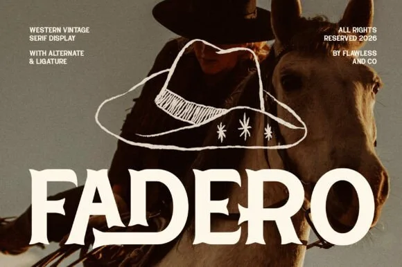
Warm concave-flared Tuscan serif with alternates & ligatures
Fadero is a warm, organic Western serif sculpting concave flared stems, soft waist spurs, and custom alternates & ligatures.
Ideas for this font
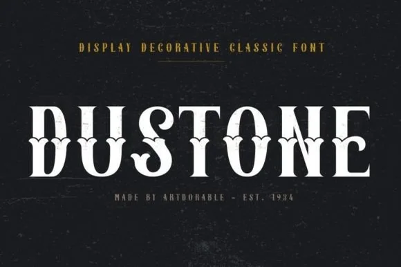
Weathered Victorian Tuscan saloon & gravestone serif
Dustone is a bold vintage Tuscan display serif combining split fishtail serifs, diamond median spurs, and subtle stone-worn texture.
Ideas for this font
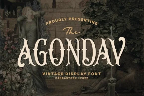
Victorian split-stem Tuscan & Pre-Raphaelite vintage serif
Agondav is a romantic 19th-century Victorian display serif sculpting bifurcated Tuscan stems, waist notches, and curled 'A/V' terminals.
Ideas for this font
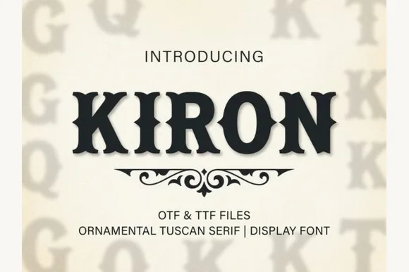
Classic median-spurred Western Tuscan slab-serif
Kiron is a clean, heavy Western Tuscan display serif with crisp diamond median spurs, flared bracketed serifs, and solid single-layer geometry.
Ideas for this font
Same independent foundry
Allow optional Google Analytics to measure visits and catalogue actions. Your search words and notes are not included. Privacy & storage