Neutral Sans Workhorse

Brontide + Borsen
Lets Brontide own the focal silhouette while handling secondary copy, sizing and subheads cleanly.
Inspect Borsen specimenDisclosure: MakerFileHub may earn a commission from qualifying purchases via paid links on this page. How our links work.
Broad distressed capitals with round O bowls and irregular pale surface breaks
Brontide sets pale uppercase lettering on dark blue-grey, where round O and D bowls contrast with the straight N diagonal and the flat T and E arms while irregular speckles and larger chipped patches interrupt the fill.
Paid link
Get this fontProject & layout blueprintsAt-a-glance maker compatibility
Fine grain and micro-texture excel in 300 DPI print, sublimation, and screen print rather than small vinyl weeding.
Visual anatomy & craft review
The bowls stay round, the straight letters hold hard edges, the fill chips in irregular patches and the speckle varies across the row. That uneven loss is the character: the word looks printed on a weathered surface rather than deliberately destroyed, which is why the sample sets one heavy line on a dark field. The background texture is separate from the breaks inside the letters, so check the actual outlines, find the smallest size where the chips still read and keep 36 pt as the floor for print.
Distressed · Round bowls · Chipped
Two-font hierarchy recipes
Tested contrast partners — pairing Brontide with grounded secondary typography.
Brontide + Borsen
Lets Brontide own the focal silhouette while handling secondary copy, sizing and subheads cleanly.
Inspect Borsen specimen
Brontide + Bulgary
Grounds bold display lettering with classic typographic authority on posters, badges and apparel.
Inspect Bulgary specimenPractical applications
Concrete hierarchy, scale and production guidance tailored to Brontide’s stroke geometry.
The distressed caps suit an industrial sign, and the heavy strokes read at 60 mm on a painted panel, where the chips give the lettering a weathered age.
Hierarchy & layout recipe
Paint a 500 by 250 mm panel: set the name at 60 mm on one row, keep the chipped edges inside the stencil, and keep 22 mm of border so no patch is cut by the edge.
Pre-production check
Distress painted at 30 mm reads as a bad coat; check the mask and hold the name at 52 mm or above.
The broad distressed letters set a music heading, and the round bowls hold a two-word title at 48 pt on a page, with the chipped patches small enough to stay ornamental.
Hierarchy & layout recipe
Print a 210 mm page: set the heading at 48 pt on one row, keep 18 mm beneath before the standfirst at 10 pt, and keep the block on flat colour so the chips stay legible.
Pre-production check
Two textures stacked on textured paper turn to noise; check the proof and use smooth stock.
The chipped caps set a seasonal poster, and the heavy forms hold a short title at 56 pt on an A3 sheet, where the pale breaks read from across a room.
Hierarchy & layout recipe
Print an A3 poster: set the title at 56 pt on one row, keep 22 mm of clear ground beneath before the times at 14 pt, and keep 22 mm of margin all round so the chipped edges stay inside the sheet.
Pre-production check
Speckles printed at 24 pt look like dirt; check the sheet and hold the title at 48 pt or above.
Technical & licence verification
Confirm included OTF/TTF/WOFF formats, full glyph tables and licence coverage on the live store page before batch production.
Closest visual alternatives
Matched across letterform anatomy, stroke behaviour and craft applications.
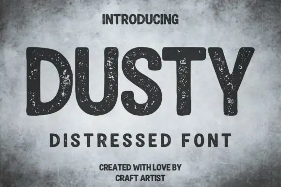
Rounded distressed capitals with broad strokes
Dusty shows thick mostly upright capitals with rounded corners and wide open letter spaces on a mottled grey field, where numerous small pale speckles interrupt the dark strokes without turning the letters into thin outlines.
Ideas for this font
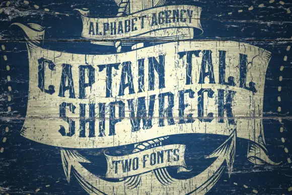
Tall distressed capitals on a curved nautical banner
Captain Tall Ship reads as a tall capital line on broad cream ribbon panels: narrow bodies with clipped corners carry rough pale gaps across the strokes, the row follows a curve and the weathered surface covers the whole cover.
Ideas for this font
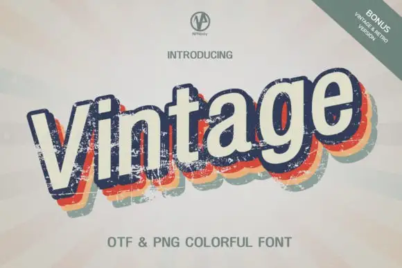
Slanted cream lettering with worn multicolour offset shadows
Vintage Npnaay sets a fat rounded display face, wears the fill down with a printed grain and stacks two offset copies behind it in warm colours so the word reads as a seventies print.
Ideas for this font
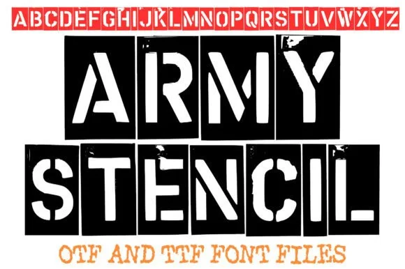
Distressed real-metal military stencil
Army Stencil captures stamped metal military stencils across a full A to Z uppercase set with organic weathered edges, and the red alphabet banner along the top of the cover confirms clean stencil bridges across every enclosed letter from A through Z.
Ideas for this font
Same independent foundry
Allow optional Google Analytics to measure visits and catalogue actions. Your search words and notes are not included. Privacy & storage