Modern Grotesque Body

College Retro + Bielchon
Creates crisp high-hierarchy contrast beneath College Retro headlines across menus, websites and labels.
Inspect Bielchon specimenDisclosure: MakerFileHub may earn a commission from qualifying purchases via paid links on this page. How our links work.
Outlined collegiate capitals with patchy interior wear
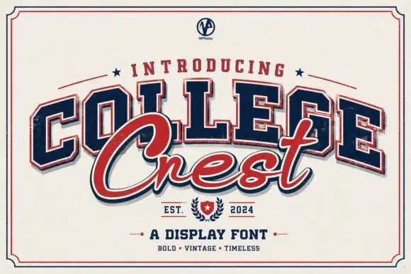
College Retro shows angular slab capitals with clipped corners in a faded red on cream, where a pale inset border traces each letter, coarse pale abrasions cut through the fill and the lower row uses substantially larger letter bodies than the upper one.
Paid link
Get this fontProject & layout blueprintsAt-a-glance maker compatibility
Fine grain and micro-texture excel in 300 DPI print, sublimation, and screen print rather than small vinyl weeding.
Visual anatomy & craft review
The slabs stay square, the corners clip at an angle, the inset line follows the outer contour and the abrasion bites into both fill and edge. That double outline is the character: the word reads as a printed varsity plate that has been worn rather than a clean collegiate face. The corner ribbon advertises a clean version that this preview does not show, so plan the worn treatment only. Keep 40 pt so the inset stays separate from the outer edge, print on matte stock where the speckles hold and check the lower row size against your own copy.
Outlined collegiate capitals with patchy interior wear
Two-font hierarchy recipes
Tested contrast partners — pairing College Retro with grounded secondary typography.
College Retro + Bielchon
Creates crisp high-hierarchy contrast beneath College Retro headlines across menus, websites and labels.
Inspect Bielchon specimen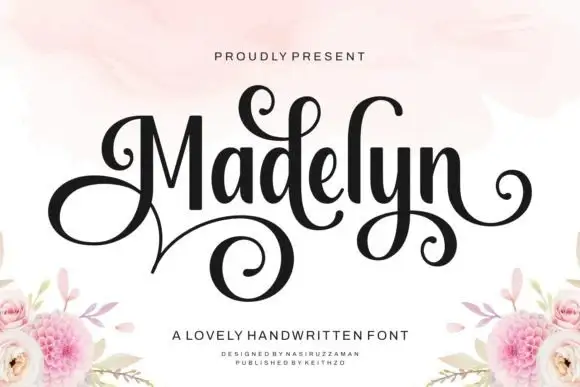
College Retro + Madelyn
Adds a warm human signature touch for 1-to-3-word callouts without competing against structured serif capitals.
Inspect Madelyn specimenPractical applications
Concrete hierarchy, scale and production guidance tailored to College Retro’s stroke geometry.
The worn varsity plate suits a shirt back, and the inset line keeps the letters readable where a solid fill would smear under a heat press.
Hierarchy & layout recipe
Print a 300 mm back panel: set the team name at 70 mm on one row, keep 14 mm between letters so the inset lines stay separate, and keep 20 mm of margin from each side seam.
Pre-production check
The abrasion merges under a transfer press; check a printed sample and keep the name at 60 mm.
The faded plate reads as a reunion sign, and the clipped corners give the row a period look without photographic texture.
Hierarchy & layout recipe
Print a 700 by 300 mm panel: set the event name at 54 mm across two rows with 24 mm between baselines, keep 24 mm of clear ground beneath before the date at 15 pt, and keep 26 mm of border.
Pre-production check
The clean version is advertised, not shown; check your file before promising an untextured option.
The heavy slabs hold a short camp name on a small tag, and the worn fill survives a simple one-colour print at that size.
Hierarchy & layout recipe
Print a 45 by 90 mm tag: set the camp name at 20 pt on one row, keep 9 mm of clear ground beneath before the number at 7 pt, and keep 7 mm to the punch hole so the inset stays whole.
Pre-production check
The inset line fills under 16 pt; check the printed tag and hold the name at 18 pt or above.
Technical & licence verification
Confirm included OTF/TTF/WOFF formats, full glyph tables and licence coverage on the live store page before batch production.
Closest visual alternatives
Matched across letterform anatomy, stroke behaviour and craft applications.
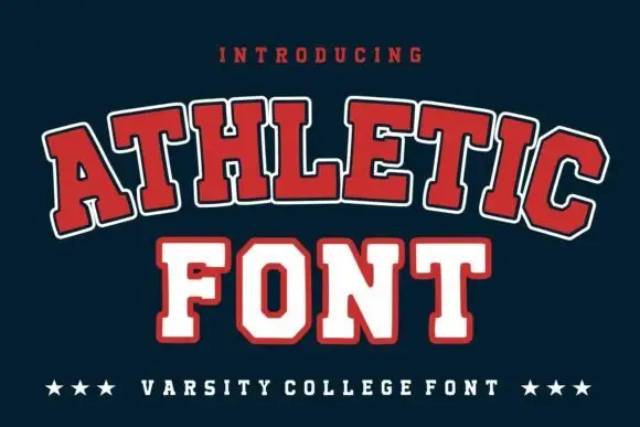
Broad outlined collegiate slabs with clipped corners in an arched specimen
Athletic is a broad collegiate slab in which the capitals clip their corners, the feet run wide and a pale and dark outline separate the fill from the ground, so a team name reads as an arched badge letter.
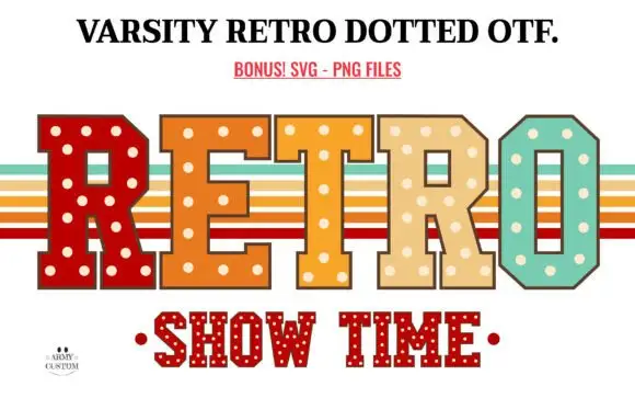
Retro dotted varsity slab
Varsity Retro Dotted is an angular varsity slab in four warm colours on white: heavy caps with chamfered corners and cream dots set into every fill, one letter per colour, with retro stripe bands behind the word and a second dotted line beneath in red.
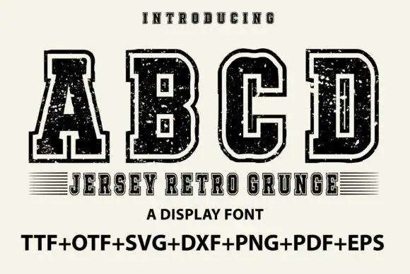
Outlined collegiate slabs with speckled wear
Jersey Retro Grunge shows large collegiate A, B, C and D forms with broad slabs and clipped corners, where a pale inset outline separates the dark letter bodies from an outer black edge and small scratches and holes roughen both the fill and the contour.
Ideas for this font
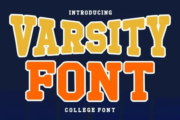
Layered college slab with arched line
Varsity Font is a layered college slab in gold and orange on navy: wide square serifs, flat-topped caps, a heavy white outline on both lines and a slight arch across the top, so the pair reads as an embroidered team patch rather than a plain headline.
Ideas for this font
Same independent foundry
Allow optional Google Analytics to measure visits and catalogue actions. Your search words and notes are not included. Privacy & storage