Neutral Sans Workhorse

Kolase + Limited Coffee
Lets Kolase own the focal silhouette while handling secondary copy, sizing and subheads cleanly.
Inspect Limited Coffee specimenDisclosure: MakerFileHub may earn a commission from qualifying purchases via paid links on this page. How our links work.
Contrast-rich lowercase with fine curled terminals inside broad bowls
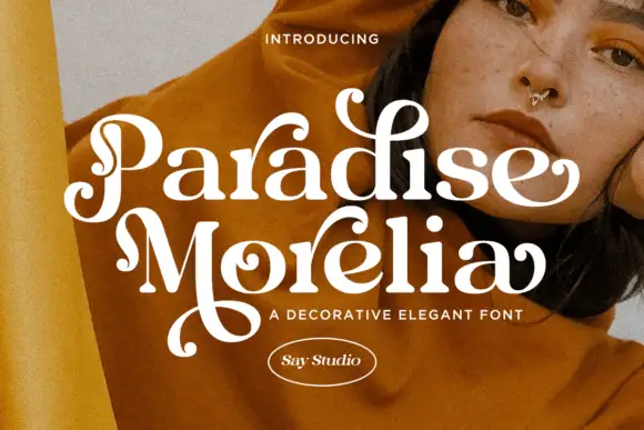
Kolase places white lettering over a pale furnished interior, where heavy upright stems meet hairline curves and the initial k, the a and the final e carry fine curled strokes, while the straight l offers a quiet pause among the rounded details and the caption names a regular and an italic.
Paid link
Get this fontProject & layout blueprintsAt-a-glance maker compatibility
Sturdy stroke walls and open counters weed cleanly on adhesive vinyl, HTV apparel film, and cut cardstock.
Visual anatomy & craft review
The uprights stay heavy, the curves thin to hairlines, the terminals curl and one letter stays straight. That contrast inside a lowercase word is the character: the word reads as a drawn fashion mark rather than a display face, which is why the sample sets it over an interior photograph. The style caption is not a side-by-side proof, so confirm which cuts your file carries, keep 28 pt for the hairlines and check the curl on the e against the following word.
Contrast-rich lowercase with fine curled terminals inside broad bowls
Two-font hierarchy recipes
Tested contrast partners — pairing Kolase with grounded secondary typography.
Kolase + Limited Coffee
Lets Kolase own the focal silhouette while handling secondary copy, sizing and subheads cleanly.
Inspect Limited Coffee specimen
Kolase + Alerigue
Grounds bold display lettering with classic typographic authority on posters, badges and apparel.
Inspect Alerigue specimenPractical applications
Concrete hierarchy, scale and production guidance tailored to Kolase’s stroke geometry.
The contrast lowercase gives a studio a soft mark, and the broad bowls hold a two-word name at 26 pt on a card, where the curled e finishes the line.
Hierarchy & layout recipe
Print an 85 by 55 mm card: set the wordmark at 26 pt on one row, keep 16 mm of clear ground beneath before the address at 7 pt, and keep the hairlines on a coated stock so they stay clean.
Pre-production check
Hairline curves thicken on uncoated card; check a printed sample and stay on a coated sheet.
The light terminals set a graceful opener, and the heavy stems hold a short sentence at 24 pt under a headline, where the contrast keeps the row lively.
Hierarchy & layout recipe
Print a 210 mm page: set the opening line at 24 pt over two lines, keep 14 mm of clear ground beneath before the body at 10 pt, and keep the measure under 60 characters so the light curves stay comfortable.
Pre-production check
Fine curls at 18 pt break on newsprint; check the proof and keep the size at 22 pt or above.
The curled terminals suit a quiet menu, and the broad bowls hold the venue name at 20 pt above the courses, where the straight l gives the row a pause.
Hierarchy & layout recipe
Print a 105 by 210 mm menu: set the venue name at 20 pt on one row, keep 16 mm of clear ground beneath before the courses at 10 pt, and keep the courses in a roman face so the display line stays singular.
Pre-production check
An italic may not exist in the file; check the styles before planning a second level, and set the courses in a plain roman instead.
Technical & licence verification
Confirm included OTF/TTF/WOFF formats, full glyph tables and licence coverage on the live store page before batch production.
Closest visual alternatives
Matched across letterform anatomy, stroke behaviour and craft applications.
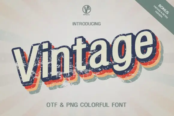
Slanted cream lettering with worn multicolour offset shadows
Vintage Npnaay sets a fat rounded display face, wears the fill down with a printed grain and stacks two offset copies behind it in warm colours so the word reads as a seventies print.
Ideas for this font
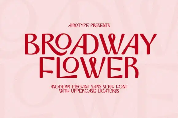
Contrast capitals with sweeping R and L tails and looped W centres
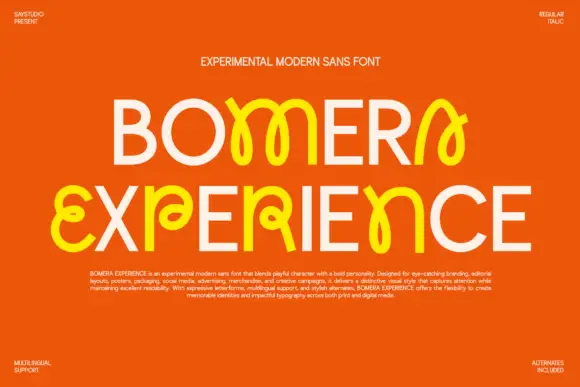
Broadway Flower is a slender sans in capitals where the ligatures do the decorating: an O grows a ribbon loop, a W folds into a wave, and adjacent letters share a stroke that curls away.
Ideas for this font
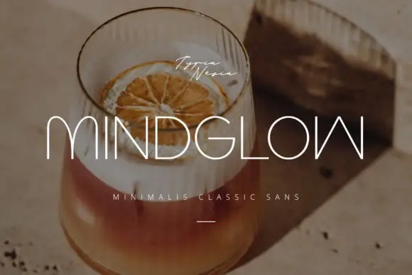
Hairline capitals with rounded m arches and an inverted angular final form
Mindglow sets wide light capitals with hairline strokes and generous tracking, and lays them over a warm photograph of a drink so the word reads as a line of light rather than a block.
Ideas for this font
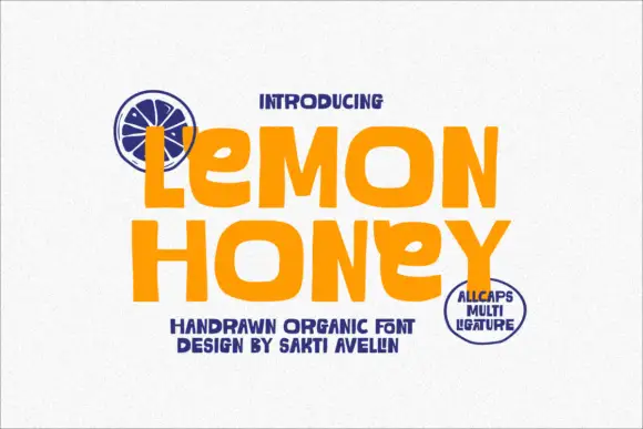
Organic hand-drawn fat display
Lemon Honey is a hand-drawn organic display in orange on off-white: fat lowercase letters with soft irregular outlines, a bouncing baseline, an open e and a curved y, with navy accents and a small round seal, so the pair reads as a hand-lettered juice label.
Ideas for this font
Same independent foundry
Allow optional Google Analytics to measure visits and catalogue actions. Your search words and notes are not included. Privacy & storage