Modern Grotesque Body

Varsity Gingham + Hermano
Creates crisp high-hierarchy contrast beneath Varsity Gingham headlines across menus, websites and labels.
Inspect Hermano specimenDisclosure: MakerFileHub may earn a commission from qualifying purchases via paid links on this page. How our links work.
Varsity block with gingham fill
Varsity Gingham is a display face on a white textured ground: upright varsity capitals with slab feet, filled with a diagonal red-and-white gingham and outlined in black, with a tracked name line above and a studio credit beneath.
Paid link
Get this fontProject & layout blueprintsAt-a-glance maker compatibility
Sturdy stroke walls and open counters weed cleanly on adhesive vinyl, HTV apparel film, and cut cardstock.
Visual anatomy & craft review
The plate is a plain specimen, and the construction is what matters: the letters keep a classic varsity skeleton with slab feet, and the fill is a diagonal gingham rather than a square check, so the pattern reads as cut cloth laid into the letter rather than as a printed grid. That construction sets a moderate size floor, because the gingham closes into a flat pink first, and the black outline holds each letter against a light ground. The name line and the credit are product copy. It suits a shirt, a poster and a card for a school, a team or a picnic theme, and it is the kind of face that looks better set in one or two words than in a long line.
Slab Serif, varsity, gingham, sport
Two-font hierarchy recipes
Tested contrast partners — pairing Varsity Gingham with grounded secondary typography.
Varsity Gingham + Hermano
Creates crisp high-hierarchy contrast beneath Varsity Gingham headlines across menus, websites and labels.
Inspect Hermano specimen
Varsity Gingham + Bunglon
Adds a warm human signature touch for 1-to-3-word callouts without competing against structured serif capitals.
Inspect Bunglon specimenPractical applications
Concrete hierarchy, scale and production guidance tailored to Varsity Gingham’s stroke geometry.
A varsity display prints as team kit, and the red gingham reads on a light shirt where a plain block would look ordinary.
Hierarchy & layout recipe
Print a 240 mm chest graphic: the team at 50 mm cap height, the year at 24 mm, and two inks on a light shirt. Keep the smallest check at 3 mm and place the graphic 80 mm below the collar.
Pre-production check
Check the screen at actual mesh, where a 3 mm check can fill; enlarge it to 4 mm. Wash-test one shirt and confirm the pattern stays even after five cycles.
A gingham display sets a picnic, and the red check carries the theme without an illustration of a basket. It suits a picnic theme.
Hierarchy & layout recipe
A6 card: the greeting at 30 pt, the details in a 10 pt sans, and the date at 9 pt. Keep 15 mm margins, print two colours on a white card and leave 12 mm at the foot for the address.
Pre-production check
Check the 30 pt greeting at home-print resolution, where the check closes into a tone; keep the squares above 1.2 mm. Confirm the details read at arm's length and that the card folds flat.
A varsity poster reads as a school bill, and the slab feet hold a long fixture line on a board seen at a distance. It holds a fixture line.
Hierarchy & layout recipe
A2 poster: the game at 100 mm cap height, the details in a 20 mm sans, and the venue at 11 mm. Keep 28 mm margins, print two colours on a light stock and keep the checks above 3 mm.
Pre-production check
Check the A2 at five metres, where the check merges; use the solid cut there. Confirm the 11 mm venue reads at two metres and that the fixture fits the measure.
Technical & licence verification
Confirm included OTF/TTF/WOFF formats, full glyph tables and licence coverage on the live store page before batch production.
Closest visual alternatives
Matched across letterform anatomy, stroke behaviour and craft applications.
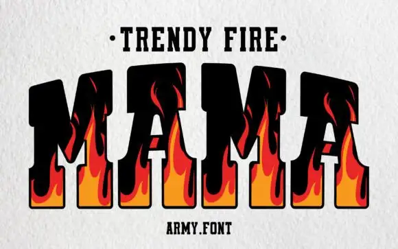
Flame-filled varsity slab
Trendy Fire is a varsity slab in black with flame shapes rising through the letters: heavy squared capitals with thick serifs, an orange-to-red flame drawn inside each stem and licking up past the top bar, set as one large word between a dotted line above and a plain credit beneath.
Ideas for this font
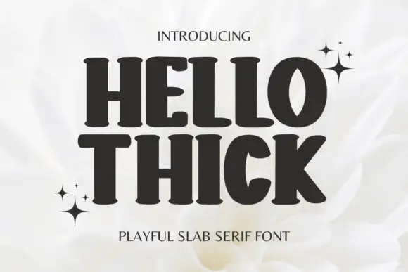
Heavy soft slabs with broad curved bowls and rounded feet
Hello Thick sets a heavy slab in squat capitals, its serifs swollen into bulbs and its counters small, so a two-word heading looks pressed into the page rather than typeset.
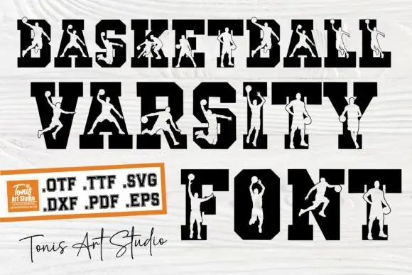
Heavy angular varsity capitals crossed by pale basketball-player silhouettes
Basketball Varsity sets heavy varsity capitals and cuts a different basketball player out of each letter, so a word reads as a row of figures framed by the block shapes.
Ideas for this font
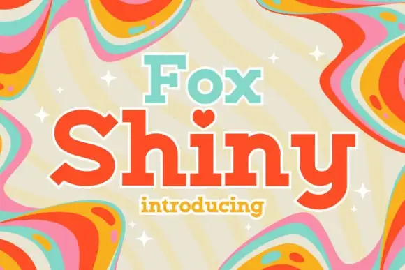
Soft heavy mixed-case slabs with rounded bowls and a heart-like i mark
Fox Shiny pairs a smaller aqua Fox with a much larger orange-red Shiny on a cream field, where the thick rounded slabs, the generous S curve and the sweeping y tail build a buoyant retro word shape while the i takes a heart in place of a dot and rainbow swirls run around the frame.
Ideas for this font
Same independent foundry
Allow optional Google Analytics to measure visits and catalogue actions. Your search words and notes are not included. Privacy & storage