Neutral Sans Workhorse

American Football + Bielchon
Lets American Football own the focal silhouette while handling secondary copy, sizing and subheads cleanly.
Inspect Bielchon specimenDisclosure: MakerFileHub may earn a commission from qualifying purchases via paid links on this page. How our links work.
Broad brown patch-like capitals with laces and white bands
American Football Army builds each capital as a leather football: a brown pigskin with painted white stripes, a laced seam and worn edges, with a matching alphabet, numerals and punctuation.
Paid link
Get this fontProject & layout blueprintsAt-a-glance maker compatibility
Sturdy stroke walls and open counters weed cleanly on adhesive vinyl, HTV apparel film, and cut cardstock.
Visual anatomy & craft review
ABCD fills the top of the card, each letter a football turned to fit: the A is a ball with its lace running up the left stroke, the B has laces on the bowl, the C is split by a white stripe, and all of them carry stitch marks on the outer edge where a ball would be joined. Beneath the four big letters the rest of the alphabet, the numbers and a row of punctuation follow at a fifth of the size, drawn in the same brown and white scheme. Small drawn footballs sit in the corners of the card, and a caption at the top names the set and the bonus files. The fills are simple: one brown, two whites and a darker brown for the shadow, so the letters hold their shape at a distance and the stitches only appear when the print is close. It is a game-day, school-spirit and party face.
Broad brown patch-like capitals with laces and white bands
Two-font hierarchy recipes
Tested contrast partners — pairing American Football with grounded secondary typography.
American Football + Bielchon
Lets American Football own the focal silhouette while handling secondary copy, sizing and subheads cleanly.
Inspect Bielchon specimen
American Football + Mewah
Grounds bold display lettering with classic typographic authority on posters, badges and apparel.
Inspect Mewah specimenPractical applications
Concrete hierarchy, scale and production guidance tailored to American Football’s stroke geometry.
The ball texture names the sport before the team name is read, and the heavy brown shapes stay clear on a fence where a thin varsity face would disappear.
Hierarchy & layout recipe
Print a 1500 by 500 mm banner: set the team name at 180 pt on one row, keep 40 mm of clear ground beneath before the game time at 20 pt, and hold 45 mm at each end so no stitched edge is cut.
Pre-production check
Stitch marks fill in on banner mesh at that size; print a 300 mm sample and check the seams from three metres before the run.
The autumn palette and the ball shapes set the season in one element, and a single word carries a sign that has no artwork behind it.
Hierarchy & layout recipe
Print a 600 by 400 mm board: set the greeting at 110 pt across two rows, keep 26 mm of clear ground between the rows, and hold 28 mm of border so the worn edges of the letters stay whole.
Pre-production check
Solid browns look flat on foam board; print one board and check the contrast of the white laces before the set.
The theme reads at a glance on a small card, and the brown and white palette keeps a children's invitation from turning into a busy scene.
Hierarchy & layout recipe
Print a 105 by 148 mm invitation: set the name at 42 pt across two rows, keep 14 mm of clear ground beneath before the details at 8 pt, and hold 12 mm from the widest letter to the card edge.
Pre-production check
The lacing detail closes up under 22 pt; print one card at the finished size and check the stitches before the batch.
Technical & licence verification
Confirm included OTF/TTF/WOFF formats, full glyph tables and licence coverage on the live store page before batch production.
Closest visual alternatives
Matched across letterform anatomy, stroke behaviour and craft applications.
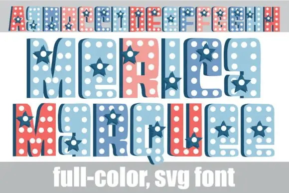
Dotted star-inset colour display
merica Marquee is a colour display on white: condensed rounded capitals filled with white dots and inset navy stars, shown in three rows at three sizes — a small banner row, a middle row and a large bottom row in red, pale blue and navy — with a plain caption along the foot.
Ideas for this font
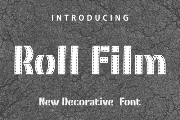
Film-strip band display
Roll Film is a display face in white on cracked grey asphalt: tall capitals built from narrow vertical bands with a row of small perforations down each side, slotted ends and a stepped, segmented silhouette, with tracked lines above and beneath.
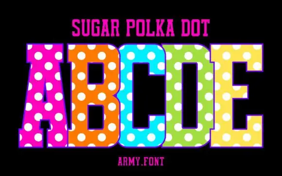
Slab capitals with polka dots
Sugar Polka Dot is a colour display on a black ground: tall slab-like capitals in vivid pink, orange, blue, green and yellow, each covered with large white dots, with a thin outline, a plain name line above and a studio credit beneath.
Ideas for this font
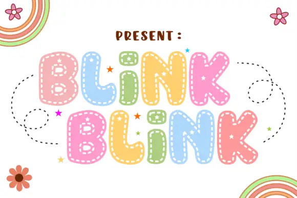
Soft rounded letters with dashed inner borders and small star-shaped openings
Blink Blink stacks two rounded words in pastel colour, traces each letter with a dotty inner line and sprinkles small stars on the fills, with dashed swirls and cartoon flowers around the block.
Ideas for this font
Same independent foundry
Allow optional Google Analytics to measure visits and catalogue actions. Your search words and notes are not included. Privacy & storage