Modern Grotesque Body

Hello Thick + Montreal
Creates crisp high-hierarchy contrast beneath Hello Thick headlines across menus, websites and labels.
Inspect Montreal specimenDisclosure: MakerFileHub may earn a commission from qualifying purchases via paid links on this page. How our links work.
Heavy soft slabs with broad curved bowls and rounded feet
Hello Thick sets a heavy slab in squat capitals, its serifs swollen into bulbs and its counters small, so a two-word heading looks pressed into the page rather than typeset.
Paid link
Get this fontProject & layout blueprintsAt-a-glance maker compatibility
Sturdy stroke walls and open counters weed cleanly on adhesive vinyl, HTV apparel film, and cut cardstock.
Visual anatomy & craft review
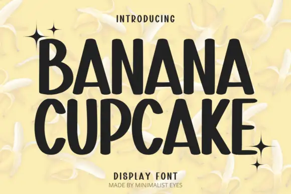
HELLO over THICK fills the card in near black on white petals, the O and the C almost circular, the H with thick stems and the K with a wide arm. Serifs flare out at the top and bottom of every stem, and the tight spacing keeps the rows compact. Small four-point sparkles sit in the margins, which is the only ornament on the page, and two tracked captions frame the sample. The face is playful without being cute, so it suits food, children's brands and posters; its limit is texture, because the swollen serifs and small counters merge on rough stock.
Heavy soft slabs with broad curved bowls and rounded feet
Two-font hierarchy recipes
Tested contrast partners — pairing Hello Thick with grounded secondary typography.
Hello Thick + Montreal
Creates crisp high-hierarchy contrast beneath Hello Thick headlines across menus, websites and labels.
Inspect Montreal specimen
Hello Thick + Autography
Adds a warm human signature touch for 1-to-3-word callouts without competing against structured serif capitals.
Inspect Autography specimenPractical applications
Concrete hierarchy, scale and production guidance tailored to Hello Thick’s stroke geometry.
The fat slab reads across a table and stays friendly, which is what a school bake sale needs from a sign propped on the counter.
Hierarchy & layout recipe
Print a 297 by 210 mm sign: set the heading at 70 pt across two rows, keep 20 mm of clear ground beneath before the prices at 14 pt, and keep 18 mm of border so the serifs keep their space.
Pre-production check
Counters fill on a cheap printer; check a copy before running the set. Print a sample and re-check it at final size.
The pressed weight gives a bar a cosy character, and the short brand name fits the squat capitals on a narrow bar label.
Hierarchy & layout recipe
Print a 70 by 40 mm wrapper: set the brand at 16 pt on one row, keep 6 mm of clear ground beneath before the cocoa percentage at 5 pt, and keep 4 mm to the fold so the serifs are not cut.
Pre-production check
Bulbous serifs crowd on a fold; check the layout at final size before the print run. Ask the printer for a sample at the finished size.
The heavy slab holds a cover line at shelf distance, and the playful shape keeps a food issue from looking corporate on the newsstand.
Hierarchy & layout recipe
Print a 210 by 280 mm cover: set the cover line at 86 pt across one row, keep 22 mm of clear ground beneath before the standfirst at 11 pt, and keep 18 mm of margin from the trim edge.
Pre-production check
Heavy coverage sets off on uncoated paper; check the press proof before the run. Confirm it on a printed sample, not on screen.
Technical & licence verification
Confirm included OTF/TTF/WOFF formats, full glyph tables and licence coverage on the live store page before batch production.
Closest visual alternatives
Matched across letterform anatomy, stroke behaviour and craft applications.
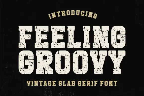
Heavy rounded athletic slabs with scattered scratches and pits
Feeling Groovy uses pale block capitals on black, where the bowls are rounded with softened corners, thick square feet keep the rows dense, and small dark pits and short scratches break the fill across the letters.
Ideas for this font
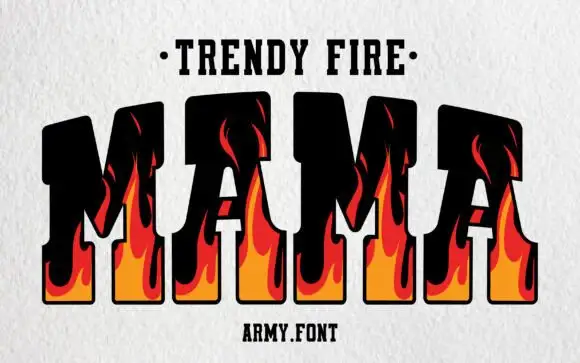
Flame-filled varsity slab
Trendy Fire is a varsity slab in black with flame shapes rising through the letters: heavy squared capitals with thick serifs, an orange-to-red flame drawn inside each stem and licking up past the top bar, set as one large word between a dotted line above and a plain credit beneath.
Ideas for this font
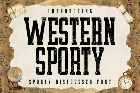
Very condensed distressed slab
Western Sporty is a very condensed square slab in black on a torn paper sheet: tall caps with heavy square slabs, scratched irregular fill and rough edges, set on two lines with a tracked line above and a caption beneath, over a ground of aged newspaper and travel props.
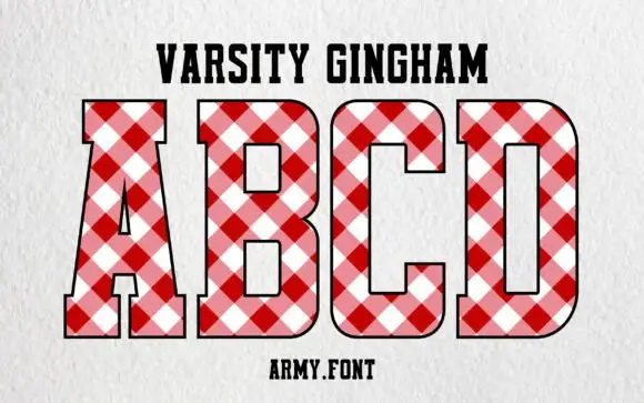
Varsity block with gingham fill
Varsity Gingham is a display face on a white textured ground: upright varsity capitals with slab feet, filled with a diagonal red-and-white gingham and outlined in black, with a tracked name line above and a studio credit beneath.
Ideas for this font
Same independent foundry
Allow optional Google Analytics to measure visits and catalogue actions. Your search words and notes are not included. Privacy & storage