Neutral Sans Workhorse

Basketball Varsity + Montreal
Lets Basketball Varsity own the focal silhouette while handling secondary copy, sizing and subheads cleanly.
Inspect Montreal specimenDisclosure: MakerFileHub may earn a commission from qualifying purchases via paid links on this page. How our links work.
Heavy angular varsity capitals crossed by pale basketball-player silhouettes
Basketball Varsity sets heavy varsity capitals and cuts a different basketball player out of each letter, so a word reads as a row of figures framed by the block shapes.
Paid link
Get this fontProject & layout blueprintsAt-a-glance maker compatibility
Sturdy stroke walls and open counters weed cleanly on adhesive vinyl, HTV apparel film, and cut cardstock.
Visual anatomy & craft review
BASKETBALL over VARSITY over FONT fills the card in black on white, and every letter is a slab block with a white figure knocked out of it: a player dribbles inside the B, shoots inside the A, dunks inside the T, and stands with the ball inside the O. The cuts are clean silhouettes rather than outlines, so the figures read at a distance and the letter shape survives around them. A small orange panel at the lower left lists the file formats, and a script signature sits beneath it. The letters keep the classic varsity proportions, with thick stems, flat serifs and tight spacing, which is why the figures have room without breaking the word. It is a school-spirit and sports face, built for banners, jerseys, posters and decals, and it depends on the cut-out staying open: below about 30 pt the figures close up and the letters turn into blocks.
Heavy angular varsity capitals crossed by pale basketball-player silhouettes
Two-font hierarchy recipes
Tested contrast partners — pairing Basketball Varsity with grounded secondary typography.
Basketball Varsity + Montreal
Lets Basketball Varsity own the focal silhouette while handling secondary copy, sizing and subheads cleanly.
Inspect Montreal specimen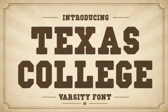
Basketball Varsity + Texas College
Grounds bold display lettering with classic typographic authority on posters, badges and apparel.
Inspect Texas College specimenPractical applications
Concrete hierarchy, scale and production guidance tailored to Basketball Varsity’s stroke geometry.
The cut figures name the sport before the team name is read, and the varsity weight carries across a gym where a thinner face would disappear.
Hierarchy & layout recipe
Print a 1500 by 500 mm banner: set the team name at 170 pt on one row, keep 38 mm of clear ground beneath before the tip-off time at 18 pt, and hold 42 mm at each end so no figure is cut by the hem.
Pre-production check
Banner mesh cannot hold a fine limb; print a 300 mm sample and check the smallest silhouette before the full length.
The letters hold a club name on a moving vehicle, and the cut-out figures read as a mark even when the van passes at speed.
Hierarchy & layout recipe
Print a 600 by 250 mm decal: set the club name at 90 pt on one row, keep 24 mm of clear ground beneath before the contact strip at 12 pt, and hold 26 mm from the letters to the decal edge.
Pre-production check
Vinyl cuts need bridges on thin limbs; print one decal and test the weed before the pair is produced.
The sport is named in one word, and the block letters stay readable in the small trim of a yearbook cover at thumbnail size.
Hierarchy & layout recipe
Print a 210 by 280 mm cover: set the cover line at 78 pt across two rows, keep 22 mm of clear ground beneath before the year at 14 pt, and hold 18 mm from the outer letters to the trim.
Pre-production check
Small figures fill in on uncoated cover stock; print one cover at the final size and check the dunk silhouette first.
Technical & licence verification
Confirm included OTF/TTF/WOFF formats, full glyph tables and licence coverage on the live store page before batch production.
Closest visual alternatives
Matched across letterform anatomy, stroke behaviour and craft applications.

Rider-silhouette block display
Motocross is a novelty display on a pale ground beside a photograph of a rider mid-jump: heavy rounded capitals with pale motorcycle silhouettes cut into the fill, plus a second red block line beneath that names the file formats.
Ideas for this font
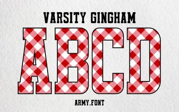
Varsity block with gingham fill
Varsity Gingham is a display face on a white textured ground: upright varsity capitals with slab feet, filled with a diagonal red-and-white gingham and outlined in black, with a tracked name line above and a studio credit beneath.
Ideas for this font
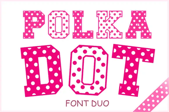
Angular slab-serif capitals alternating solid dotted and hollow dotted treatments
Polka Dot draws its capitals as octagons with the corners cut straight off, then punches a scatter of round holes through the fill so every letter looks like a punched paper tag.
Ideas for this font
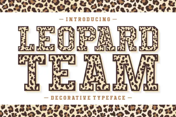
Leopard-filled varsity slab
Leopard Team is an outlined varsity slab in dark brown on cream: heavy caps drawn with a contour and filled with irregular leopard rosettes, on a light keyline with a dark offset shadow, with a tracked line above and beneath and a leopard band across the top and bottom of the sheet.
Ideas for this font
Same independent foundry
Allow optional Google Analytics to measure visits and catalogue actions. Your search words and notes are not included. Privacy & storage