Neutral Sans Workhorse

Colorful Blocks + Lemon Milk Pro FTR
Lets Colorful Blocks own the focal silhouette while handling secondary copy, sizing and subheads cleanly.
Inspect Lemon Milk Pro FTR specimenDisclosure: MakerFileHub may earn a commission from qualifying purchases via paid links on this page. How our links work.
Outlined block capitals filled with colourful studded rectangles
Colorful Blocks builds every letter from a grid of plastic bricks, fills them in primary red, yellow, green and blue, and adds a glossy highlight and a heavy black contour around the whole shape.
Paid link
Get this fontProject & layout blueprintsAt-a-glance maker compatibility
Sturdy stroke walls and open counters weed cleanly on adhesive vinyl, HTV apparel film, and cut cardstock.
Visual anatomy & craft review
The preview shows four giant letters across the top, each a mosaic of stacked bricks with visible studs, and a highlight running down one edge so the surface looks moulded rather than printed. Under them the rest of the alphabet, the numerals and a row of punctuation follow at a fifth of the size, drawn in the same style and in the same four colours. Around the letters, drawn toys fill the margins: a teddy, a duck, a rocking horse, a ball and a stacking ring, all in a simple line with flat colour. A caption at the top names the set and a line under it mentions the bonus files in grey. Because the bricks are large, the letters stay readable from a distance and the grid of studs gives the surface its character; the black contour is what stops two adjacent colours from vibrating into one another.
Outlined block capitals filled with colourful studded rectangles
Two-font hierarchy recipes
Tested contrast partners — pairing Colorful Blocks with grounded secondary typography.
Colorful Blocks + Lemon Milk Pro FTR
Lets Colorful Blocks own the focal silhouette while handling secondary copy, sizing and subheads cleanly.
Inspect Lemon Milk Pro FTR specimen
Colorful Blocks + Gorga
Grounds bold display lettering with classic typographic authority on posters, badges and apparel.
Inspect Gorga specimenPractical applications
Concrete hierarchy, scale and production guidance tailored to Colorful Blocks’s stroke geometry.
The brick letters speak to children before they can read the word, and the heavy contour keeps each letter separate on a wall that children see up close.
Hierarchy & layout recipe
Print a 400 by 250 mm door sign: set the class name at 70 pt on one row, keep 18 mm of clear ground beneath before the teacher's name at 12 pt, and hold 20 mm of border so the raised contour is not cut.
Pre-production check
Small brick studs fill in when printed large; print one sign at the final size and check the grid before the set is mounted.
The bricks name the theme without a printed character, and the four-colour grid gives a photograph behind the table something to work with.
Hierarchy & layout recipe
Print a 1000 by 700 mm backdrop: set the name at 140 pt on one row, keep 40 mm of clear ground beneath before the age at 26 pt, and hold 45 mm of margin around the frame.
Pre-production check
Backdrop material dulls primary colours; print a short sample on the actual fabric and compare the blue before the full panel.
The grid repeats well on a sheet, and a short word cut from bricks reads as a toy mark rather than as a children's font borrowed for a logo.
Hierarchy & layout recipe
Print a 500 mm wide repeat on 90 gsm sheet: set the shop name at 36 pt inside a 60 mm tile, keep 14 mm of clear ground around the word before the tile edge, and hold the tile spacing at 28 mm so the contours never touch.
Pre-production check
Thin highlight lines on the bricks break in offset; print a short run on the real paper and check the gloss line first.
Technical & licence verification
Confirm included OTF/TTF/WOFF formats, full glyph tables and licence coverage on the live store page before batch production.
Closest visual alternatives
Matched across letterform anatomy, stroke behaviour and craft applications.
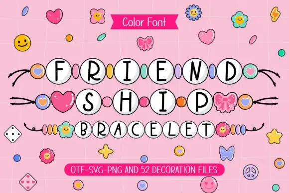
Slim black capitals inside white round beads with coloured spacers
Friendship Bracelet draws each capital inside a round bead threaded on a string, and fills the spaces between the words with charms: hearts, flowers, butterflies and small smiling faces.
Ideas for this font
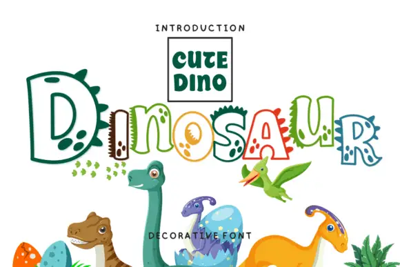
Hollow irregular mixed case with dinosaur-like spikes and rounded footprint-like spots
Dinosaur draws hollow letters with an unsteady hand, gives several of them spikes along the top and fills the neighbours with round footprint spots, so a word looks assembled by a child who likes big reptiles.
Ideas for this font
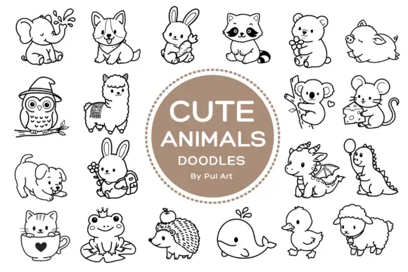
Rounded black outline animal dingbats with simple expressions and props
Cute Animals Doodles is a typable collection of about two dozen animals — elephant, corgi, bunny, raccoon, bear, owl, alpaca, koala, mouse, hedgehog, whale, duck, sheep, a small dragon — each drawn in one even black line.
Ideas for this font
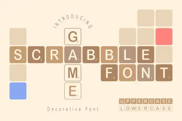
Game-tile display
Scrabble Game is a novelty display on cream: plain capitals set inside rounded square tiles with small numerals in the lower corner, arranged on a grid as a crossword, with blank and coloured tiles filling the gaps and a small format line at the lower right.
Same independent foundry
Allow optional Google Analytics to measure visits and catalogue actions. Your search words and notes are not included. Privacy & storage