Neutral Sans Workhorse

Tomrolan + Memoir Slang
Lets Tomrolan own the focal silhouette while handling secondary copy, sizing and subheads cleanly.
Inspect Memoir Slang specimenDisclosure: MakerFileHub may earn a commission from qualifying purchases via paid links on this page. How our links work.
Art deco geometric condensed display
Tomrolan is an art deco display in cream on bronze: tall geometric capitals with high waists, circular counters, hairline crossbars and a stepped ornament frame, so the word reads as a nineteen-twenties cinema title.
Paid link
Get this fontProject & layout blueprintsAt-a-glance maker compatibility
Sturdy stroke walls and open counters weed cleanly on adhesive vinyl, HTV apparel film, and cut cardstock.
Visual anatomy & craft review
The word is set once across the plate and the drawing is deco geometry: the stems are straight and narrow, the counters are perfect circles that sit high in the letters, and the horizontals are hairlines, which creates the contrast that defines the period. The A and the N are built from single verticals with thin diagonals, and the final letter carries a small square counter, which keeps the rhythm from becoming monotonous. Spacing is even and quite tight, so the word reads as a plate of ornament rather than a line of letters. The specimen frames the word with stepped corner brackets and a centred rule with a diamond, and sets three small tracked lines in a light deco-sans, so the whole page reads as a title card rather than as a specimen sheet.
Art deco, geometric, geometric ornament, elegant
Two-font hierarchy recipes
Tested contrast partners — pairing Tomrolan with grounded secondary typography.
Tomrolan + Memoir Slang
Lets Tomrolan own the focal silhouette while handling secondary copy, sizing and subheads cleanly.
Inspect Memoir Slang specimen
Tomrolan + Lumera Editorial
Grounds bold display lettering with classic typographic authority on posters, badges and apparel.
Inspect Lumera Editorial specimenPractical applications
Concrete hierarchy, scale and production guidance tailored to Tomrolan’s stroke geometry.
A deco face gives a bar the look of a period interior, and the geometric skeleton works at sign scale where the hairlines can still hold in metal or vinyl.
Hierarchy & layout recipe
Fabricate an 800 by 300 mm sign: the name at 110 mm cap height, the hours in a 22 mm deco sans, and a stepped rule beneath. Keep the hairlines at least 4 mm wide for cutting and mount the sign on a dark ground.
Pre-production check
Check the 110 mm name, where a hairline crossbar can disappear at night; thicken it for the fabrication file. Confirm the 22 mm hours read from four metres and that the stepped rule aligns with the sign's frame.
A deco display sets a period theme with a single element, and the tall geometry fits an invitation where the names must sit on one line above the details.
Hierarchy & layout recipe
A5 invitation: the names at 28 pt, the request in a 9.5 pt deco sans, and the date at 8 pt caps. Keep 20 mm margins and print one ink on a heavy cream card with a stepped rule under the names.
Pre-production check
Check the 28 pt names, where the circular counters can look empty next to the hairlines; keep the names on one line. Confirm the 9.5 pt request reads under low light and that the rule does not crowd the date.
A deco title reads as a period record sleeve, and the geometric construction gives a reissue a cover that looks of its era without a photograph.
Hierarchy & layout recipe
Set the title at 95 mm cap height across a 300 mm sleeve, the artist in a 12 pt deco sans, and the catalogue number at 7 pt. Print two colours on a matte board with the stepped frame running to the trim.
Pre-production check
Check the title at sleeve size, where the hairlines can break on the press; proof the board. Confirm the 7 pt catalogue number reads on the spine and that the frame clears the trim by 5 mm on all sides.
Technical & licence verification
Confirm included OTF/TTF/WOFF formats, full glyph tables and licence coverage on the live store page before batch production.
Closest visual alternatives
Matched across letterform anatomy, stroke behaviour and craft applications.
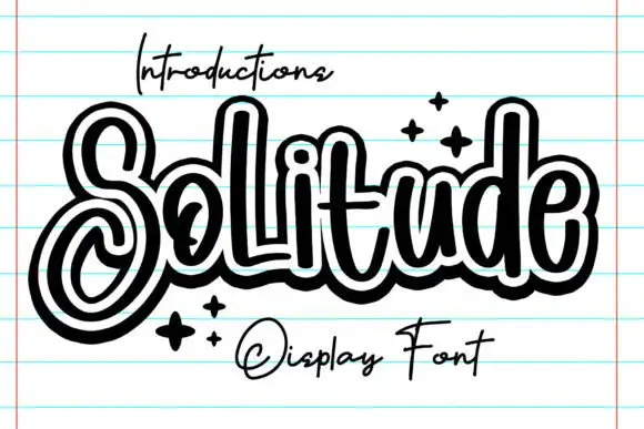
Outlined looping display script
Solitude shows connected upright script forms traced by a thick dark outer contour with a second pale inline inside it, where the S curls into a large lower loop, the tall l and d rise over a compact rounded body and four spark marks sit at the right.

Narrow Gothic strokes with curled descenders and split terminals
Kingsbridge sets silver-blackletter capitals on a dark heraldic scene, the strokes tall and angular, the K throwing a long entry swash and the g closing in a hooked tail that curls under the word.
Ideas for this font
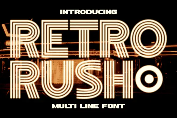
Geometric capitals built from parallel lines with a rounded inner counter
Retro Rush is a geometric capital alphabet in which every stroke is drawn as several parallel lines, so a word reads as a neon tube sign or a striped poster from the late seventies.
Ideas for this font
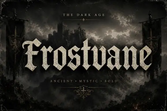
Chunky faceted blackletter with a curled F and triangular feet
Frostvane is a bold blackletter display face with wide letters, diamond-shaped spurs and a surface that looks pressed into old parchment rather than printed on it.
Ideas for this font
Same independent foundry
Allow optional Google Analytics to measure visits and catalogue actions. Your search words and notes are not included. Privacy & storage