Modern Grotesque Body

Magielle + Saltriver Grotesk
Creates crisp high-hierarchy contrast beneath Magielle headlines across menus, websites and labels.
Inspect Saltriver Grotesk specimenDisclosure: MakerFileHub may earn a commission from qualifying purchases via paid links on this page. How our links work.
High-contrast modern serif with flourish alternates
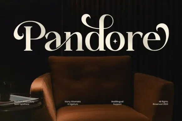
Magielle is a high-contrast modern serif in white on a taupe interior: hairline serifs, a single story g with a deep loop, and an l whose foot curls back into a ball terminal, shown with a note that the family ships alternates and ligatures.
Paid link
Get this fontProject & layout blueprintsAt-a-glance maker compatibility
Sturdy stroke walls and open counters weed cleanly on adhesive vinyl, HTV apparel film, and cut cardstock.
Visual anatomy & craft review
The name sits in one line across the upper half of the frame, and the drawing is a display serif with extreme contrast: thick stems, hairlines that thin to almost nothing in the joins, and flat serifs that stay short so the letterforms read as tall rather than wide. The expressive letters are the g, whose descender loop curls in and closes, and the l, which ends in a hooked foot with a ball terminal, while the M opens with a light entry stroke that lifts above the cap height. Spacing is generous for a serif of this weight, which keeps the hairline joins from crowding and lets the flourishes breathe. Small tracked captions in the lower corners name the style, the alternates and the licensing year, and the ground is a photograph of a red leather chair against a warm plaster wall, so the white type sits on a mid-value field instead of a flat plate.
Elegant, contrasted, swashed, modern
Two-font hierarchy recipes
Tested contrast partners — pairing Magielle with grounded secondary typography.
Magielle + Saltriver Grotesk
Creates crisp high-hierarchy contrast beneath Magielle headlines across menus, websites and labels.
Inspect Saltriver Grotesk specimen
Magielle + Wishful Women
Adds a warm human signature touch for 1-to-3-word callouts without competing against structured serif capitals.
Inspect Wishful Women specimenPractical applications
Concrete hierarchy, scale and production guidance tailored to Magielle’s stroke geometry.
A contrasted serif with flourish alternates gives a hotel mark the look of engraved stationery, and the alternates let one word carry a signature letter without a second typeface.
Hierarchy & layout recipe
Set the name at 34 pt with the alternate l and the looped g enabled, tracked at 40 units, and place the descriptor in a 9 pt sans 8 mm below with a 0.5 pt rule between. Keep the mark single-colour for signage and reversed white for the site.
Pre-production check
Check the hairline joins at 34 pt in proof, where a 0.2 pt join drops out on uncoated stock, and confirm the alternate l reads as an l rather than a stray swash at small sizes. Verify the wordmark holds at 180 px wide in a mobile header.
Swash alternates give a formal serif the gesture of a script while keeping the structure of a roman, which suits a suite that has to stay legible on small place cards.
Hierarchy & layout recipe
A5 portrait: the names at 28 pt in one line with the looped g and the alternate l, the details in a 9.5 pt roman serif, and the reply card at the same size so the pair matches. Print one ink on cotton stock and keep the swash inside a 20 mm margin.
Pre-production check
Check the looped descender on the place card at 14 pt, where the loop can close into a blot; disable the alternate there instead of scaling the face. Confirm the swash clears the trim by 6 mm and that the suite reads consistently across card weights.
A contrasted serif with one flourish letter gives a feature title a strong silhouette at large size, which a neutral serif cannot provide on a page otherwise built from photographs.
Hierarchy & layout recipe
Set the title at 110 pt spanning 230 mm on the opening spread, enable the alternate l only, and set the standfirst in a 12 pt roman at a 150 mm measure beneath. Keep 25 mm between the title and the standfirst so the swash has room.
Pre-production check
Check the swash against the column edge on the fold side, where an overhanging l can be clipped by 3 mm on trim. Confirm the hairline serifs survive the press at 110 pt and that the standfirst does not sit inside the descender's axis.
Technical & licence verification
Confirm included OTF/TTF/WOFF formats, full glyph tables and licence coverage on the live store page before batch production.
Closest visual alternatives
Matched across letterform anatomy, stroke behaviour and craft applications.

Fine serif title with large upper and lower loops
Amilea shows pale yellow high-contrast letters with fine tapered serifs and broad rounded lowercase over a dark portrait, where a thin loop curves below the capital A and a tall upper flourish crosses the central ascender before sweeping right.
Vintage serif with floral frame
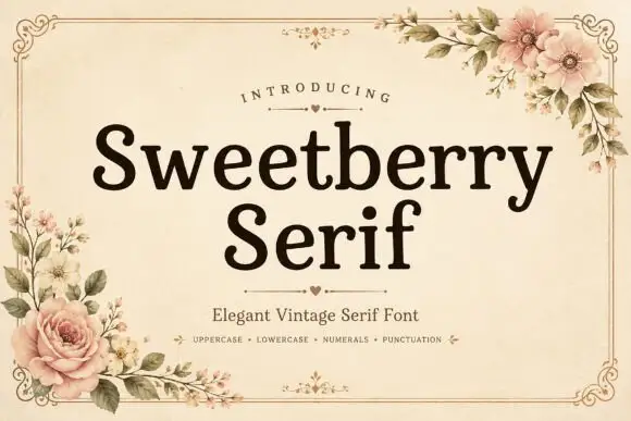
Sweetberry Serif is a vintage serif in deep brown on cream: moderate contrast, bracketed serifs, a large x-height and generous spacing, set in two lines inside a fine ornamental frame with roses and blossom at the corners and a small heart rule beneath the title.
Ideas for this font
Elegant retro serif with tall ascenders
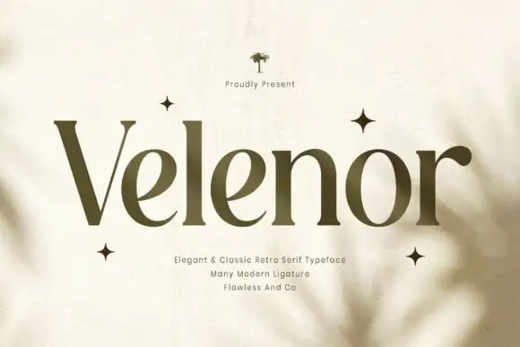
Velenor is an elegant retro serif in olive on cream: tall ascenders, wide bowls, high contrast and long flat serifs, set among four-point stars on a page with soft leaf shadows falling across it.
Ideas for this font
Beauty serif with script accents
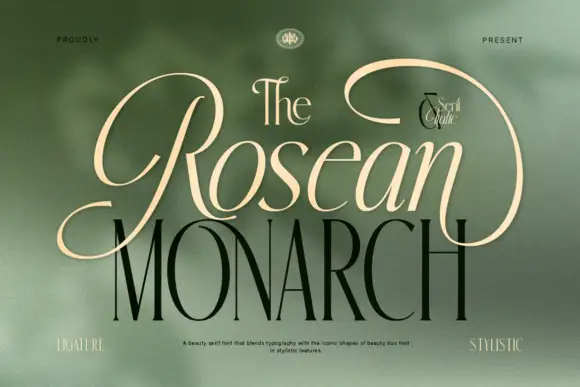
Rosean Monarch is a beauty serif in cream and olive on a blurred green ground: a small high-contrast serif for the article and a much larger serif for the name, with two script accents set between them and small tracked labels at the corners naming the features.
Ideas for this font
Same independent foundry
Allow optional Google Analytics to measure visits and catalogue actions. Your search words and notes are not included. Privacy & storage