Editorial Serif Anchor

Teacher Appreciation + Flowsky Editorial
Anchors Teacher Appreciation's fluid strokes with crisp Roman proportions on wedding suites, headers and packaging.
Inspect Flowsky Editorial specimenDisclosure: MakerFileHub may earn a commission from qualifying purchases via paid links on this page. How our links work.
Smart calligraphy with looping capitals
Teacher Appreciation is a smart calligraphy script in white on a classroom photograph: a thin monoline stroke with tall looping capitals, a heart set inside the crossbar of one letter, and long entries that sweep in from the left, so the phrase reads as a handwritten tribute.
Paid link
Get this fontProject & layout blueprintsAt-a-glance maker compatibility
Weld or Unite overlapping script joins into one continuous vector path before sending to the blade.
Visual anatomy & craft review
The two words are stacked and offset, and the drawing is a monoline calligraphy rather than a brush script: the stroke is even, the capitals rise into tall narrow loops, and the lowercase keeps a low x-height with visible links, which keeps the phrase legible at the size shown. The T opens with a long crossbar that runs into the next word, and the A is drawn as a full loop with a small heart nested inside the crossbar, which is the one decorative gesture. Spacing is loose enough that the loops stay separate, and the angle is steady, so the lockup reads as written rather than arranged. The ground is a photograph of a teacher in a classroom, and the white type sits over the darker chalkboard side so the thin strokes stay visible.
Calligraphy, elegant, looping, personal
Two-font hierarchy recipes
Tested contrast partners — pairing Teacher Appreciation with grounded secondary typography.
Teacher Appreciation + Flowsky Editorial
Anchors Teacher Appreciation's fluid strokes with crisp Roman proportions on wedding suites, headers and packaging.
Inspect Flowsky Editorial specimen
Teacher Appreciation + Homies
Keeps small-scale dates, URLs, nutrition facts and care instructions crisp and legible below script titles.
Inspect Homies specimenPractical applications
Concrete hierarchy, scale and production guidance tailored to Teacher Appreciation’s stroke geometry.
A calligraphy script makes an award certificate feel like a personal tribute, and the monoline stroke prints cleanly on the office printer a school actually uses.
Hierarchy & layout recipe
A4 landscape: the phrase at 54 pt, the recipient's name at 30 pt in the same script, and the citation in an 11 pt serif. Keep 30 mm margins and print one ink on a heavy white card so the loops stay crisp.
Pre-production check
Check the 54 pt loops on the card, where a thin stroke can break on a laser printer; print at the highest quality setting. Confirm the 11 pt citation reads under stage lighting and that the heart detail is still visible at that size.
A handwritten calligraphy gives a thank-you card a personal voice, and the looping capitals carry the message at a size that still fits a folded card.
Hierarchy & layout recipe
A5 folded card: the phrase at 34 pt, the message in a 9.5 pt serif at 13 pt leading, and the class name in 8 pt caps. Keep 18 mm margins and print one ink on a cream stock so the thin strokes read as pen work.
Pre-production check
Check the phrase at 34 pt, where the long entry can run into the text block below; keep 12 mm of clear space. Confirm the 9.5 pt message stays legible for a class to sign around and that the 8 pt caps clear the fold.
A calligraphy mark signals a personal teaching service, and the even stroke keeps the mark readable on a leaflet and a small sticker where a contrasted script would fail.
Hierarchy & layout recipe
Set the mark at 30 pt on the leaflet, 14 pt on the sticker, and 80 mm wide for a window decal. Keep the mark one colour and build a version without the heart for sizes below 16 pt.
Pre-production check
Check the 14 pt sticker, where the loops can close into blots; simplify the mark below 16 pt. Confirm the window decal weeds cleanly at 80 mm and that the mark reads on a glass door in daylight.
Technical & licence verification
Confirm included OTF/TTF/WOFF formats, full glyph tables and licence coverage on the live store page before batch production.
Closest visual alternatives
Matched across letterform anatomy, stroke behaviour and craft applications.
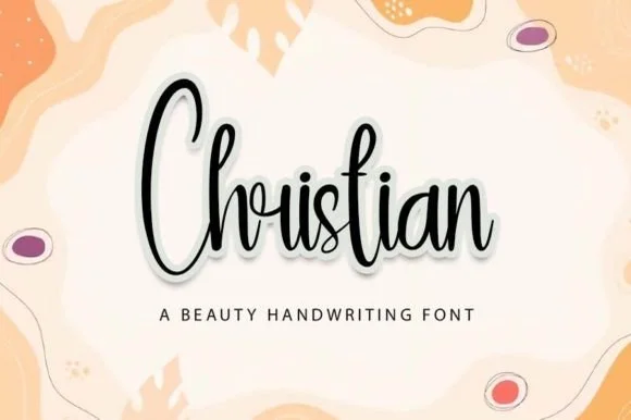
Tall condensed bouncy calligraphy script
Christian (by Yoni Art) is a tall, narrow bouncy handwritten script with elongated vertical loops and compact horizontal word width.
Ideas for this font
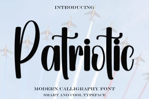
Bold upright brush-calligraphy script with connected crossbar
Patriotic is a sturdy, upright modern calligraphy brush script with bold downstrokes, rounded loops, and a sweeping t-crossbar.
Ideas for this font
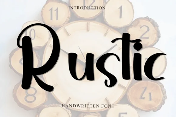
Handmade brush display with curls
Rustic is a handmade brush display in black over a wood-slice clock mockup: mixed-case letters with thick uneven strokes, curls on the R and the s, and a descender on the t, so the word reads as lettering painted on a rustic sign.
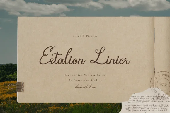
Nostalgic 1940s postal-letter & archival fountain-pen script
Estalion Linier is a nostalgic vintage letter-writing script mimicking 1940s fountain-pen ink on aged airmail and journal paper.
Ideas for this font
Same independent foundry
Allow optional Google Analytics to measure visits and catalogue actions. Your search words and notes are not included. Privacy & storage