Editorial Serif Anchor

Estalion Linier + Svara
Anchors Estalion Linier's fluid strokes with crisp Roman proportions on wedding suites, headers and packaging.
Inspect Svara specimenDisclosure: MakerFileHub may earn a commission from qualifying purchases via paid links on this page. How our links work.
Nostalgic 1940s postal-letter & archival fountain-pen script
Estalion Linier is a nostalgic vintage letter-writing script mimicking 1940s fountain-pen ink on aged airmail and journal paper.
Paid link
Get this fontProject & layout blueprintsAt-a-glance maker compatibility
Weld or Unite overlapping script joins into one continuous vector path before sending to the blade.
Visual anatomy & craft review
Estalion Linier mimics a 1940s fountain-pen hand written on airmail paper: a steady right slant, fine nib edges with slight tooth, and letterforms that narrow at speed but never lose their skeleton. The joins are genuine, the ascenders are modest, and the pressure shift is subtle, which lets the face read as a letter written by a person rather than a vintage display script. It holds at 11 pt in print, which is rare for this category, and it is best in a single ink colour on buff or cream stock with visible fibre.
Vintage-epistolary · Textured-nib · Archival
Two-font hierarchy recipes
Tested contrast partners — pairing Estalion Linier with grounded secondary typography.
Estalion Linier + Svara
Anchors Estalion Linier's fluid strokes with crisp Roman proportions on wedding suites, headers and packaging.
Inspect Svara specimen
Estalion Linier + Inkora
Keeps small-scale dates, URLs, nutrition facts and care instructions crisp and legible below script titles.
Inspect Inkora specimenPractical applications
Concrete hierarchy, scale and production guidance tailored to Estalion Linier’s stroke geometry.
A steady 1940s hand reproduces the look of a real letter with no texture overlay, which is the whole point of an ephemera kit. Fine nib edges hold at 11 pt where a display script would need twice the size.
Hierarchy & layout recipe
Ephemera sheets A5 and A6, 11/16 pt on a 78 mm measure, 15 mm margins, printed both sides on 100 gsm buff. Novel insert 120 x 180 mm, letter block 12/17 pt. Recipe card 105 x 148 mm, 10.5/15 pt, 12 mm margins.
Pre-production check
Double-sided printing on thin buff stock shows through, and a page of handwriting becomes noisy. Use 110 gsm or heavier and check one duplex sheet against a lamp before printing a kit.
Genuine joins and a light nib edge make a love-letter liner look written rather than typeset, which suits a vintage-themed wedding. Modest ascenders keep a full address block inside an envelope's width.
Hierarchy & layout recipe
Envelope 220 x 110 mm, address block 11/16 pt on a 90 mm measure, 15 mm from the left trim. Seal card 90 x 130 mm, message 11/16 pt. Guest book A4, headings 14 mm, ruled lines 9 mm pitch.
Pre-production check
Envelope liners are cut to a template and a line of script running past the liner edge gets trimmed. Print the liner on a separate sheet with a 10 mm bleed, then die-cut after printing.
Handwriting at reading size is what makes a printed thank-you feel personal rather than mass-produced, and 11 pt is small enough that a full note fits a card. The 1940s reference gives weight without ornament.
Hierarchy & layout recipe
Letter sheet A5, 11/16 pt on an 80 mm measure, 20 mm margins, ragged right, date line 6 mm above the greeting. Note card 105 x 148 mm, 10.5/15 pt, 15 mm margins. Recipe box 150 x 100 x 80 mm, lid label 8 mm with 12 mm margins.
Pre-production check
A printed letter at 11 pt invites the recipient to read it as handwriting, so any typographic error becomes conspicuous. Proofread the final text at 100 percent, and print a single copy for a hand check before the set.
Technical & licence verification
Confirm included OTF/TTF/WOFF formats, full glyph tables and licence coverage on the live store page before batch production.
Closest visual alternatives
Matched across letterform anatomy, stroke behaviour and craft applications.
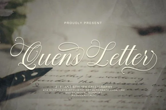
Elegant calligraphic script with swashed capitals
Quens Letter is an elegant calligraphic script in white over a handwritten-manuscript mockup: hairline upstrokes, thick downstrokes, capitals that open into long curled swashes, and a note that the file carries over four hundred glyphs with stylistic sets and an italic.
Ideas for this font
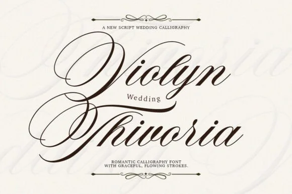
Grand copperplate wedding calligraphy with multi-looped capitals
Violyn Wedding Thivoria is a formal slanted calligraphy script distinguished by sweeping multi-looped capitals and smooth shaded lowercase.
Ideas for this font
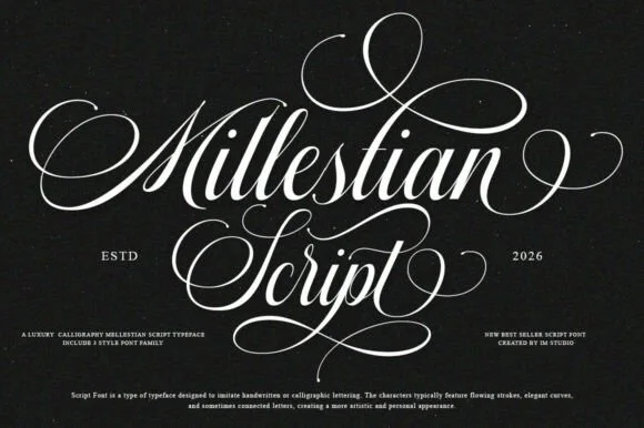
2-style PUA luxury Copperplate ornamental calligraphy family
Mallestian Script ('Millestian Script') is a PUA-encoded 2-style luxury Copperplate calligraphy family crowned with regal looping flourishes!
Ideas for this font
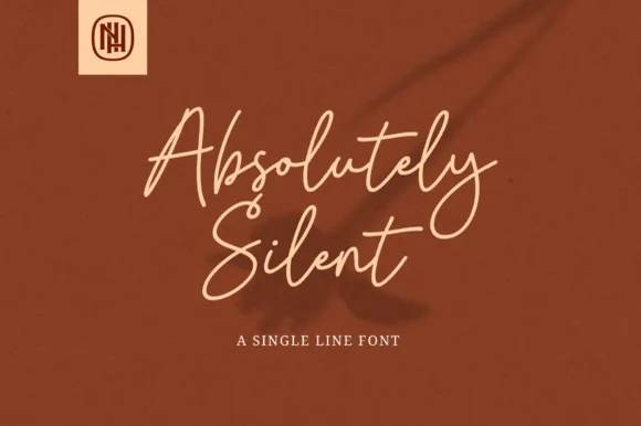
Airy tall-looped monoline fountain-pen script
Absolutely Silent is a graceful, slender monoline cursive script with tall narrow ascender loops and sweeping crossed 't' bars.
Ideas for this font
Same independent foundry
Allow optional Google Analytics to measure visits and catalogue actions. Your search words and notes are not included. Privacy & storage