Editorial Serif Anchor

Rustic + Stanza
Anchors Rustic's fluid strokes with crisp Roman proportions on wedding suites, headers and packaging.
Inspect Stanza specimenDisclosure: MakerFileHub may earn a commission from qualifying purchases via paid links on this page. How our links work.
Handmade brush display with curls
Rustic is a handmade brush display in black over a wood-slice clock mockup: mixed-case letters with thick uneven strokes, curls on the R and the s, and a descender on the t, so the word reads as lettering painted on a rustic sign.
Paid link
Get this fontProject & layout blueprintsAt-a-glance maker compatibility
Weld or Unite overlapping script joins into one continuous vector path before sending to the blade.
Visual anatomy & craft review
The specimen sets the word at large size in mixed case, and the drawing is a hand rather than a typeface: the R opens with a curled entry, the u and the s swell in the middle, the t finishes with a hook that drops below the baseline, and the c closes almost into a circle. Stroke weight varies noticeably between letters, which is what makes the pair look painted, and the spacing is loose enough that the curls read separately. The letters sit on a level baseline, which keeps the word legible despite the irregular weights. The ground is a pale photograph of wood slices arranged as a clock face, and the type is placed on the lightest area so the dark strokes hold, while the caption above and below is set in a small tracked serif.
Handmade, brushy, quirky, warm
Two-font hierarchy recipes
Tested contrast partners — pairing Rustic with grounded secondary typography.
Rustic + Stanza
Anchors Rustic's fluid strokes with crisp Roman proportions on wedding suites, headers and packaging.
Inspect Stanza specimen
Rustic + Cultivo
Keeps small-scale dates, URLs, nutrition facts and care instructions crisp and legible below script titles.
Inspect Cultivo specimenPractical applications
Concrete hierarchy, scale and production guidance tailored to Rustic’s stroke geometry.
A handmade brush face reads as painted lettering on wood, which is what a farm shop sign actually is, and the uneven weights look intentional at board size.
Hierarchy & layout recipe
Paint an 800 by 400 mm board: the name at 130 mm cap height, the opening hours in a 26 mm serif, and a hand-drawn rule between. Keep 30 mm between the display and the rule so the hooked descender stays clear.
Pre-production check
Check the board at four metres in daylight, where a thin stroke can fade on a pale ground; use a darker ink. Confirm the 26 mm hours read at two metres and that the hook of the t does not touch the rule.
A handmade label gives a honey jar the look of a kitchen product, and the thick strokes stay legible on a small round label where a thin script would not.
Hierarchy & layout recipe
Print a 55 mm round label: the name at 16 pt, the variety in a 7 pt serif, and the weight in 6 pt. Keep 4 mm of clear label inside the die so the descender is never cut, and print one ink on a cream stock.
Pre-production check
Check the 16 pt name on the jar, where the curls can close; open the spacing for the label version. Confirm the 6 pt weight reads on the glass curve and that the hooked descender clears the die line.
A handmade display reads as a painted farmhouse sign, and the mixed case with curls gives a kitchen print a warm, unpolished character.
Hierarchy & layout recipe
A3 print: the phrase at 90 mm cap height, a second line in the same face at 40 mm, and no other element. Keep 30 mm margins and print one ink on a warm paper so the brush edges read as texture.
Pre-production check
Check the print at A3, where the uneven strokes can look like a rendering error; keep the weight variation deliberate. Confirm the second line reads at a metre and that the curls do not touch the frame.
Technical & licence verification
Confirm included OTF/TTF/WOFF formats, full glyph tables and licence coverage on the live store page before batch production.
Closest visual alternatives
Matched across letterform anatomy, stroke behaviour and craft applications.
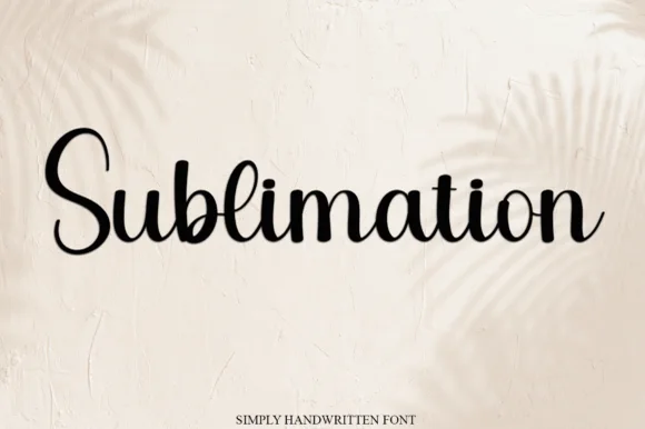
Simple handwritten script
Sublimation is a simple handwritten script in black on a cream wall: a light stroke with gentle contrast, upright letterforms, small loops on the ascenders and open counters, so the word reads as a name written with a fine brush pen rather than as a formal calligraphy.
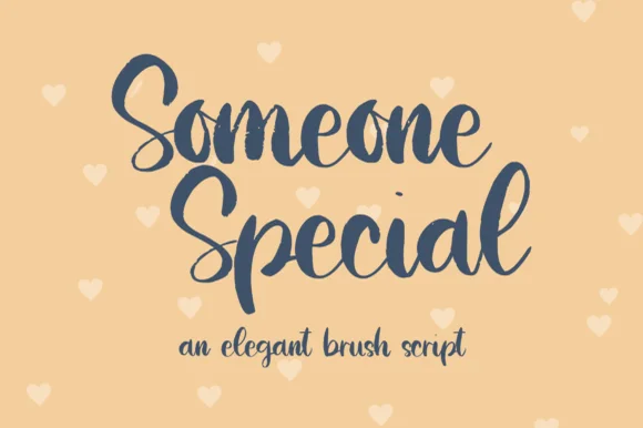
Elegant brush script
Someone Special is an elegant brush script in navy on peach: thick downstrokes with a visible brush entry, thin upstrokes, wide looping capitals on the S, and a joined lowercase whose final l lifts into a loop, with pale hearts scattered across the ground.
Ideas for this font
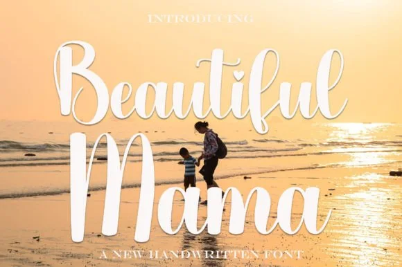
Bold bouncy sunset-beach brush calligraphy script
Beautiful Mama is a warm, thick-stroked brush calligraphy script (not a block display) featuring tall upright loops and sturdy vinyl-ready curves.
Ideas for this font
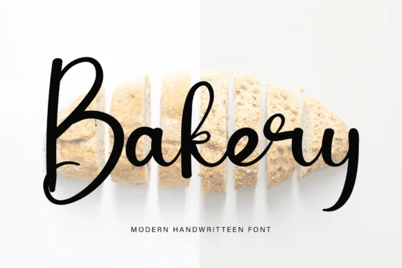
Tall lively modern brush calligraphy script
Bakery (by pinkmeca) is a tall, lively modern brush calligraphy script pairing a big rounded 'B' with energetic thick-and-thin cursive loops.
Ideas for this font
Same independent foundry
Allow optional Google Analytics to measure visits and catalogue actions. Your search words and notes are not included. Privacy & storage