Modern Grotesque Body

Super Uncle + Noar
Creates crisp high-hierarchy contrast beneath Super Uncle headlines across menus, websites and labels.
Inspect Noar specimenDisclosure: MakerFileHub may earn a commission from qualifying purchases via paid links on this page. How our links work.
Tall narrow soft slab
Super Uncle is a tall narrow soft slab in a pink-to-orange gradient on a pale ground: condensed caps with rounded ends, open curves and a light weight, set on two lines with a tracked line beneath and soft blurred circles behind the block.
Paid link
Get this fontProject & layout blueprintsAt-a-glance maker compatibility
Sturdy stroke walls and open counters weed cleanly on adhesive vinyl, HTV apparel film, and cut cardstock.
Visual anatomy & craft review
The two words are stacked and each letter carries a different tone of one gradient, which is a colour decision rather than a letterform one, but it matters because it shows how the face behaves when the letters are not uniform. The drawing is a narrow slab with rounded ends and open curves, so the face reads as friendly rather than industrial, and the light weight keeps the tall letters from looking heavy. Because the strokes are thin and the letters narrow, the face works at moderate sizes as well as display, and the plate shows both lines at a size where the curves are visible. The blurred circles behind the block are staging, and the tracked line beneath is the only plain text, naming the style.
Slab, tall, narrow, friendly
Two-font hierarchy recipes
Tested contrast partners — pairing Super Uncle with grounded secondary typography.
Super Uncle + Noar
Creates crisp high-hierarchy contrast beneath Super Uncle headlines across menus, websites and labels.
Inspect Noar specimen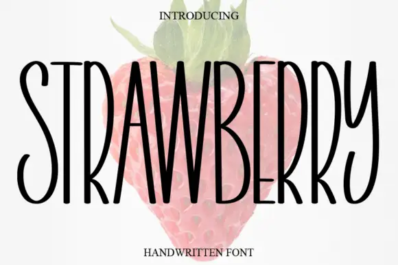
Super Uncle + Strawberry
Adds a warm human signature touch for 1-to-3-word callouts without competing against structured serif capitals.
Inspect Strawberry specimenPractical applications
Concrete hierarchy, scale and production guidance tailored to Super Uncle’s stroke geometry.
A tall soft slab sets a party greeting in a friendly voice, and the light strokes keep a gradient print from muddying at small size.
Hierarchy & layout recipe
A6 card: the greeting at 26 pt, the details at 9 pt, and the date at 8 pt. Keep 14 mm margins and print two colours on a white card with a soft background shape.
Pre-production check
Check the 26 pt greeting at home-print resolution, where a rounded end can fill; keep the counters above 0.6 mm. Confirm the 9 pt details keep a 4.5:1 contrast and that the card folds flat.
A narrow soft slab fits a long product name on a small label, and the rounded ends keep it playful rather than industrial.
Hierarchy & layout recipe
Print a 55 by 85 mm label: the brand at 14 pt, the flavour at 8 pt, and the volume at 6 pt. Keep 4 mm inside the die and print three colours on a white stock.
Pre-production check
Check the 14 pt brand on a curved bottle, where narrow letters distort; reduce the width. Confirm the 6 pt volume reads on the shelf and that the label holds in a cooler.
A friendly slab suits a printed gift tag, and the narrow letters keep a long recipient name on one line at forty-five millimetres.
Hierarchy & layout recipe
Print 45 by 70 mm tags: the name at 12 pt, the date at 7 pt, and two colours on a cream card. Keep 4 mm inside the die and punch a 3 mm hole clear of the letters.
Pre-production check
Check the 12 pt name on a 45 mm tag, where the rounded end can reach the hole; keep 6 mm clearance. Confirm the tags tie cleanly and that the ink holds on a textured card.
Technical & licence verification
Confirm included OTF/TTF/WOFF formats, full glyph tables and licence coverage on the live store page before batch production.
Closest visual alternatives
Matched across letterform anatomy, stroke behaviour and craft applications.
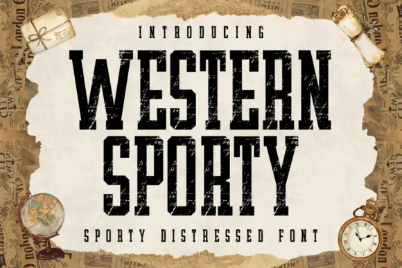
Very condensed distressed slab
Western Sporty is a very condensed square slab in black on a torn paper sheet: tall caps with heavy square slabs, scratched irregular fill and rough edges, set on two lines with a tracked line above and a caption beneath, over a ground of aged newspaper and travel props.
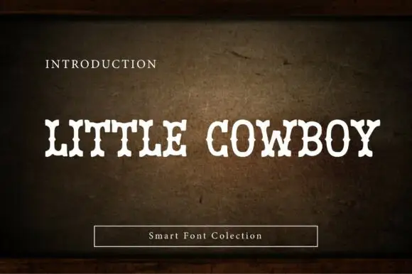
Soft narrow western slab
Little Cowboy is a soft narrow western slab in cream on a worn leather ground: capitals with bifurcated slab ends, waist spurs and slight swelling at the joins, set as one line with a small plain line above and a boxed label beneath.
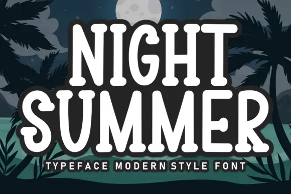
Rounded slab with curled terminals
Night Summer is a tall rounded slab in white with a heavy dark outline on a night beach illustration: capitals with slab ends, curled S and G terminals and soft corners, set in two lines with a tracked line beneath and a thick outline that separates the words from the palms behind.
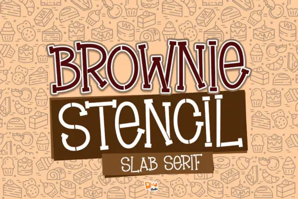
Slender irregular slabs with deliberate stencil-like gaps
Brownie Stencil combines a brown outlined BROWNIE title with a thin white STENCIL row, where the tall letters vary in width, small breaks interrupt strokes at several joins and curves, and a pastry pattern, colour panels and title edging fill the cover around them.
Ideas for this font
Same independent foundry
Allow optional Google Analytics to measure visits and catalogue actions. Your search words and notes are not included. Privacy & storage