Modern Grotesque Body

Gothic Halloween + Memoir Slang
Creates crisp high-hierarchy contrast beneath Gothic Halloween headlines across menus, websites and labels.
Inspect Memoir Slang specimenDisclosure: MakerFileHub may earn a commission from qualifying purchases via paid links on this page. How our links work.
Upright capitals with pointed crossbars and small diamond accents
Gothic Halloween shows tall white capitals across a dark cave scene, where the H carries a sharp waist-level crossbar, the O is a narrow oval and fine triangular flares appear at the joins, with bats and sparkles filling the setting around the word.
Paid link
Get this fontProject & layout blueprintsAt-a-glance maker compatibility
Sturdy stroke walls and open counters weed cleanly on adhesive vinyl, HTV apparel film, and cut cardstock.
Visual anatomy & craft review
The stems stand upright and tall, the crossbars point, the bowls narrow and the accents sit at the junctions. That pointed crossbar is the character: an upright serif gains a gothic edge without any broken strokes, which is why the sample keeps one word in a cave. The bats and sparkles supply the setting rather than the letters, so check whether the interior accents are selectable, keep 40 pt and set the word on a plain field before adding any scenery.
Upright capitals with pointed crossbars and small diamond accents
Two-font hierarchy recipes
Tested contrast partners — pairing Gothic Halloween with grounded secondary typography.
Gothic Halloween + Memoir Slang
Creates crisp high-hierarchy contrast beneath Gothic Halloween headlines across menus, websites and labels.
Inspect Memoir Slang specimen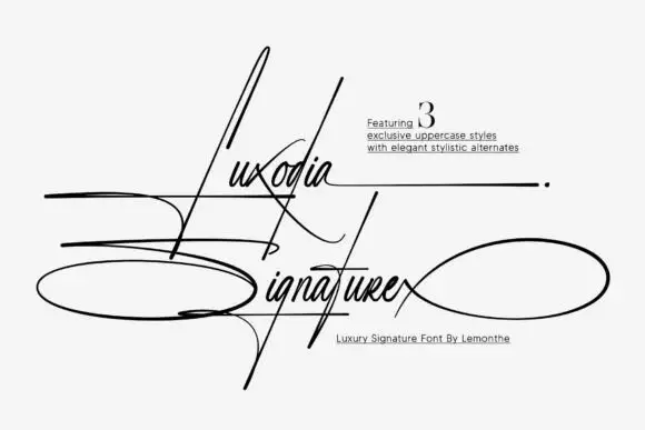
Gothic Halloween + Luxodia Signature
Adds a warm human signature touch for 1-to-3-word callouts without competing against structured serif capitals.
Inspect Luxodia Signature specimenPractical applications
Concrete hierarchy, scale and production guidance tailored to Gothic Halloween’s stroke geometry.
The pointed caps set a seasonal poster, and the narrow ovals hold a two-word title at 56 pt on an A2 sheet, where the triangular flares stay crisp in white.
Hierarchy & layout recipe
Print an A2 poster: set the title at 56 pt on one row, keep 24 mm of clear ground beneath before the times at 15 pt, and keep the background dark and flat so the pointed joins read.
Pre-production check
Small diamond accents may be layout additions; check the file before promising them in your design.
The upright caps suit a fiction heading, and the pointed crossbars give a one-word title a period edge at 50 pt on a page, where the narrow bowls keep the column tight.
Hierarchy & layout recipe
Print a 210 mm page: set the heading at 50 pt on one row, keep 20 mm of clear ground beneath before the standfirst at 10 pt, and keep the body in a roman serif so the heading carries the theme.
Pre-production check
Two pointed rows on one page compete; check the layout and keep the deck in a plain face, since the crossbars need 40 pt to stay sharp.
The narrowed caps give a bottle a theme, and the pointed joins hold a short name at 22 pt on a 55 by 65 mm label, where the white letters read on a dark ground.
Hierarchy & layout recipe
Print a 55 by 65 mm label: set the name at 22 pt on one row, keep 10 mm of clear ground beneath before the strength at 6 pt, and keep the label dark so the pointed flares stay visible.
Pre-production check
The crossbar points close below 16 pt; check the plate proof and hold the name at 20 pt or above.
Technical & licence verification
Confirm included OTF/TTF/WOFF formats, full glyph tables and licence coverage on the live store page before batch production.
Closest visual alternatives
Matched across letterform anatomy, stroke behaviour and craft applications.
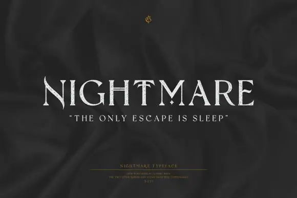
Fine uppercase serifs with blade-like points and a diamond separator
Nightmare is a refined display serif with very wide capitals, high stroke contrast and small sharp spurs at the ends of the stems, set quiet and pale on a dark ground.
Ideas for this font
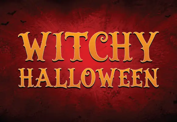
Spooky serif with pointed terminals
Witchy Halloween is a decorative serif in gold on a dark red wall: heavy letters with pointed serifs and small spurs, softened by a bevel that catches light along the top edge, set as two stacked words with bats in the corners.
Ideas for this font
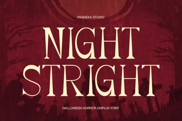
High-contrast horror serif display
Night Stright is a horror display serif in bone cream on blood red: very high contrast, tall pointed serifs that flare into thorns, a splayed M and sharp wedge terminals, set over a graveyard silhouette, so the pair reads as a film title rather than as an editorial serif.
Ideas for this font
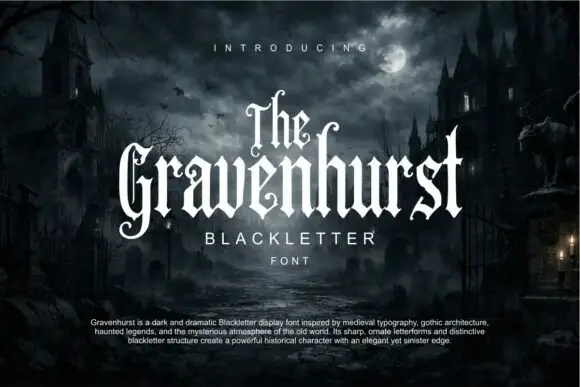
Slim blackletter with curled capital terminals and tall ascenders
Gravenhurst sets a condensed blackletter in white against a moonlit churchyard, its capitals hooked, its ascenders drawn to fine points and its counters kept narrow enough to feel carved.
Ideas for this font
Same independent foundry
Allow optional Google Analytics to measure visits and catalogue actions. Your search words and notes are not included. Privacy & storage