High-Contrast Display Serif

Dream Savage + Papillon Serif – Elegant Modern Luxury
Pairs sculptural editorial warmth with Dream Savage's clean modern geometry.
Inspect Papillon Serif – Elegant Modern Luxury specimenDisclosure: MakerFileHub may earn a commission from qualifying purchases via paid links on this page. How our links work.
Broad bold capitals with triangular A counters and open curved S and G
Dream Savage sets two stacked words in a heavy condensed grotesque, the caps tall and flat-ended, the apertures tight and the two rows in different greens so the pair reads as one mark.
Paid link
Get this fontProject & layout blueprintsAt-a-glance maker compatibility
Sturdy stroke walls and open counters weed cleanly on adhesive vinyl, HTV apparel film, and cut cardstock.
Visual anatomy & craft review
DREAM over SAVAGE fills the page width, the strokes thick enough that the counters become narrow slots and the spacing close enough that the words almost touch. The C and the S keep small flat openings, the A comes to a blunt apex and the G closes with a short bar. Nothing is rounded, so the face reads as an industrial marque rather than a friendly poster face. Small tracked captions sit above and below in the same colour family, and there is no other element on the cover. Stacked in two rows the face gives a poster a solid block of colour, and that is its use: loud short words at large sizes, where the tight apertures still print as gaps.
Broad bold capitals with triangular A counters and open curved S and G
Two-font hierarchy recipes
Tested contrast partners — pairing Dream Savage with grounded secondary typography.
Dream Savage + Papillon Serif – Elegant Modern Luxury
Pairs sculptural editorial warmth with Dream Savage's clean modern geometry.
Inspect Papillon Serif – Elegant Modern Luxury specimen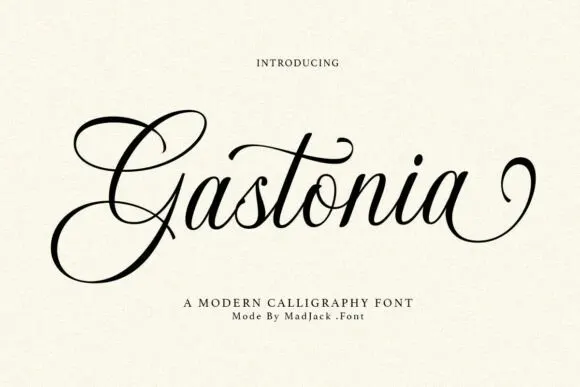
Dream Savage + Gastonia Script
Introduces organic movement on pull-quotes, signatures and gift tags.
Inspect Gastonia Script specimenPractical applications
Concrete hierarchy, scale and production guidance tailored to Dream Savage’s stroke geometry.
The heavy condensed blocks read across a field, and two stacked words fit a banner that has to be seen from the far touchline.
Hierarchy & layout recipe
Print a 1500 by 600 mm banner: set the two rows at 200 pt with 40 mm between baselines, keep 34 mm of clear ground beneath before the times at 26 pt, and keep 40 mm of border all round.
Pre-production check
Tight counters fill in cheap banner printing; check a physical test print before the order.
The condensed weight holds a masthead over a chart or a photograph, and the flat terminals print sharply at speed on newsprint.
Hierarchy & layout recipe
Print a 220 by 290 mm cover: set the masthead at 96 pt on one row, keep 22 mm of clear ground beneath before the issue line at 11 pt, and keep 18 mm of margin from the trim edge.
Pre-production check
Heavy ink coverage can set off on uncoated stock; check the press proof before the full run.
The condensed capitals give a gym a mark that reads at sign scale, and two short words stack into a square block for a window decal.
Hierarchy & layout recipe
Print an 800 by 400 mm window decal: set the two words at 80 mm stacked, keep 24 mm of clear ground beneath before the schedule at 12 mm, and keep 28 mm of border so the decal frames cleanly.
Pre-production check
Closely spaced letters bridge on cut vinyl; check a weeding test before the decal run starts.
Technical & licence verification
Confirm included OTF/TTF/WOFF formats, full glyph tables and licence coverage on the live store page before batch production.
Closest visual alternatives
Matched across letterform anatomy, stroke behaviour and craft applications.
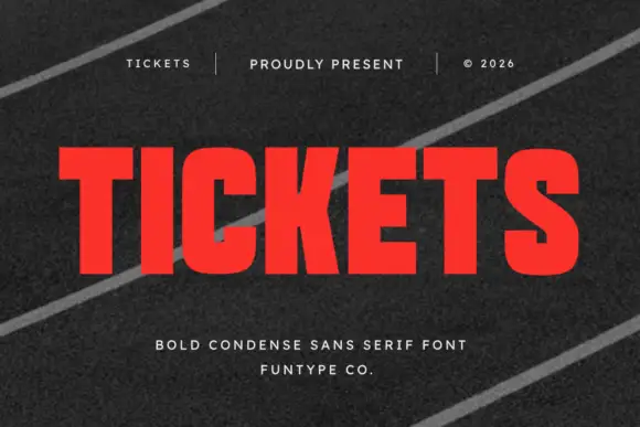
Bold condensed sans display
Tickets is a bold condensed sans in red on a dark striped ground: heavy stems, narrow counters, flat terminals and a tall x-height, set edge to edge with a tracked header and credit above and below, so the word reads as a ticket stub headline.
Ideas for this font
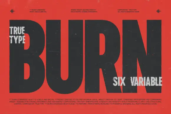
Heavy condensed variable sans
TRT Burn is a very heavy condensed sans in near-black on vermilion: capitals with broad flat stems, tight bowls and almost no counters, set as one word at full width with small tracked notes at the four corners and a paragraph of specification text along the foot.
Ideas for this font
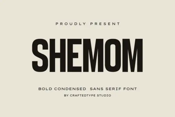
Bold condensed sans
Shemom Font is a bold condensed sans in near-black on a warm cream ground: capitals with narrow oval counters, deep M diagonals and an even heavy stroke, set as one large word with a small tracked line above and two plain lines beneath.
Ideas for this font
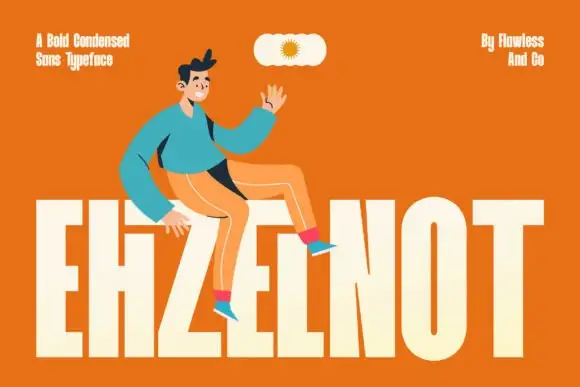
Very tall heavy capitals with narrow vertical counters and a tightly joined H area
Ehzelnot sets a bold condensed sans in cream on orange, the stems tall, the terminals flat and the letters packed tight, so a single word fills the lower half of the frame.
Same independent foundry
Allow optional Google Analytics to measure visits and catalogue actions. Your search words and notes are not included. Privacy & storage