Modern Grotesque Body

Brownie Stencil + Borsen
Creates crisp high-hierarchy contrast beneath Brownie Stencil headlines across menus, websites and labels.
Inspect Borsen specimenDisclosure: MakerFileHub may earn a commission from qualifying purchases via paid links on this page. How our links work.
Slender irregular slabs with deliberate stencil-like gaps
Brownie Stencil combines a brown outlined BROWNIE title with a thin white STENCIL row, where the tall letters vary in width, small breaks interrupt strokes at several joins and curves, and a pastry pattern, colour panels and title edging fill the cover around them.
Paid link
Get this fontProject & layout blueprintsAt-a-glance maker compatibility
Open counter bridges hold interior islands intact on laser-cut wood, acrylic, and mylar stencils.
Visual anatomy & craft review
The slab feet stay square, the letters stay tall and narrow, the widths shift row by row and the stencil breaks cut the strokes at joins rather than at the middle. That interruption is the character, because the word reads as a cut stencil rather than a slab face with a texture. The pastry pattern and the panels are cover artwork. Keep 44 pt so the breaks stay open, check that each break is deliberate in your file, and test on fabric where a stencil cut needs bridges to hold.
Slender irregular slabs with deliberate stencil-like gaps
Two-font hierarchy recipes
Tested contrast partners — pairing Brownie Stencil with grounded secondary typography.
Brownie Stencil + Borsen
Creates crisp high-hierarchy contrast beneath Brownie Stencil headlines across menus, websites and labels.
Inspect Borsen specimen
Brownie Stencil + Abigail
Adds a warm human signature touch for 1-to-3-word callouts without competing against structured serif capitals.
Inspect Abigail specimenPractical applications
Concrete hierarchy, scale and production guidance tailored to Brownie Stencil’s stroke geometry.
The stencil slab gives a box a bakery register and the breaks read at label size without needing a second graphic element.
Hierarchy & layout recipe
Print an 80 by 60 mm box label: set the product word at 24 pt on one row, keep 10 mm of clear ground beneath before the weight at 7 pt, and keep 7 mm to the die edge so the breaks are not clipped.
Pre-production check
Breaks under 1 mm close on uncoated stock; check the plate proof and keep the word at 22 pt or above.
The open breaks let a stencil be cut from card and reused, which is the practical reason to choose this face for a crate.
Hierarchy & layout recipe
Cut a 300 by 100 mm stencil: set the word at 50 mm on one row, keep bridges at least 6 mm wide, keep 18 mm of clear ground between letters for the cutter, and keep 20 mm of border so the sheet holds.
Pre-production check
Thin bridges tear on the second use of the stencil; check the cut test and widen every bridge to 6 mm or more.
The tall letters read across a counter and the stencil breaks give a market sign a hand-cut story that a solid slab lacks.
Hierarchy & layout recipe
Paint a 600 by 300 mm board: set the stall name at 60 mm on one row, keep 24 mm of clear ground beneath before the prices at 16 pt, and keep 26 mm of border so the flared feet stay whole.
Pre-production check
Breaks fill when painted with a roller; check the mask artwork and brush the breaks by hand.
Technical & licence verification
Confirm included OTF/TTF/WOFF formats, full glyph tables and licence coverage on the live store page before batch production.
Closest visual alternatives
Matched across letterform anatomy, stroke behaviour and craft applications.
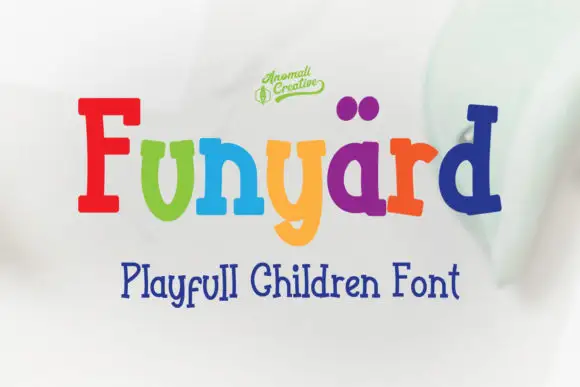
Bouncy mixed-case slabs with rounded bowls and uneven stems
Funyard uses multicoloured mixed-case lettering on a pale blurred field, where a tall red F and a blue d frame shorter soft rounded forms, the y drops into a broad curved descender and two purple dot-like shapes sit above the central letters as a playful accent.
Ideas for this font
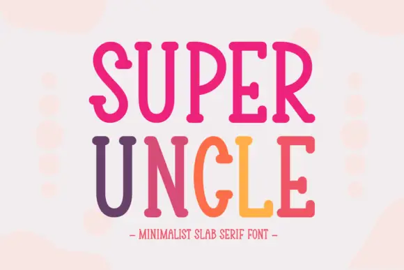
Tall narrow soft slab
Super Uncle is a tall narrow soft slab in a pink-to-orange gradient on a pale ground: condensed caps with rounded ends, open curves and a light weight, set on two lines with a tracked line beneath and soft blurred circles behind the block.
Ideas for this font
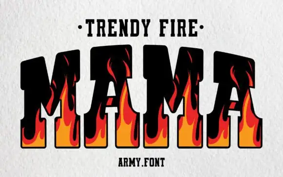
Flame-filled varsity slab
Trendy Fire is a varsity slab in black with flame shapes rising through the letters: heavy squared capitals with thick serifs, an orange-to-red flame drawn inside each stem and licking up past the top bar, set as one large word between a dotted line above and a plain credit beneath.
Ideas for this font
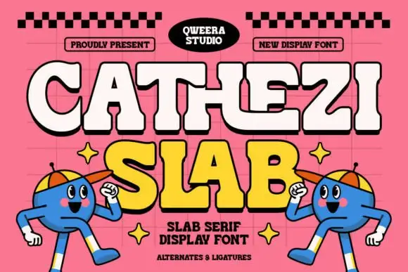
Playful chunky slabs with curled joins and softened notches
Cathezi Slab presents cream CATHEZI above yellow SLAB on pink. Thick rounded stems bend into unexpected curls with soft inward cuts, the E sweeps a long lower arm, black edging gives the irregular shapes a clear silhouette, and the short A counter stays small inside the heavy fill.
Ideas for this font
Same independent foundry
Allow optional Google Analytics to measure visits and catalogue actions. Your search words and notes are not included. Privacy & storage