Modern Grotesque Body

Little Cowboy + Prime Nordic
Creates crisp high-hierarchy contrast beneath Little Cowboy headlines across menus, websites and labels.
Inspect Prime Nordic specimenDisclosure: MakerFileHub may earn a commission from qualifying purchases via paid links on this page. How our links work.
Soft narrow western slab
Little Cowboy is a soft narrow western slab in cream on a worn leather ground: capitals with bifurcated slab ends, waist spurs and slight swelling at the joins, set as one line with a small plain line above and a boxed label beneath.
Paid link
Get this fontProject & layout blueprintsAt-a-glance maker compatibility
Sturdy stroke walls and open counters weed cleanly on adhesive vinyl, HTV apparel film, and cut cardstock.
Visual anatomy & craft review
The word is set in one line with generous space above and below, which suits a face whose character sits in the serifs rather than in the silhouette. The drawing is a narrow capital with bifurcated ends and small spurs at the waist, so the letters read as a wooden sign rather than as a modern slab, and the softened corners keep the genre friendly rather than harsh. That construction sets a moderate size floor, because the spurs close when the letters shrink. The leather ground is staging that names the register, and the boxed label beneath is product copy that names the collection. Because the letters are narrow, the face fits a long name on a sign, a tag and a shirt, and the plate sets them large enough that each bifurcation is visible.
Slab, western, narrow, soft
Two-font hierarchy recipes
Tested contrast partners — pairing Little Cowboy with grounded secondary typography.
Little Cowboy + Prime Nordic
Creates crisp high-hierarchy contrast beneath Little Cowboy headlines across menus, websites and labels.
Inspect Prime Nordic specimen
Little Cowboy + Silken Luxe
Adds a warm human signature touch for 1-to-3-word callouts without competing against structured serif capitals.
Inspect Silken Luxe specimenPractical applications
Concrete hierarchy, scale and production guidance tailored to Little Cowboy’s stroke geometry.
A narrow western slab reads as a carved sign, and the bifurcated serifs give a long name character on a board. A ranch sign is read from a moving car.
Hierarchy & layout recipe
Paint a 1,100 by 400 mm board: the ranch at 120 mm cap height, the rates in a 24 mm slab, and a 5 mm rule. Keep 26 mm margins and paint two colours on a primed board.
Pre-production check
Check the board at 120 mm, where a spur can look like a chip; keep the cuts deliberate. Confirm the 24 mm rates read at three metres and that the rule survives a wet season.
A western slab sets a themed invitation without a costume illustration, and the warm cream prints at home. The theme carries without an illustration.
Hierarchy & layout recipe
A6 card: the greeting at 26 pt, the details in a 9.5 pt sans, and the date at 8.5 pt. Keep 15 mm margins and print two colours on a kraft card. Leave 12 mm at the foot for the address line.
Pre-production check
Check the 26 pt greeting on kraft, where a spur can clot; keep the smallest detail above 1 mm. Confirm the 9.5 pt details keep a 4.5:1 contrast and that the card folds flat.
A western slab signals leatherwork on a shelf, and the narrow letters fit a long workshop name on a small tag. Leatherwork sells on a printed tag.
Hierarchy & layout recipe
Print a 50 by 70 mm tag: the workshop at 12 pt, the item at 7.5 pt, and one colour on a tan card. Keep 5 mm inside the die and stamp or print the type above 0.4 mm.
Pre-production check
Check the 12 pt name stamped on leather, where a spur can fill; keep the stroke above 0.6 mm. Confirm the 7.5 pt item reads at arm's length and that the tag takes a rivet.
Technical & licence verification
Confirm included OTF/TTF/WOFF formats, full glyph tables and licence coverage on the live store page before batch production.
Closest visual alternatives
Matched across letterform anatomy, stroke behaviour and craft applications.
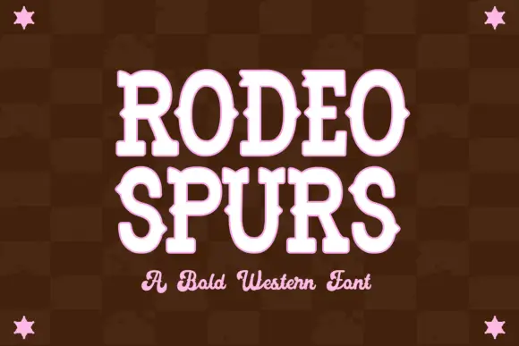
Western slab with mid-stroke spurs
Rodeo Spurs is a tall rounded western slab in pale pink on a dark brown check: heavy caps with pointed spurs standing out from the mid-stroke, round bowls and a strong vertical stress, with a script line beneath in the same tone and four stars set in the corners.
Ideas for this font
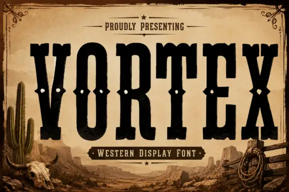
Tall western slab
Vortex is a very tall western slab in black on a sepia desert scene: narrow caps with heavy square slabs, spurs at the joins, and a row of small diamond cut-outs across the waist of each letter, with a small line above in a rule frame and a banner beneath naming the style.
Ideas for this font
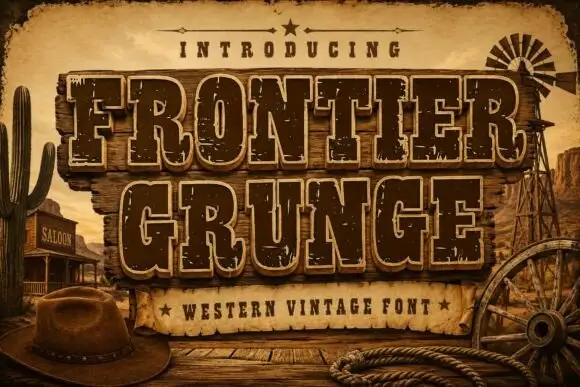
Tall Western slabs with pale edging and chipped fill
Frontier Grunge shows dark brown slab capitals with pale contours on wooden boards, where tall narrow counters and pinched sides sit beside scattered pale chips that create a layered worn surface, and the boards, rope, hat and windmill form the scene around the word.
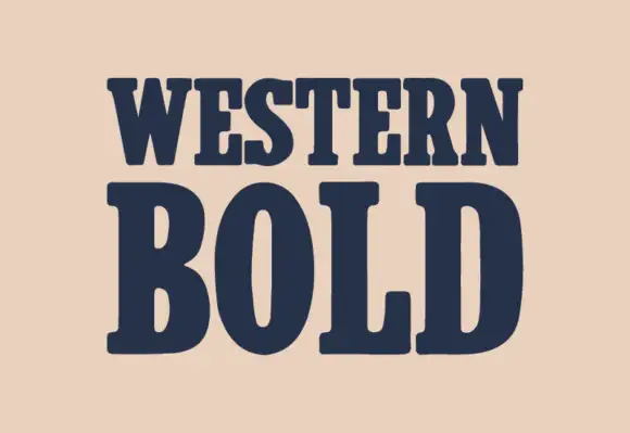
Heavy western slab
Western Bold is a heavy slab shown in navy on a warm sand ground: two lines of capitals with broad rounded brackets, narrow vertical counters in the O, blunt serifs and a heavy even stroke, with no ornament on the sheet at all.
Ideas for this font
Same independent foundry
Allow optional Google Analytics to measure visits and catalogue actions. Your search words and notes are not included. Privacy & storage



