High-Contrast Display Serif

Rustic Baseball + Majestic Letters
Pairs sculptural editorial warmth with Rustic Baseball's clean modern geometry.
Inspect Majestic Letters specimenDisclosure: MakerFileHub may earn a commission from qualifying purchases via paid links on this page. How our links work.
Distressed condensed slab caps
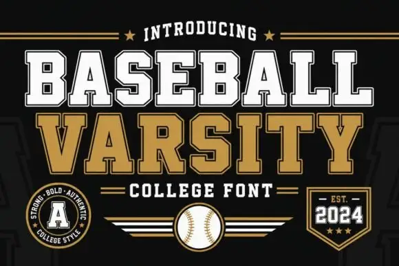
Rustic Baseball is a distressed condensed slab in red and black on cream: heavy flat serifs, tall narrow caps, chipped edges and a speckled fill, with two small stars flanking a tracked caption, so the sheet reads as a vintage team print.
Paid link
Get this fontProject & layout blueprintsAt-a-glance maker compatibility
Fine grain and micro-texture excel in 300 DPI print, sublimation, and screen print rather than small vinyl weeding.
Visual anatomy & craft review
Two lines are stacked in two colours, and the drawing is a condensed slab built for sport: the stems are heavy, the serifs are square blocks that match the stems, and the counters are narrow, which gives the words the look of a stencil cut for a jersey. The damage is the same scale on both lines, so the red and the black read as the same plate printed twice, and the chips are concentrated on the edges and the corners rather than spread across the counters, which keeps the letters readable at a distance. The stars and the tracked caption beneath repeat the period language, and the cream ground keeps the two inks from vibrating. Because the face is condensed and heavy, it holds up in a small format as well as at poster size, which the specimen demonstrates by keeping everything large and simple.
Vintage, sporty, distressed, American
Two-font hierarchy recipes
Tested contrast partners — pairing Rustic Baseball with grounded secondary typography.
Rustic Baseball + Majestic Letters
Pairs sculptural editorial warmth with Rustic Baseball's clean modern geometry.
Inspect Majestic Letters specimen
Rustic Baseball + Welcome
Introduces organic movement on pull-quotes, signatures and gift tags.
Inspect Welcome specimenPractical applications
Concrete hierarchy, scale and production guidance tailored to Rustic Baseball’s stroke geometry.
A distressed slab reads as a period team print, which is exactly the reference a vintage shop wants, and the two-ink version prints cheaply on paper bags and tags.
Hierarchy & layout recipe
Print a 300 by 200 mm bag: the name at 80 mm cap height in one ink, the address in a 12 mm sans, and a 4 mm rule. Keep the damage away from the smallest line so the address stays clean, and print on kraft.
Pre-production check
Check the 80 mm name on kraft, where the speckle can vanish into the paper texture; open the fill for that stock. Confirm the 12 mm address reads at arm's length and that the bag survives a filled weight of five kilos.
A vintage sports slab sets the theme in two words, and the distressed texture means the invitation looks printed rather than downloaded, which matters for a party that leans on team nostalgia.
Hierarchy & layout recipe
A6 card: the headline at 34 pt in the red cut, the details in a 9 pt sans, and two small stars flanking the date. Keep 12 mm margins and print two inks on a cream card so the chip texture reads at card size.
Pre-production check
Check the 34 pt headline, where the damage can close a narrow counter; use the cleaner cut at that size. Confirm the 9 pt details keep a 4.5:1 contrast and that the stars do not crowd the trim.
A period slab frames a sports history as a document of its era, and the condensed width fits a long club name across a book cover without wrapping.
Hierarchy & layout recipe
Set the title at 90 mm cap height across 230 mm, the subtitle in a 10 pt sans, and the author in 9 pt caps. Print two inks on a cream stock and keep a single archival photograph in the lower third.
Pre-production check
Check the title at thumbnail size, where the distress reduces contrast; use the black cut for the primary word. Confirm the 9 pt author survives lamination and that the title clears the trim by 15 mm on every side.
Technical & licence verification
Confirm included OTF/TTF/WOFF formats, full glyph tables and licence coverage on the live store page before batch production.
Closest visual alternatives
Matched across letterform anatomy, stroke behaviour and craft applications.
Modern condensed sans in very tall capitals
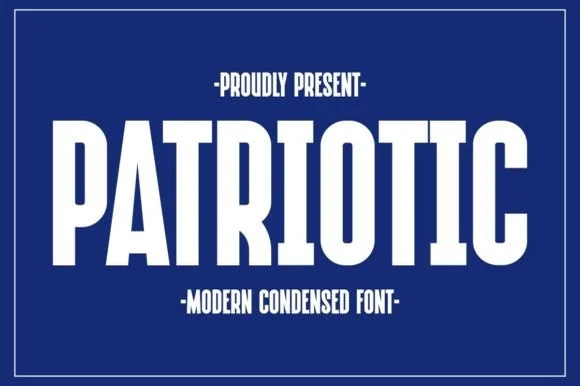
Patriotic is a modern condensed sans in white on navy: very tall narrow capitals with flat terminals, tight fitting and short counters, framed by a thin rule with small tracked capital lines above and below.
Ideas for this font
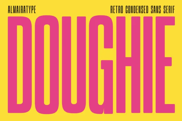
Ultra-tall 5:1 pillar-condensed retro poster sans
Doughie is an ultra-tall, compressed retro condensed sans stretching rounded-corner vertical pillars edge-to-edge across posters and packaging!
Ideas for this font

Clean straight-sided heritage coffeehouse condensed grotesk (OTF/TTF + Multilingual)
Hermano is a clean, straight-sided vintage condensed grotesk with softly eased corners built for coffee roasters, craft beer, and utilitarian labels (OTF & TTF).
Ideas for this font

Tall architectural condensed poster sans serif
Headline is a crisp, heavy condensed sans serif engineered with flat horizontal terminals, narrow counters, and clean newspaper-poster punch.
Ideas for this font
Same independent foundry
Allow optional Google Analytics to measure visits and catalogue actions. Your search words and notes are not included. Privacy & storage