Modern Grotesque Body

Rustpress + Lemon Milk Pro FTR
Creates crisp high-hierarchy contrast beneath Rustpress headlines across menus, websites and labels.
Inspect Lemon Milk Pro FTR specimenDisclosure: MakerFileHub may earn a commission from qualifying purchases via paid links on this page. How our links work.
Condensed grunge grotesque
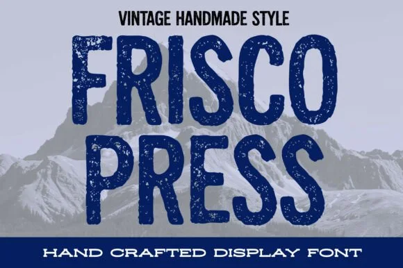
Rustpress is a condensed grotesque in black on a stained white ground: narrow caps with square shoulders, thick even stems, and a distress of punched holes and scratches that makes the word read as a rubber stamp pressed too hard.
Paid link
Get this fontProject & layout blueprintsAt-a-glance maker compatibility
Fine grain and micro-texture excel in 300 DPI print, sublimation, and screen print rather than small vinyl weeding.
Visual anatomy & craft review
The word runs edge to edge across the page and the first and last letters are cut by the frame, which is the strongest evidence that the face is meant to be set large. The skeleton is a condensed grotesque: the O is narrow, the R has a straight leg, and the counters are small, so the texture of punched holes does not destroy the reading. The wear is drawn as discrete holes and thin scratches rather than as a fog, which keeps the letterforms crisp and prints cleanly in one ink on a speckled ground. There is no other type on the page except a caption in a wide-tracked grotesque at the foot, which is set solid so the contrast with the distressed display is obvious.
Grunge, condensed, industrial, worn
Two-font hierarchy recipes
Tested contrast partners — pairing Rustpress with grounded secondary typography.
Rustpress + Lemon Milk Pro FTR
Creates crisp high-hierarchy contrast beneath Rustpress headlines across menus, websites and labels.
Inspect Lemon Milk Pro FTR specimen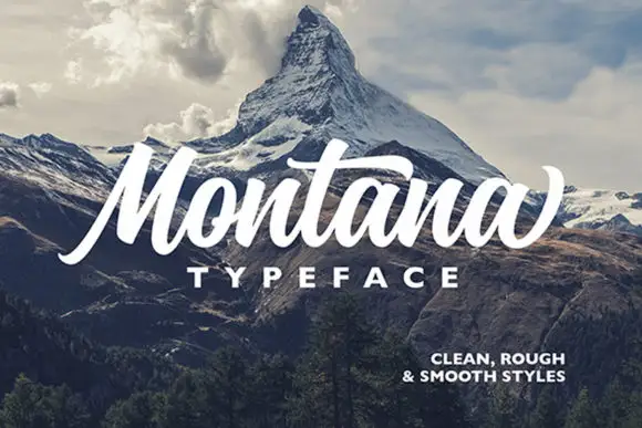
Rustpress + Montana
Adds a warm human signature touch for 1-to-3-word callouts without competing against structured serif capitals.
Inspect Montana specimenPractical applications
Concrete hierarchy, scale and production guidance tailored to Rustpress’s stroke geometry.
A distressed condensed face reads as a garment that has been through work, and the single ink keeps a small-run screen print affordable.
Hierarchy & layout recipe
Print a 300 mm chest graphic: the word at 80 mm cap height spanning the width, the size marker in a 6 mm grotesque, and no other element. Keep the punched holes at least 2 mm wide so the shirt colour reads through them clearly.
Pre-production check
Check the screen at actual mesh, where holes under 1.5 mm clog; enlarge them for the print. Wash-test one shirt and confirm the wear does not read as a printing defect at arm's length, and that the size marker stays legible.
A worn grotesque gives an annual a utilitarian cover that stands out against the polished covers of other design books, and the condensed width lets a long title fit.
Hierarchy & layout recipe
Set the title at 140 pt across the full width with 10 mm bleeds at both edges, the year in a 12 pt grotesque at the foot, and a 0.5 pt rule at the head. Print black on an uncoated stock so the specks read as paper rather than as noise.
Pre-production check
Check the bleeds at trim: the first and last letters must lose no more than a third of their width or the title stops reading. Confirm the 12 pt year survives on the uncoated cover and that the head rule does not crowd the title.
A worn industrial face suits a workshop sign, and the condensed proportions let a long venue name fit a board at a size that reads from the road.
Hierarchy & layout recipe
Print 900 by 600 mm: the venue name at 160 mm cap height, the times in a 30 mm grotesque, and a 10 mm border. Keep the lettering large so the punched texture does not close the counters, and print one ink on a light board.
Pre-production check
Check the sign at eight metres in daylight, where the texture can make a long word look unreadable; reduce the wear for the large format. Confirm the 30 mm times read from five metres and that the border clears the fixing points.
Technical & licence verification
Confirm included OTF/TTF/WOFF formats, full glyph tables and licence coverage on the live store page before batch production.
Closest visual alternatives
Matched across letterform anatomy, stroke behaviour and craft applications.
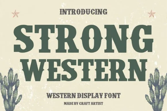
Western display slab with weathered fill
Strong Western is a heavy western slab in forest green on cream: bracketed slab serifs with spurred feet, thick even strokes, slightly condensed proportions, and a weathered fill with fine speckle that reads as a worn woodblock.
Ideas for this font
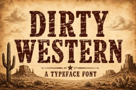
Heavily weathered Wild-West woodtype & saloon slab serif
Dirty Western is a rugged frontier slab serif stamped with coarse woodblock grain, pitted distress, and classic 1880s wanted-poster authority.
Ideas for this font
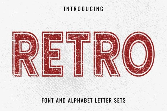
Distressed outline slab
Retro is a distressed outline slab in red on a white textured ground: letters drawn as a double contour with a worn, chipped edge, heavy square serifs and flat tops, so the word reads as a stamp from a mail-order catalogue rather than a solid display.
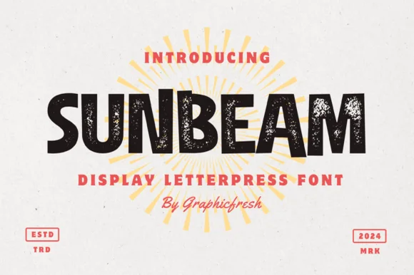
Chunky hand-cut vintage letterpress sans display
Sunbeam is a bold, wide-stance vintage sans display typeface pairing hand-carved organic contours with subtle letterpress speckle texture.
Ideas for this font
Same independent foundry
Allow optional Google Analytics to measure visits and catalogue actions. Your search words and notes are not included. Privacy & storage