Neutral Sans Workhorse

Neon Colored + Sailors
Lets Neon Colored own the focal silhouette while handling secondary copy, sizing and subheads cleanly.
Inspect Sailors specimenDisclosure: MakerFileHub may earn a commission from qualifying purchases via paid links on this page. How our links work.
Neon double-line outline display
Neon Colored is a colour display on a dark brick ground: rounded outline capitals in bright double-line neon colours — violet, blue, orange, green, yellow, pink — with soft glow, set in two lines inside small corner brackets, with a small presenting line above and two plain lines below.
Paid link
Get this fontProject & layout blueprintsAt-a-glance maker compatibility
Sturdy stroke walls and open counters weed cleanly on adhesive vinyl, HTV apparel film, and cut cardstock.
Visual anatomy & craft review
The plate is a nightlife mock-up, and the construction is the draw: each letter is an outline with a second inner line, so the form reads as a glass tube rather than a filled shape, and the colour changes letter by letter to keep the tube looking like separate fixtures. The soft glow is a render effect, which means the buyer should reproduce it with a print technique or accept a flat outline at small sizes. That construction sets a moderate size floor, because the inner line closes first. The presenting line and the two lines below are product copy. It suits a poster, a card and a sign for a bar, a club or a seasonal event.
Decorative, neon, outline, nightlife
Two-font hierarchy recipes
Tested contrast partners — pairing Neon Colored with grounded secondary typography.
Neon Colored + Sailors
Lets Neon Colored own the focal silhouette while handling secondary copy, sizing and subheads cleanly.
Inspect Sailors specimen
Neon Colored + Mewah
Grounds bold display lettering with classic typographic authority on posters, badges and apparel.
Inspect Mewah specimenPractical applications
Concrete hierarchy, scale and production guidance tailored to Neon Colored’s stroke geometry.
A neon display names a night, and the bright tubes read on a dark poster where a flat face would look dull. It reads as a venue sign.
Hierarchy & layout recipe
A2 poster: the night at 100 mm cap height, the line-up in an 18 mm sans, and the venue at 11 mm. Keep 28 mm margins, print four colours on a dark stock and keep the inner line above 2 mm.
Pre-production check
Check the A2 at five metres, where the inner line closes; keep it above 2 mm. Confirm the 11 mm venue reads at two metres and that the brackets clear the type.
A neon sign reads at night, and the outline construction survives a real tube or a printed substitute on a dark fascia. It works as printed neon.
Hierarchy & layout recipe
Fabricate a 1000 by 340 mm fascia: the bar at 120 mm cap height, the line in a 22 mm sans, and four colours on a dark panel. Keep 26 mm margins and keep the tube gap above 6 mm.
Pre-production check
Check the fascia at 120 mm, where the inner line can merge with the outer; keep 6 mm of gap. Confirm the 22 mm line reads at ten metres and that the glow clears the frame.
A neon display sets an evening party, and the bright tubes give a small card the look of a venue sign. It reads as a night out.
Hierarchy & layout recipe
A6 card: the greeting at 26 pt, the details in a 10 pt sans, and the date at 9 pt. Keep 15 mm margins, print four colours on a dark card and leave 12 mm at the foot for the address.
Pre-production check
Check the 26 pt greeting at home-print resolution, where the inner line closes; keep it above 1.2 mm. Confirm the details keep a 4.5:1 contrast and that the card folds flat.
Technical & licence verification
Confirm included OTF/TTF/WOFF formats, full glyph tables and licence coverage on the live store page before batch production.
Closest visual alternatives
Matched across letterform anatomy, stroke behaviour and craft applications.
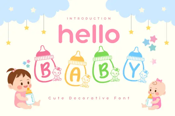
Rounded capitals inside outlined feeding bottles with small seated-animal companions
Hello Baby is a cute colour font in which each capital sits inside a drawn baby bottle, with a pastel keyline and a row of cartoon babies, clouds and stars around the words.
Ideas for this font
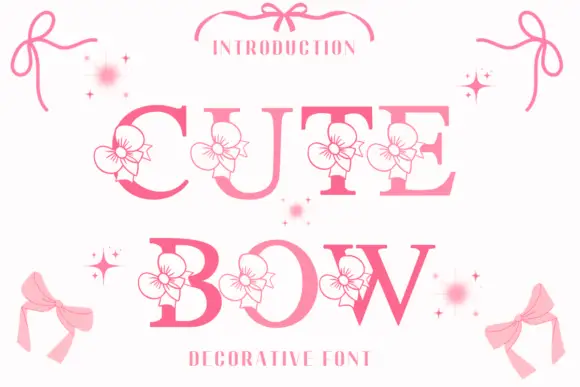
High-contrast serif capitals interrupted by outlined flower-like ribbon motifs
Cute Bow is a high-contrast serif display face in pink, with a drawn ribbon bow attached to each letter and small sparkles scattered around the word.
Ideas for this font
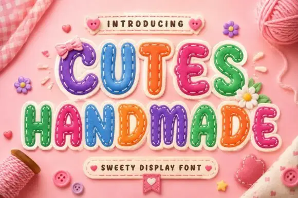
Padded letter shapes with stitch-like details
Cutes Handmade shows rounded inflated capitals outlined by small dashed stitch marks, where uneven coloured fills and highlights make the letters resemble soft fabric patches and yarn, buttons and bows fill the pink textile setting around them.
Ideas for this font
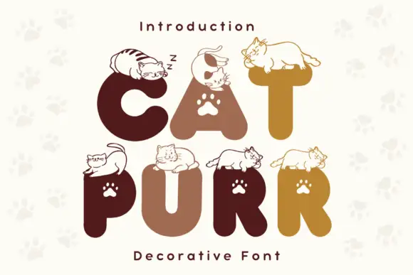
Rounded heavy capitals topped by resting cat drawings with paw-shaped counters
Cat Purr is a colour font that draws fat rounded letters in warm browns and golds, sets a white paw print in most counters, and rests a drawn cat on top of nearly every letter.
Ideas for this font
Same independent foundry
Allow optional Google Analytics to measure visits and catalogue actions. Your search words and notes are not included. Privacy & storage