Neutral Sans Workhorse

Dot Marker + Monure
Lets Dot Marker own the focal silhouette while handling secondary copy, sizing and subheads cleanly.
Inspect Monure specimenDisclosure: MakerFileHub may earn a commission from qualifying purchases via paid links on this page. How our links work.
Hollow broad capitals containing a row of large outlined circles within each stroke
Dot Marker displays four pale-pink outlined capitals, where a thin outer contour defines broad sans-like forms while large hollow circles follow the stems and curves, the A keeps a clean triangular counter and the B holds two smaller inner spaces separated from the circular targets by narrow gaps.
Paid link
Get this fontProject & layout blueprintsAt-a-glance maker compatibility
Sturdy stroke walls and open counters weed cleanly on adhesive vinyl, HTV apparel film, and cut cardstock.
Visual anatomy & craft review
The outer contour stays even and thin, the circles sit on a regular rhythm, and the counters stay empty so the letters remain readable as shapes. That target grid is the character: the word reads as a printable activity rather than a display face, which is why the sample keeps four letters on a plain field. The spacing has to be tested in your own file. Keep 60 pt for any mark-making use, have a teacher review the activity and print a size proof with the real tools.
Hollow broad capitals containing a row of large outlined circles within each stroke
Two-font hierarchy recipes
Tested contrast partners — pairing Dot Marker with grounded secondary typography.
Dot Marker + Monure
Lets Dot Marker own the focal silhouette while handling secondary copy, sizing and subheads cleanly.
Inspect Monure specimen
Dot Marker + Majestic Letters
Grounds bold display lettering with classic typographic authority on posters, badges and apparel.
Inspect Majestic Letters specimenPractical applications
Concrete hierarchy, scale and production guidance tailored to Dot Marker’s stroke geometry.
The circle targets give a teacher a ready mark-making sheet, and the outlined forms stay clear at a size small hands can reach.
Hierarchy & layout recipe
Print an A4 sheet: set five letters at 110 pt across one row, keep 26 mm between letters for crayon clearance, and keep 22 mm of clear margin at each side.
Pre-production check
Circle spacing must suit the markers used; check a proof with the real pen before printing.
The hollow letters read as a craft invitation, and the open targets survive a simple one-colour print on thick card stock.
Hierarchy & layout recipe
Print a 300 by 150 mm plate: set the heading at 54 pt on one row, keep 18 mm of clear ground beneath before the small line at 11 pt, and keep 20 mm of margin for the fixings.
Pre-production check
Thin contours break on textured card; check the proof and choose a smooth stock for the run.
The targets turn a card into an activity, and the outlined capitals leave clear white space for colour inside every circle.
Hierarchy & layout recipe
Print a 148 by 105 mm card: set the greeting at 60 pt across two rows, keep 18 mm of clear ground between them, and keep 15 mm of margin at each side.
Pre-production check
Small circles close under 40 pt; check the printed card and hold the letters at 50 pt or above.
Technical & licence verification
Confirm included OTF/TTF/WOFF formats, full glyph tables and licence coverage on the live store page before batch production.
Closest visual alternatives
Matched across letterform anatomy, stroke behaviour and craft applications.
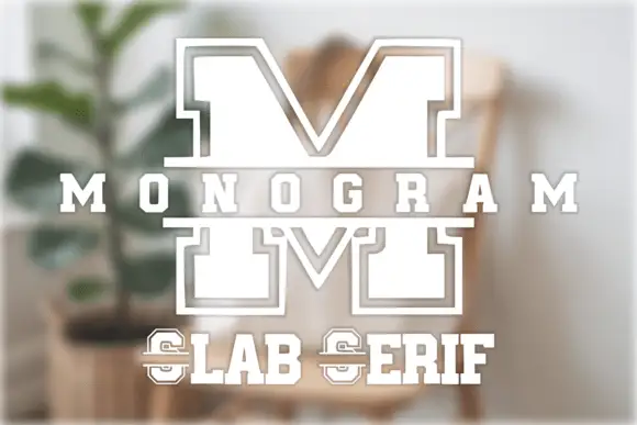
Split varsity monogram initial
Monogram Slab Serif is a single split initial in white on a soft interior scene: a varsity-like M drawn in two halves with slab feet, an inset outline that follows every contour, and a horizontal band that cuts through the middle, with the family name set in a small slab above and below.
Ideas for this font
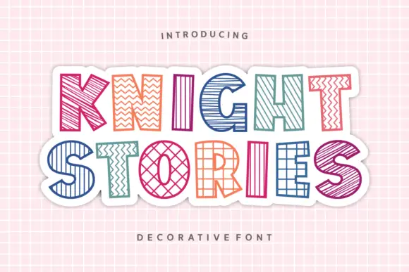
Outlined block capitals filled with varied stripes, zigzags, grids and crosshatching
Knight Stories places two colourful uppercase rows on a white sticker-like shape over a pink grid, where the broad outlined letters contain different linear patterns, from diagonals and zigzags to grids and crosshatching, one pattern per glyph.
Ideas for this font
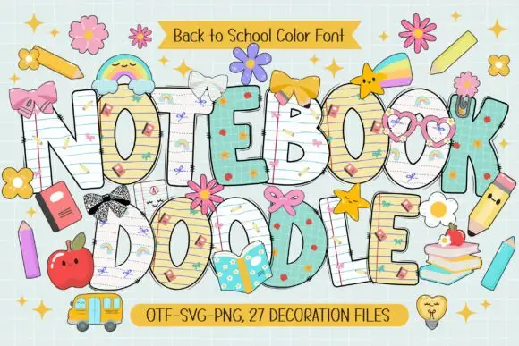
School-paper doodle colour display
Notebook Doodle is a colour display on a pale study scene: fat capitals filled with ruled paper, graph paper and star patterns, outlined in dark ink, decorated with bows, flower clips, pencils and stickers, with two ribbons that name the format list and the count of decoration files.
Ideas for this font
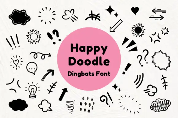
Black comic-style emphasis marks, arrows and outlined speech shapes
Happy Doodle is a dingbat set of marker-style marks: arrows, sparkles, suns, clouds, speech bubbles, exclamation marks, hatching and small stars, all drawn in one even black line.
Ideas for this font
Same independent foundry
Allow optional Google Analytics to measure visits and catalogue actions. Your search words and notes are not included. Privacy & storage