Neutral Sans Workhorse

Gold Glitter + Homies
Lets Gold Glitter own the focal silhouette while handling secondary copy, sizing and subheads cleanly.
Inspect Homies specimenDisclosure: MakerFileHub may earn a commission from qualifying purchases via paid links on this page. How our links work.
Rounded heavy capitals with faceted gold-like fills
Gold Glitter fills chunky rounded capitals with gold glitter: small irregular flakes in three tones packed edge to edge inside each letter, with a fine dark contour around the shape.
Paid link
Get this fontProject & layout blueprintsAt-a-glance maker compatibility
Sturdy stroke walls and open counters weed cleanly on adhesive vinyl, HTV apparel film, and cut cardstock.
Visual anatomy & craft review
ABCD fills the card in four fat capitals on a pale watercolour ground of warm beige washes, and each letter is packed with small angular flakes in pale gold, deep gold and near-white, laid at every angle so the surface reads as foil rather than as flat colour. A thin dark outline holds each shape, and the letters are set with generous spacing so the glitter does not run between them. Two small lines under the letters name the style and the file formats, set in a plain grotesque at a fraction of the size. The face is a colour font, so the texture is part of the file, and the effect depends on scale: at poster size the flakes read as individual pieces of glitter, and at small sizes they average out into a warm metallic tone, which is still a usable result for a label or a sticker.
Rounded heavy capitals with faceted gold-like fills
Two-font hierarchy recipes
Tested contrast partners — pairing Gold Glitter with grounded secondary typography.
Gold Glitter + Homies
Lets Gold Glitter own the focal silhouette while handling secondary copy, sizing and subheads cleanly.
Inspect Homies specimen
Gold Glitter + Resquel
Grounds bold display lettering with classic typographic authority on posters, badges and apparel.
Inspect Resquel specimenPractical applications
Concrete hierarchy, scale and production guidance tailored to Gold Glitter’s stroke geometry.
The metallic fill gives a plain box a festive look without a foil stamp, and a short shop name stays readable at label size.
Hierarchy & layout recipe
Print a 60 by 45 mm box label: set the shop name at 18 pt on one row, keep 6 mm of clear ground beneath before the word cakes at 4.5 pt, and hold 4 mm from the contour to the label edge.
Pre-production check
Digital presses print glitter texture flat; print one label on the real stock and check that the flakes still read as flakes.
The metallic texture supplies the decoration for a milestone, and one word across a board replaces balloons and a printed backdrop.
Hierarchy & layout recipe
Print a 500 by 350 mm board: set the greeting at 90 pt across two rows, keep 22 mm of clear ground between the rows, and hold 26 mm of border so the glitter is not cut at the edge.
Pre-production check
Board soaks ink and dulls the gold; print one sign on the intended material and compare the tone before the set.
The glitter reads as metal at a glance, and one word carries a magazine cover that has no photograph of the product on it anywhere.
Hierarchy & layout recipe
Print a 230 by 300 mm cover: set the feature word at 130 pt on one row, keep 30 mm of clear ground beneath before the standfirst at 11 pt, and hold 18 mm from the last letter to the right trim.
Pre-production check
Glitter texture bands when enlarged; print one cover at the final size and check for repeating flakes before the run.
Technical & licence verification
Confirm included OTF/TTF/WOFF formats, full glyph tables and licence coverage on the live store page before batch production.
Closest visual alternatives
Matched across letterform anatomy, stroke behaviour and craft applications.
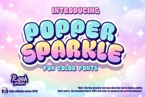
Glossy pastel bubble display
Popper Sparkle is a glossy pastel display on a pink cloud ground: swollen capital blocks with white highlights, dotted lower shading and a thick keyline, set in two lines with a colour-font line beneath and a small note at the foot that explains how the preview may render.
Ideas for this font
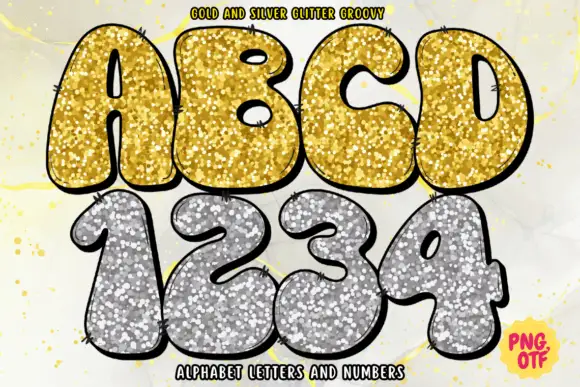
Swollen sketch-edged capitals and numerals with dense gold-silver sparkle-like fills
Gold and Silver Glitter Groovy sets fat rounded letters and numerals in a hand-drawn outline and fills them with a photographic glitter texture, supplied as a gold alphabet and a silver numeral set.
Ideas for this font
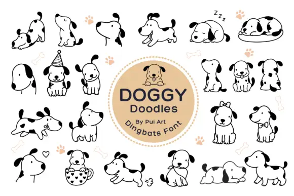
Simple dog doodle symbols with black ears and varied playful poses
Doggy Doodles is a dingbat set of about two dozen line-drawn dogs: sitting, sleeping, running, wearing a party hat, holding a bone, curled in a cup, with a heart or a ball beside them.
Ideas for this font
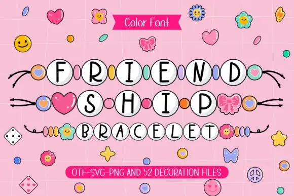
Slim black capitals inside white round beads with coloured spacers
Friendship Bracelet draws each capital inside a round bead threaded on a string, and fills the spaces between the words with charms: hearts, flowers, butterflies and small smiling faces.
Ideas for this font
Same independent foundry
Allow optional Google Analytics to measure visits and catalogue actions. Your search words and notes are not included. Privacy & storage