Editorial Serif Anchor

Playful + Bulgary
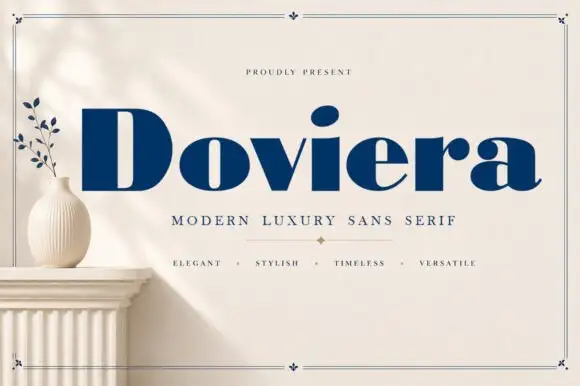
Anchors Playful's fluid strokes with crisp Roman proportions on wedding suites, headers and packaging.
Inspect Bulgary specimenDisclosure: MakerFileHub may earn a commission from qualifying purchases via paid links on this page. How our links work.
Heavy rounded childlike lettering
Playful is a heavy rounded handwritten face in dark brown on cream: fat even strokes, a large x-height, round bowls and a few slanting stems that keep a very friendly face from looking mechanical.
Paid link
Get this fontProject & layout blueprintsAt-a-glance maker compatibility
Weld or Unite overlapping script joins into one continuous vector path before sending to the blade.
Visual anatomy & craft review
The word is set alone and large, and the face is a bold hand rather than a script: the P is a fat round bowl on a short stem, the a closes into a circle, the y drops a rounded tail and the l leans a little further than the others, which is what makes a face this heavy feel drawn by hand. The stroke is even and very thick with rounded terminals, the spacing is open and the letters stand separately, so the word reads at a distance without any risk of filling in. The specimen sits on a cream sheet with a teddy bear, a pot of pencils, a pastel rainbow and small leaves, and four badges at the foot list what the set contains: upper and lower case, numbers and punctuation, multilingual support, and a note that it is made for fun projects. Playful is a display handwriting for children's products, party goods and school material.
A bold friendly hand with round shapes
Two-font hierarchy recipes
Tested contrast partners — pairing Playful with grounded secondary typography.
Playful + Bulgary
Anchors Playful's fluid strokes with crisp Roman proportions on wedding suites, headers and packaging.
Inspect Bulgary specimen
Playful + Furion
Keeps small-scale dates, URLs, nutrition facts and care instructions crisp and legible below script titles.
Inspect Furion specimenPractical applications
Concrete hierarchy, scale and production guidance tailored to Playful’s stroke geometry.
A fat rounded hand reads at a child's eye level and looks friendly rather than institutional, which is the whole point of a nursery sign.
Hierarchy & layout recipe
Print a 300 by 200 mm sign: set the room name at 66 pt on one line, keep 18 mm of clear ground beneath before the teacher name at 22 pt, and hold 16 mm of border on all four sides.
Pre-production check
A very heavy face at sixty-six points can look like a logo; print one sign at the final size and check the word still reads before the set.
A rounded bold hand carries a party banner at a distance, and the open spacing means the letters stay separate on fabric.
Hierarchy & layout recipe
Print a 900 by 400 mm banner: set the greeting at 150 pt over two lines, keep 30 mm of clear ground beneath before the name at 48 pt, and hold 26 mm of border on all four sides.
Pre-production check
Fabric banners stretch and fat letters merge; print one section at the final size and check the gaps before the order.
A bold friendly hand is what a workbook cover needs to look approachable, and the thick stems hold at a small cover size in one ink.
Hierarchy & layout recipe
Print a 210 by 297 mm cover: set the title at 70 pt over two lines, keep 24 mm of clear ground beneath before the subject line at 18 pt, and hold 20 mm of margin on all sides.
Pre-production check
Heavy letters on a busy illustration can blur; print one cover and check the contrast before the print run.
Technical & licence verification
Confirm included OTF/TTF/WOFF formats, full glyph tables and licence coverage on the live store page before batch production.
Closest visual alternatives
Matched across letterform anatomy, stroke behaviour and craft applications.
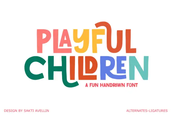
Angular playful capitals with long horizontal extensions
Playful Children is a hand-drawn capital alphabet in which the letters are angular, the arms run long and some strokes extend past the letter body, so a word reads as something drawn with a ruler-free marker.
Ideas for this font
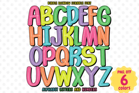
Rounded rainbow capitals with thin sketch-like interior highlights
Bubble Rainbow Scribble sets fat rounded letters with a heavy black contour and fills them with hand-drawn diagonal scribble, supplied in six repeating colourways across a full alphabet and numerals.
Ideas for this font
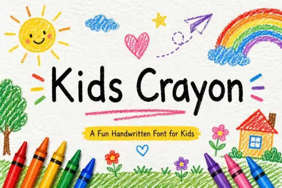
Rounded separate handwriting with uneven letter heights and soft terminals
Kids Crayon is rounded handwriting in which the letters stand separately, the heights drift a little and the strokes end softly, so a phrase reads as something written by a child rather than drawn for one.
Ideas for this font
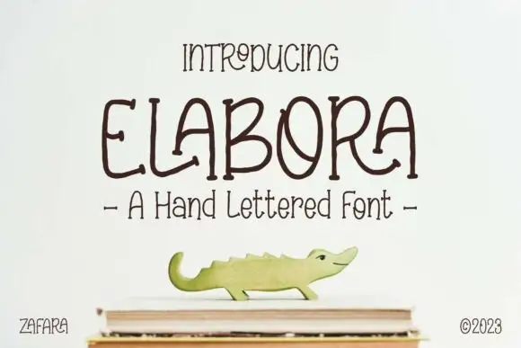
Hand-lettered rounded caps with irregular shapes and a light monoline
Elabora is a hand-lettered capital alphabet in which every letter is drawn with an even rounded line, the proportions wander and the corners stay soft, so a word reads as something sketched on a card with a felt pen.
Ideas for this font
Same independent foundry
Allow optional Google Analytics to measure visits and catalogue actions. Your search words and notes are not included. Privacy & storage