Editorial Serif Anchor

Elabora + Things
Anchors Elabora's fluid strokes with crisp Roman proportions on wedding suites, headers and packaging.
Inspect Things specimenDisclosure: MakerFileHub may earn a commission from qualifying purchases via paid links on this page. How our links work.
Hand-lettered rounded caps with irregular shapes and a light monoline
Elabora is a hand-lettered capital alphabet in which every letter is drawn with an even rounded line, the proportions wander and the corners stay soft, so a word reads as something sketched on a card with a felt pen.
Paid link
Get this fontProject & layout blueprintsAt-a-glance maker compatibility
Sturdy stroke walls and open counters weed cleanly on adhesive vinyl, HTV apparel film, and cut cardstock.
Visual anatomy & craft review
The E stacks three uneven arms on a rounded stem, the L turns a wide curve, the A carries a low bar, the B closes two soft bowls, the O stays a wide ring and the R finishes a curled leg, all at one even monoline weight with rounded ends and proportions that shift letter to letter. The irregularity is the character: nothing is squared off, which is why the sample sets one word with a small drawing beneath and no other type. Because the line is even and the counters open, the face reads from 24 pt and draws cleanly with a marker on a board. The pale ground, the wooden crocodile, the small credits and the parenthetical caption are presentation; the dark hand-lettered word is the face.
Hand-lettered · Rounded · Whimsical
Two-font hierarchy recipes
Tested contrast partners — pairing Elabora with grounded secondary typography.
Elabora + Things
Anchors Elabora's fluid strokes with crisp Roman proportions on wedding suites, headers and packaging.
Inspect Things specimen
Elabora + Mango Dream
Keeps small-scale dates, URLs, nutrition facts and care instructions crisp and legible below script titles.
Inspect Mango Dream specimenPractical applications
Concrete hierarchy, scale and production guidance tailored to Elabora’s stroke geometry.
The rounded hand lettering reads as something drawn for the day, and the open counters keep a name legible at 40 mm on a tent card.
Hierarchy & layout recipe
Print an A5 tent card: set the name at 40 mm, set the age in a 14 pt rounded sans beneath, and keep 15 mm of margin so the wide curves stay clear of the fold at the top.
Pre-production check
A tent fold across a wide round curve cracks the print; check the folded card and keep the whole word below the crease.
The soft monoline suits a classroom sheet, and the even weight photocopies cleanly at 26 pt without filling the counters.
Hierarchy & layout recipe
Print an A4 worksheet: set the header at 26 pt across the top, set the instructions in a 12 pt sans beneath, and keep 18 mm of margin so the rounded ends are inside the printable area.
Pre-production check
Even monoline letters printed at 26 pt on a school copier can thicken; check the photocopy and keep the header at 26 pt or above.
The drawn lettering gives a small maker a friendly mark, and the even line holds at 20 pt on a kraft jar label printed in one ink.
Hierarchy & layout recipe
Print a 60 by 40 mm label: set the studio name at 20 pt, set the contact line in a 7 pt sans at the foot, and keep 5 mm of border so the rounded terminals are not clipped by the die.
Pre-production check
Rounded terminals cut by a small die lose their shape; check the imposed label and keep 4 mm of clear ground around the word.
Technical & licence verification
Confirm included OTF/TTF/WOFF formats, full glyph tables and licence coverage on the live store page before batch production.
Closest visual alternatives
Matched across letterform anatomy, stroke behaviour and craft applications.
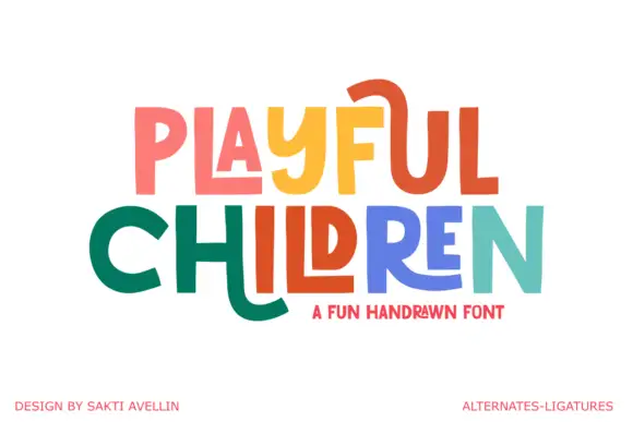
Angular playful capitals with long horizontal extensions
Playful Children is a hand-drawn capital alphabet in which the letters are angular, the arms run long and some strokes extend past the letter body, so a word reads as something drawn with a ruler-free marker.
Ideas for this font
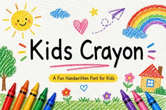
Rounded separate handwriting with uneven letter heights and soft terminals
Kids Crayon is rounded handwriting in which the letters stand separately, the heights drift a little and the strokes end softly, so a phrase reads as something written by a child rather than drawn for one.
Ideas for this font
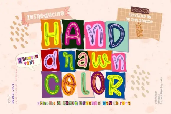
Loose multicolour scribble outlines on contrasting rectangular tiles
Hand Drawn Color builds each word out of separate squares of coloured paper, every tile carrying one letter drawn in loose multicolour scribble outlines, so a headline reads as a pile of marker sketches rather than one even typeface.
Ideas for this font
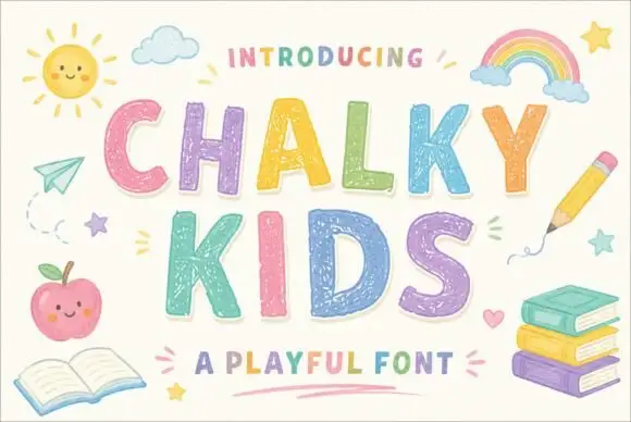
Textured chalk capitals with rounded frames and a broken inner fill
Chalky Kids is a rounded capital alphabet with a chalk texture inside the strokes, drawn so a word looks written on a blackboard rather than printed on paper.
Ideas for this font
Same independent foundry
Allow optional Google Analytics to measure visits and catalogue actions. Your search words and notes are not included. Privacy & storage