Editorial Serif Anchor

Brush Script + Marquis - Elegant Modern Serif
Anchors Brush Script's fluid strokes with crisp Roman proportions on wedding suites, headers and packaging.
Inspect Marquis - Elegant Modern Serif specimenDisclosure: MakerFileHub may earn a commission from qualifying purchases via paid links on this page. How our links work.
Slanted brush lettering with heavy dry strokes and a rough edge
Brush Script is slanted brush lettering in which the strokes carry a dry edge, the weight varies from thick to thin within each letter and the ends finish rough, so a word reads as paint laid on with a chisel brush.
Paid link
Get this fontProject & layout blueprintsAt-a-glance maker compatibility
Weld or Unite overlapping script joins into one continuous vector path before sending to the blade.
Visual anatomy & craft review
The capital B opens with a heavy downstroke that thins through the turn, the r keeps a short dry arm, the u holds a thick stem and the s reverses with a rough exit. The variation is the point: the face is drawn to imitate a loaded brush, so the edges break up along the stroke and the terminals are torn rather than cut. Because the letterforms are wide and heavy, a two-word phrase fills a panel at 60 pt, and the dry texture reads at a metre where a clean script would look printed. Below 24 pt the roughness turns into noise. The black ground, the white ink, the gold brush stroke, the splatter and the three caption lines are presentation; the script is the two words.
Brushed · Dry · Bold
Two-font hierarchy recipes
Tested contrast partners — pairing Brush Script with grounded secondary typography.
Brush Script + Marquis - Elegant Modern Serif
Anchors Brush Script's fluid strokes with crisp Roman proportions on wedding suites, headers and packaging.
Inspect Marquis - Elegant Modern Serif specimen
Brush Script + Kohilo
Keeps small-scale dates, URLs, nutrition facts and care instructions crisp and legible below script titles.
Inspect Kohilo specimenPractical applications
Concrete hierarchy, scale and production guidance tailored to Brush Script’s stroke geometry.
The dry brush edge suits a screen print on denim, and the heavy strokes read at 70 mm across a back panel where a clean script would look pasted on.
Hierarchy & layout recipe
Screen a 300 mm back print: set the word at 70 mm through a 160-thread mesh, keep the dry marks inside the print area, and stay 45 mm below the collar seam so the print clears the yoke.
Pre-production check
A rough edge on a coarse mesh fills in and turns solid; check a pull on the actual denim and print at a heavier weight rather than adding texture.
The brush weight gives a feature cover a handmade register, and the dry strokes hold at 80 pt where a fine script would disappear into the paper.
Hierarchy & layout recipe
Print an A4 cover: set the title at 80 pt across the middle, set the standfirst in an 11 pt sans beneath, and keep 18 mm of margin so the rough terminals stay inside the trim on both sides.
Pre-production check
Dry texture printed on coated stock looks digital; check the proof and specify an uncoated sheet so the edge reads as brush.
The heavy brush stroke reads at 12 cm on a painted board, and the rough edge gives a small shop a hand-painted fascia rather than a vinyl one.
Hierarchy & layout recipe
Paint a 700 by 400 mm board: set the name at 12 cm across the upper half, set the hours in a 4 cm sans below, and leave 9 cm of border so the rough terminals do not meet the frame.
Pre-production check
A rough edge painted by hand on top of a print looks doubled; check one letter at full size and decide between the print and the paint before the run.
Technical & licence verification
Confirm included OTF/TTF/WOFF formats, full glyph tables and licence coverage on the live store page before batch production.
Closest visual alternatives
Matched across letterform anatomy, stroke behaviour and craft applications.

Substantial handwriting script
Simple Handwriting is a substantial handwritten script in deep green on white: connected lowercase with open round bowls, a firm even stroke, tall ascenders and a long entry stroke on the H, set across two lines over a soft brush swipe, with a serif caption beneath and a studio credit at the foot.
Ideas for this font
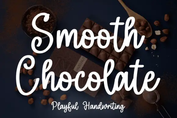
Rounded brush handwriting on a dark ground
Smooth Chocolate is a rounded brush handwriting in white over a dark photograph of chocolate: fat soft strokes with rounded ends, large open bowls, tall loops and a light bounce that keeps a long phrase moving.
Ideas for this font
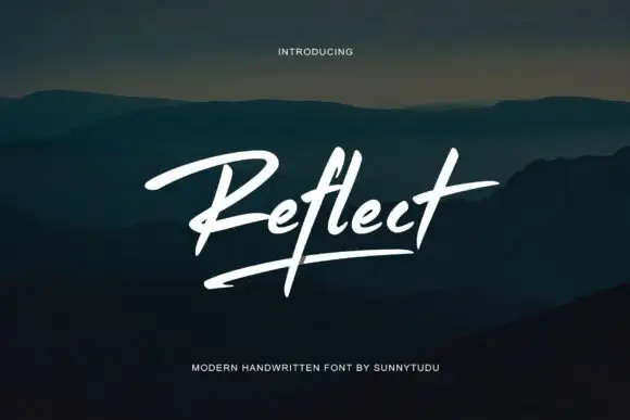
Modern brush signature with an underline
Reflect Handwritten Font is a modern brush signature in white: a single slanted word with a long underline stroke, set over a dark photograph of hills at dusk.
Ideas for this font
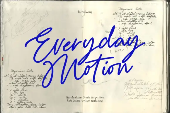
Sloping brush signature with long crossbars and a heavy loaded stroke
Everyday Motion is a sloping brush signature in a heavy loaded weight, with long crossbars that extend past the letters and strokes that swell through the middle of each word.
Ideas for this font
Same independent foundry
Allow optional Google Analytics to measure visits and catalogue actions. Your search words and notes are not included. Privacy & storage