Editorial Serif Anchor

Kids Crayon + Brenco
Anchors Kids Crayon's fluid strokes with crisp Roman proportions on wedding suites, headers and packaging.
Inspect Brenco specimenDisclosure: MakerFileHub may earn a commission from qualifying purchases via paid links on this page. How our links work.
Rounded separate handwriting with uneven letter heights and soft terminals
Kids Crayon is rounded handwriting in which the letters stand separately, the heights drift a little and the strokes end softly, so a phrase reads as something written by a child rather than drawn for one.
Paid link
Get this fontProject & layout blueprintsAt-a-glance maker compatibility
Weld or Unite overlapping script joins into one continuous vector path before sending to the blade.
Visual anatomy & craft review
The capital K is a tall stem with two soft arms, and the letters after it keep a childlike ease: the i carries a round dot, the d and the s vary in height, the C opens wide and the r and the a close loosely. Nothing connects, nothing is ruled and the weight drifts by a stroke here and there, which is what gives the phrase its unselfconscious tone. The terminals are rounded rather than tapered, the counters are large and open, and the baseline wanders slightly without ever becoming hard to follow. Because the letterforms stay simple, the face reproduces well at small sizes and copies cleanly. The crayon drawings, the rainbow, the little house and the two caption bands are presentation; the lettering is the two words.
Rounded · Casual · Uneven
Two-font hierarchy recipes
Tested contrast partners — pairing Kids Crayon with grounded secondary typography.
Kids Crayon + Brenco
Anchors Kids Crayon's fluid strokes with crisp Roman proportions on wedding suites, headers and packaging.
Inspect Brenco specimen
Kids Crayon + Helina
Keeps small-scale dates, URLs, nutrition facts and care instructions crisp and legible below script titles.
Inspect Helina specimenPractical applications
Concrete hierarchy, scale and production guidance tailored to Kids Crayon’s stroke geometry.
The childlike hand reads at a child's eye level and signals a room for young children faster than any pictogram, and the open counters stay legible at 30 pt.
Hierarchy & layout recipe
Set the room name at 40 pt on an A3 door sign, keep the teacher's name in a plain 14 pt sans, and hold 20 mm below the lettering so nothing crowds the eye.
Pre-production check
Door signs are printed and laminated; check the print at final size and confirm the small counters of the a and e stay open through the lamination.
The uneven round letters set a young child's tone without illustration, and the soft strokes keep a short greeting warm on a small card.
Hierarchy & layout recipe
Set the greeting at 36 pt on a 148 by 105 mm card, keep the date and place in a 9 pt sans, and leave 12 mm of margin so the uneven heights stay inside the trim.
Pre-production check
A childlike face printed in a single dark ink can look like a mistake; print the card in two cheerful colours and check the proof.
The round letters read across a playroom and the unevenness keeps a printed banner looking homemade, which is what the setting needs.
Hierarchy & layout recipe
Set the greeting at 70 mm on a 1.2 m paper banner, keep the name at 45 mm beneath it, and leave 30 mm at each end so the soft terminals stay inside the edge.
Pre-production check
Paper banners tear at the eyelets; check the artwork against the hole positions and keep the shortest letter 8 mm clear of any punch.
Technical & licence verification
Confirm included OTF/TTF/WOFF formats, full glyph tables and licence coverage on the live store page before batch production.
Closest visual alternatives
Matched across letterform anatomy, stroke behaviour and craft applications.
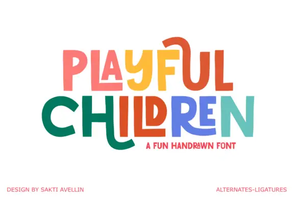
Angular playful capitals with long horizontal extensions
Playful Children is a hand-drawn capital alphabet in which the letters are angular, the arms run long and some strokes extend past the letter body, so a word reads as something drawn with a ruler-free marker.
Ideas for this font
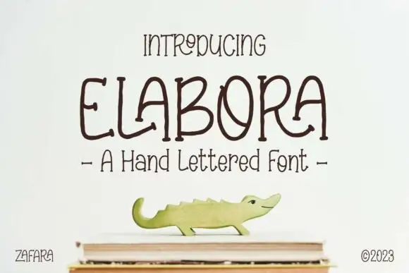
Hand-lettered rounded caps with irregular shapes and a light monoline
Elabora is a hand-lettered capital alphabet in which every letter is drawn with an even rounded line, the proportions wander and the corners stay soft, so a word reads as something sketched on a card with a felt pen.
Ideas for this font
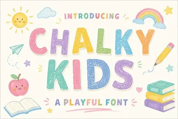
Textured chalk capitals with rounded frames and a broken inner fill
Chalky Kids is a rounded capital alphabet with a chalk texture inside the strokes, drawn so a word looks written on a blackboard rather than printed on paper.
Ideas for this font
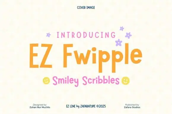
Bouncy separate mixed-case print
Ez Fwipple shows uneven separate letters with a tall F, long p descenders and lowercase proportions that change from letter to letter rather than holding one geometric width.
Ideas for this font
Same independent foundry
Allow optional Google Analytics to measure visits and catalogue actions. Your search words and notes are not included. Privacy & storage



